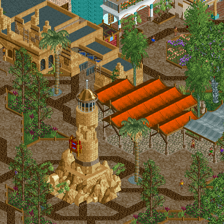
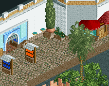
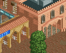
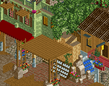
I actually quite like that, excpet for the paths- they're too murky and down. It either needs heaps more colorful flowers and overgrown bushes to counteract it, or else a change- possibly from the dark zigzags to something brighter (the classic tile texture maybe?)
I really like this, looks to be some of your best stuff to date from a lot of angles. Feels like your clean style, but it's got enough grit to it here to give it more atmosphere. Only thing I'd suggest is lusher trees and foliage in general.. honestly I wouldn't be afraid to spill it onto the path and add plenty of vines on the buildings.
Hmm some really good stuff in there, two points that immediately comes to mind though:
- The streaks of darker brown on the path seems too chaotic. Would it not work better to use it as an outline around buildings and planters in a more regular fashion?
- I absolutely like the pop of orange from the awnings, but it seems maybe to be a bit repetitive clustered together like that. Could it be broken up somehow, like raising a part of the center of it? And/or try to add some details to it in certain spots so that it doesn't look so copy/paste?
Other than that I think it looks great! Good initiative to launch a tiny fiesta
Lovely screen, that tower is awesome! I agree with Cocoa on the paths, it's looking too brown right now. Some colorful flowers here and there will do a lot imo.
This is great. I agree with Cocoa & Dirt about the foliage. Love the tan buildings up top.. Its not easy to pull off these kind of low ceiling structures.
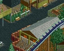
Worse than the poop streaks I think is the change to crazy paving under the awnings, and the roadline object to highlight the abruptness of the transition.
I like that lighthouse. Classic design of course, but nice execution.
Very nice, just the transition between the light brown of the tower to the dark brown of the path is a bit abrupt. You could try colouring some of the rocks individually perhaps.
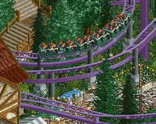
Agree that it seems quite dark, you can definitely breathe more life into the foliage to make it more vibrant. Other than that this is great work, I really love the tower design.
 11-February 20
I actually quite like that, excpet for the paths- they're too murky and down. It either needs heaps more colorful flowers and overgrown bushes to counteract it, or else a change- possibly from the dark zigzags to something brighter (the classic tile texture maybe?)
I really like this, looks to be some of your best stuff to date from a lot of angles. Feels like your clean style, but it's got enough grit to it here to give it more atmosphere. Only thing I'd suggest is lusher trees and foliage in general.. honestly I wouldn't be afraid to spill it onto the path and add plenty of vines on the buildings.
Hmm some really good stuff in there, two points that immediately comes to mind though:
- The streaks of darker brown on the path seems too chaotic. Would it not work better to use it as an outline around buildings and planters in a more regular fashion?
- I absolutely like the pop of orange from the awnings, but it seems maybe to be a bit repetitive clustered together like that. Could it be broken up somehow, like raising a part of the center of it? And/or try to add some details to it in certain spots so that it doesn't look so copy/paste?
Other than that I think it looks great! Good initiative to launch a tiny fiesta
Lovely screen, that tower is awesome! I agree with Cocoa on the paths, it's looking too brown right now. Some colorful flowers here and there will do a lot imo.
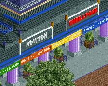
It looks like something i'd build
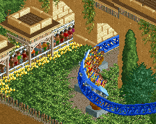
I'd change the mulch path striping to maybe red. Looks great otherwise.
Great work, ditto the remark about the bown path.
This is great. I agree with Cocoa & Dirt about the foliage. Love the tan buildings up top.. Its not easy to pull off these kind of low ceiling structures.
Worse than the poop streaks I think is the change to crazy paving under the awnings, and the roadline object to highlight the abruptness of the transition.
I like that lighthouse. Classic design of course, but nice execution.
Very nice, just the transition between the light brown of the tower to the dark brown of the path is a bit abrupt. You could try colouring some of the rocks individually perhaps.
Great screen
Good, but also really dark for an entrance area of a theme park.
Agree that it seems quite dark, you can definitely breathe more life into the foliage to make it more vibrant. Other than that this is great work, I really love the tower design.
God this is good...
This is fucking awesome, love all the little details in the architecture.
I wish there was a little more color, I feel like if you changed the covering roofs to more popping colors then it would catch my attention more.
Scoop evolved