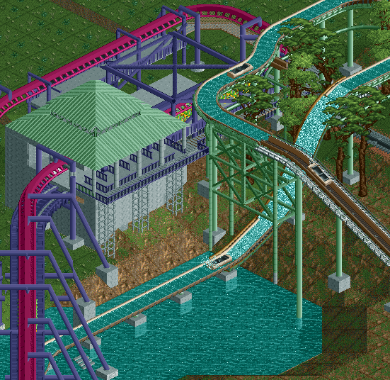
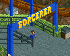
Screenshot / Mardi Gras HangOver & Shipwreck Falls
-
 17-February 20
-
Six Flags Adventure Kingdom
-
1 of 7
- Views 1,990
- Fans 0
- Comments 11
Community Forum Software by IP.Board

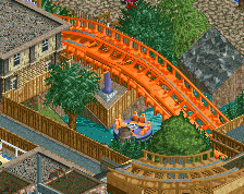
Interesting stuff! I like the support structure of that flue lift hill, well done. I also like the coaster colours.
But I'm not a fan of the grey blob that is the station. Perhaps use a different colour, add some spice, or colour accents. Isn't Mardi Gras a very colourful day? I'm not seeing any of that here. It's also pretty blocky, perhaps adding some extra structures might help break the box-like shape.
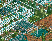
The rest of is it is pretty unfinished to comment on. The foliage is perphaps also a tad on the dark side, but I'd need to see a more finished screen of it to really comment on it.
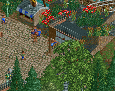
Glad to see you back... this is a nice screen and the support work is very well done. And there seems to be some good interaction between these rides.
I agree with Jappy on the station though, very grey and dull looking and could use some accents.
Interaction is good tho, keep it up.
The lone diagonal support jutting out over the water is rather odd; the flume height would be more readable with just a vertical support underneath it, or even no support at all since the tiles directly around it seem to be supported well as it is.
I like the grey station; it contrasts the colorful coaster nicely. I think if you opened up the left side the way you did with the right side--with pillars supporting the roof instead of thick concrete walls--it would take the edge of the blockiness.
Good start, though I really wish more foliage was there to complete the screen. The coaster colours are gorgeous.
Foliage has been and probably well always been my weakness. This park is heavily inspired by a real life park, so I have been trying to use pictures and videos to reflect that.
The grey box to the left of the station track houses the transfer track shop opening that side up all the way isn't really an option.
The diagonal "support" on the flume is the piping that carries the water up to the top.
the log flume is great, the coaster colours too, just the station is a bit square. but great job!
I'm scrapping this station as well. It's a giant block, I mean eyesore, and I built it in the wrong direction anyway. Not sure how ya'll decided to vote what you did, but it doesn't deserve it. Lack of foliage, ugly custom path supports, missing path supports, no exit path, clashing ground textures, bland station colors, missing corner roof eaves... #startover
Yep, totally 0%. Worst screen on NE, tied with anything else posted by Dark Horse.
Agreed.