Screenshot / Roscoe's Point: Buena Bay (Entrance Plaza)
-
 20-February 20
-
 Roscoe's Point: Buena Bay
-
 1 of 5
- Views 1,764
- Fans 1
- Comments 11
-
 Description
The time has come for a new project. I will be posting updates for this park as much as possible. Any and all feedback, comments, suggestions are greatly welcome.
For those of you wondering about my previous project ive posted about before, Adventure Creek, I needed to adapt those skills to a fresh start. That park is on hold for now, but perhaps someday it will make a showing. -
 Full-Size
-
1 fan
 Fans of this screenshot
-
 Tags
Tags
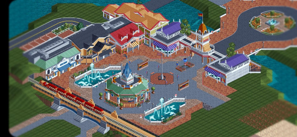
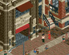
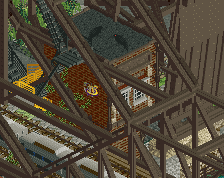
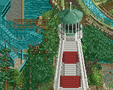
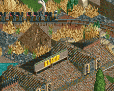
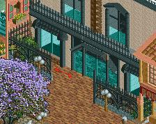
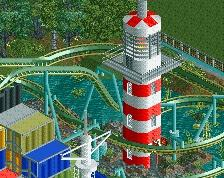
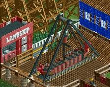
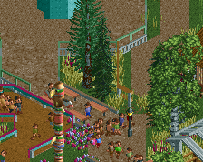
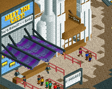
First thing I notice is the railway bridge archways are verrry low.
Really nice otherwise!
Solid start, hope to see more.
Not sold on all the different path types, I'd try to stick to one type of brick (hopefully the darker one) and one "base" path type.
Not sure the roadlines are needed around the flag pole either, or the red ones between the brick and the crazy path. Sorta becomes a distraction from the really strong archy you have here.
To me its important to channel color and detail into things that you want people to look at, everything should work together to create the image you want. If the path is the most eye catching thing on the screen then its not working out, especially when you have some really solid archy and other design that should be the focus.
The jagged path is driving me insane. I like the diagonal but don't have it jut out for no reason.
Attached Thumbnails
It's a classic though, I immediately thought of Kennywood. Lends it the feel of something designed in the 50s-70s as a small family park.
I do appreciate that it's colorful. The buildings have a lot of life and it feels like an exciting entry.
This is a great start. I think the general structures are already really, really good. That said, you should work a bit about the finer aspects of architecture, some of the building fronts don't look as well as their shapes promise, if you understand what I'm trying to say.
hey this is pretty good - I agree with what's been said, be mindful of the path types as well as feeling the need to trim every building. Spend more time on getting them into interesting shapes than adding ornaments to them - it's easier to do time-wise and pays off much, much more.
In this screen, the heights of your stories of the buildings feel very low, and combine that with the roofs that slope down towards the path, it is killing any grandeur to the architecture. Also - look to simplify the colors and textures of the buildings - once you have solid shapes down you can get away with a lot less work which will look much more cohesive.
I think the reason you are getting so much constructive criticism is because this is high quality work. Let me first say I really enjoy this screen.
I agree with path types is too much, and I agree with the tunnels being too low. However if thats intentional like ][ said then I guess its okay.
By far my biggest grip is with colours, which is rich coming from me because I struggle with them as well. I think the train bridge should be grey instead of tan. The Carousel top should be green or the bottom should be blue, either way make it one colour. The gross tan roof should change colour, I don't like that. The top of the clock town should be purple to match the two buildings beside it. Overall even if you don't change to what I'm suggesting play around with it some, I think you can find combinations that work better then what you have now.
Lovely plaza, really good quality work and I'm getting a bit of Royr-ism from the architecture which is great. I agree that the tan coloured roof at the top feels out of place and the path situation could be cleaner. I really like the railway bridge, and the entrance tower is superb.
WOW very good