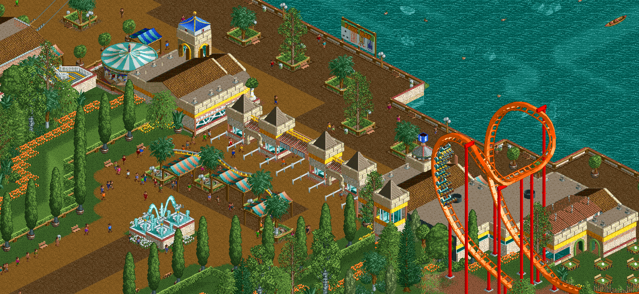
I'm hoping those sunken boats are theming and not faulty attractions. Looks really nice. The orange flowers work great as an accent, and help to further sell the warm feeling that all the other foliage is suggesting. Only question, are the glass spheres in the left-hand building representing curved windows, or interior details? They look good either way, but I just wasn't sure of your intended outcome.
I was kinda hoping for something a bit more grand, this is fine but just seems so plain for a park like this. Wish you did something a bit more elaborate and macro.
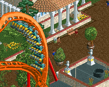
I think as a whole the entrance is a bit underwhelming, especially for a park with a kick-ass B&M like that. The gardens around the plaza before the entrance need some work. I wouldn't use the dirt path with the rounded edges for the outer part of the plaza, and I think there is some border needed between the path and the grass. Also that hedge looks a bit misplaced, I'd leave it open and make the gardens a more interesting sight. More options for guest service, ticket sales, toilets and souvenirs in this plaza before you enter could also make a big improvement. It would definitely make it a more lively space.
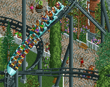
Good stuff. I think you could break up the solid edge of the waterfront a bit with some lowered seating areas or docks - something which extend out into the water.
I'm kinda disappointed this is the entrance of that NCSO park from you. I really hoped for something more grand. It's nicely done though, just wished it was bigger.
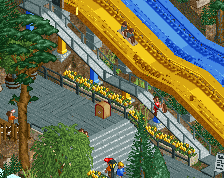
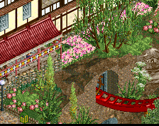
Significant improvement. Way better scale, more details, overall you revamped the area well. Imo the brown path, brown fence, and brown dock makes the upper right area hard to read. I'd either continue the dirt path all the way to the lake or find some colors to give that section more definition. First screen 60%, updated screen 70%, you're definitely on the right track.
 20-March 20
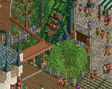
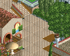
I'm hoping those sunken boats are theming and not faulty attractions. Looks really nice. The orange flowers work great as an accent, and help to further sell the warm feeling that all the other foliage is suggesting. Only question, are the glass spheres in the left-hand building representing curved windows, or interior details? They look good either way, but I just wasn't sure of your intended outcome.
Great creativity with the park map
I was kinda hoping for something a bit more grand, this is fine but just seems so plain for a park like this. Wish you did something a bit more elaborate and macro.
Quite charming, I like it.
Big fan of the area before the entrance with the tent rooves and the fountain. Nice atmosphere before even entering the park.
I think as a whole the entrance is a bit underwhelming, especially for a park with a kick-ass B&M like that. The gardens around the plaza before the entrance need some work. I wouldn't use the dirt path with the rounded edges for the outer part of the plaza, and I think there is some border needed between the path and the grass. Also that hedge looks a bit misplaced, I'd leave it open and make the gardens a more interesting sight. More options for guest service, ticket sales, toilets and souvenirs in this plaza before you enter could also make a big improvement. It would definitely make it a more lively space.
Good stuff. I think you could break up the solid edge of the waterfront a bit with some lowered seating areas or docks - something which extend out into the water.
I'm kinda disappointed this is the entrance of that NCSO park from you. I really hoped for something more grand. It's nicely done though, just wished it was bigger.
Thanks for the input guys, I changed it up a bit.
i like that idea for the fountain, v cool. never a huge fan of that hexagon clock setup, but the rest is good
Significant improvement. Way better scale, more details, overall you revamped the area well. Imo the brown path, brown fence, and brown dock makes the upper right area hard to read. I'd either continue the dirt path all the way to the lake or find some colors to give that section more definition. First screen 60%, updated screen 70%, you're definitely on the right track.