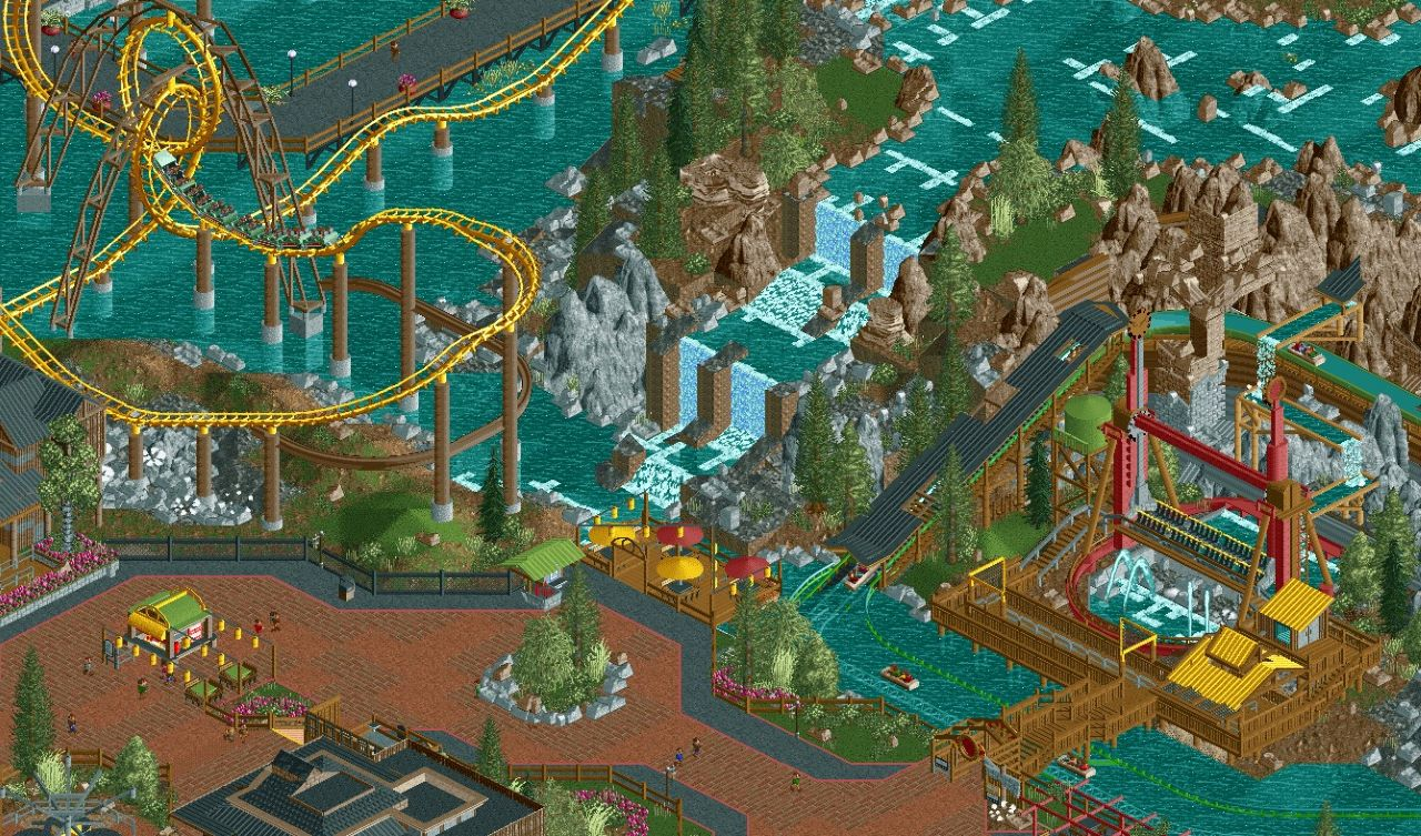
wow... that flat is amazing. I think plenty of the individual bits and pieces are nice too, but there is something stopping the whole are from coming together. I'd reduce the amount of path, and find an alternative to the log flume rails, the bright green doesn't look good in the slightest. Other than that keep up the great work.
this is really really good! so atmospheric and detailed.
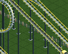
I dont like the coaster supports. I think the brown makes this screen too dark. If you made them a brighter color I think this screen would look a lot better.
Some really good stuff here - except the rocks. Honestly I think that part is plain bad. Grey, brown, 1k ruins, LOTR rocks, land blocks... This is some kind of weird frankenstein landscape. Just pick one look and stick to it.
Some really good stuff here - except the rocks. Honestly I think that part is plain bad. Grey, brown, 1k ruins, LOTR rocks, land blocks... This is some kind of weird frankenstein landscape. Just pick one look and stick to it.
I was contemplating the same thing. Thank you for the feedback!
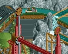
Not really sure about that little airtime hill before/after the 2nd loop there, arrow loopers are definitely not intended for airtime moments.
Also, I'd replace the monorail support with single rail coaster track, the monorail track is just too large for that purpose IMO. Otherwise pretty solid work!
Yes yellow has to stay! Overall it looks great, the rides all look amazing, especially the flat ride, and I'm really liking what can be seen in terms of pathing and archy at the bottom. Now that you've changed all the rocks to grey I think the landscape looks pretty good, I think you've managed to blend the LOTR rocks with the 1k ruins well enough as to not be distracting.
One thing I feel can be improved is the waterfall - to me, it looks like it is jotting out a bit, and I think it would look more natural if you set it back more into the cliff wall. I also think you could try to make the waterfall have a more organic shape, as opposed to just straight, lined up sections with only variations in incline as it is right now. For example, you could try to throw in some diagonal sections, add another thinner waterfall runing off to the side, and also vary the elevation across the width of it.
Aw man, I also loved the yellow! Great screen, and all the main points that needed to be adressed have been touched upon I see. Keep it up, this is going to be something great!
I think I posted once 2 years ago.. Miss this game. Here's a little something I started this week. Can't work due to virus. Feedback and critiques are highly encouraged.
 21-March 20
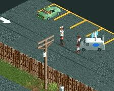
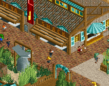
wow... that flat is amazing. I think plenty of the individual bits and pieces are nice too, but there is something stopping the whole are from coming together. I'd reduce the amount of path, and find an alternative to the log flume rails, the bright green doesn't look good in the slightest. Other than that keep up the great work.
Yeah this is great. In particular I'm liking how much of the path and coaster is standing above water in the top left corner, it works very well.
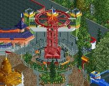
wow that top spin is so serious. Great stuff.
Again looking like the "new realism 2020". Love it.
Tree colors seem off. Other than that its quite a nice scene
I like this a lot, but the colours are indeed a bit all over the place.
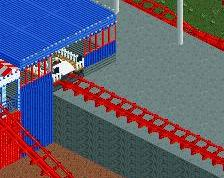
Biggest culprits are the log flume rails and the yellow roofs.
Very excited to see more though!
this is really really good! so atmospheric and detailed.
I dont like the coaster supports. I think the brown makes this screen too dark. If you made them a brighter color I think this screen would look a lot better.
Some really good stuff here - except the rocks. Honestly I think that part is plain bad. Grey, brown, 1k ruins, LOTR rocks, land blocks... This is some kind of weird frankenstein landscape. Just pick one look and stick to it.
RaunchyRussell Offline
I was contemplating the same thing. Thank you for the feedback!
Not really sure about that little airtime hill before/after the 2nd loop there, arrow loopers are definitely not intended for airtime moments.
Also, I'd replace the monorail support with single rail coaster track, the monorail track is just too large for that purpose IMO. Otherwise pretty solid work!
RaunchyRussell Offline
Thanks for the feedback everyone. I am taking everyone's advice into consideration. I appreciate it!
RaunchyRussell Offline
Thoughts on the changes?
Noooo, keep the yellow. I instantly thought of Lochness Monster. This is fcking gorgeous by the way.
Yes yellow has to stay! Overall it looks great, the rides all look amazing, especially the flat ride, and I'm really liking what can be seen in terms of pathing and archy at the bottom. Now that you've changed all the rocks to grey I think the landscape looks pretty good, I think you've managed to blend the LOTR rocks with the 1k ruins well enough as to not be distracting.
One thing I feel can be improved is the waterfall - to me, it looks like it is jotting out a bit, and I think it would look more natural if you set it back more into the cliff wall. I also think you could try to make the waterfall have a more organic shape, as opposed to just straight, lined up sections with only variations in incline as it is right now. For example, you could try to throw in some diagonal sections, add another thinner waterfall runing off to the side, and also vary the elevation across the width of it.
Very impressive stuff, show more please!
That little F&B kiosk and seating area on the left is beautiful.
Keep the yellow for the coaster, all the other changes are good. Lovely screen dude.
Aw man, I also loved the yellow! Great screen, and all the main points that needed to be adressed have been touched upon I see. Keep it up, this is going to be something great!
the log flume interaction with the top spin is fukn sikc