Screenshot / The start
-
 07-June 20
-
Tony's Chocolonely Park
-
1 of 4
- Views 1,612
- Fans 0
- Comments 18
-
Description
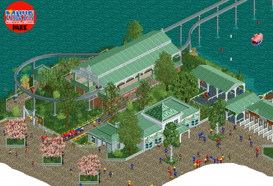
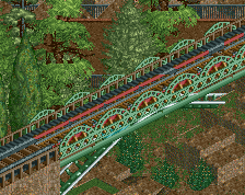
I started working on a new park; Tony's Chocolonely Park. It's a Dutch chocolate brand. The idea started when I heard they are building an experience center near Amsterdam with a rollercoaster. I figure it will become some kind of Dutch Hershey Park, but we will see... :)
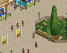
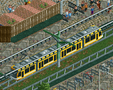
This is the transportation hub. The parking is near, guests enter one of the transportation options to cross the river and start their day at the CityWalk. -
Full-Size
-
No fans of this screenshot
-
Tags
Airtime Offline
I think if you broke the path up a little, maybe line the trees or areas near the buildings would a different texture it would really elevate this.
Maybe even an additional accent of colour in addition to just white or green. Or separate the building colours up a little?
https://www.nedesign...-fucking-donts/
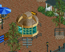
This is such a cool idea for a park. Could be really good! I like what you've started with. Nice little details like the net at the monorail station and the sign. My advice would be to watch out with too many different types of fences, it tends to make it incoherent and unnecessary messy.
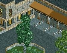
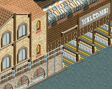
This is pretty nice, the green roof is a good combo with the subtle brick texture and this definitely teases the park nicely. Be careful with your choice of tree trunk colour, a lot of the ones here differ from the vanilla rct colours which makes them seem off. The chinese cedar and the silver birch in particular.
Dude this is absolutely lovely. Fantastic work!
nice work! I like the station very much... Not a fan of the hats though... makes it ala bit to monotonous..
Nice stuff. Monorail station is great
I think you have a great screen here, just needs a little polish. You should vary your roof and detail colors, not every building has to be green. Love the monorail station. The Building with the shake roofs kinda looks like it should be a centerpiece, and if thats the case the scale is 1-2 units too small on that. Would make that higher to stand out. A second path type might help break up the crazy paving.
Batwing? You're the Batwing I'm thinking of, right?
Nice cozy transport hub. Good stuff.
Wow! I never knew this was still online!! I’ve been looking for this for ages!! Thanks Liam! And yes. That’s me. Like I said... It’s been a while
Everyone: thanks for the tips and help! I have made a few adjustments and I’m pretty sure more will follow. Good tips!! Thanks!
Tony's Chocolonely, it's my favorite kind of chocolate
Really like this so far! The builing shapes are well done, as are the architectural details and the consistency here.
I would like to add to the comments about colours though, I think it needs a pop out colour, some sort of accent. Perhaps you can achieve this by making some flower beds?
So it is you! Good to see you're building again. The screen definitely shows some experience with the game. The one thing I'm not keen on is the foliage, it's a little messy and scattered. And moreover a lot of your trees have weird trunk colours. If you make the birch trunks grey instead of white for example, it'll look a lot more natural.
I like that you took this concept btw. Be careful with the architectural style though, this stuff strikes me as quite Americanized.
Looking forward to seeing more.
very good
Wow, I had no idea Tony's Chocolonely was Dutch, you learn something new every day.
This looks pretty good, if a bit blocky. It reminds me of a blend between American realism and Concurrenten-style Dutch building. Keep up the good work.