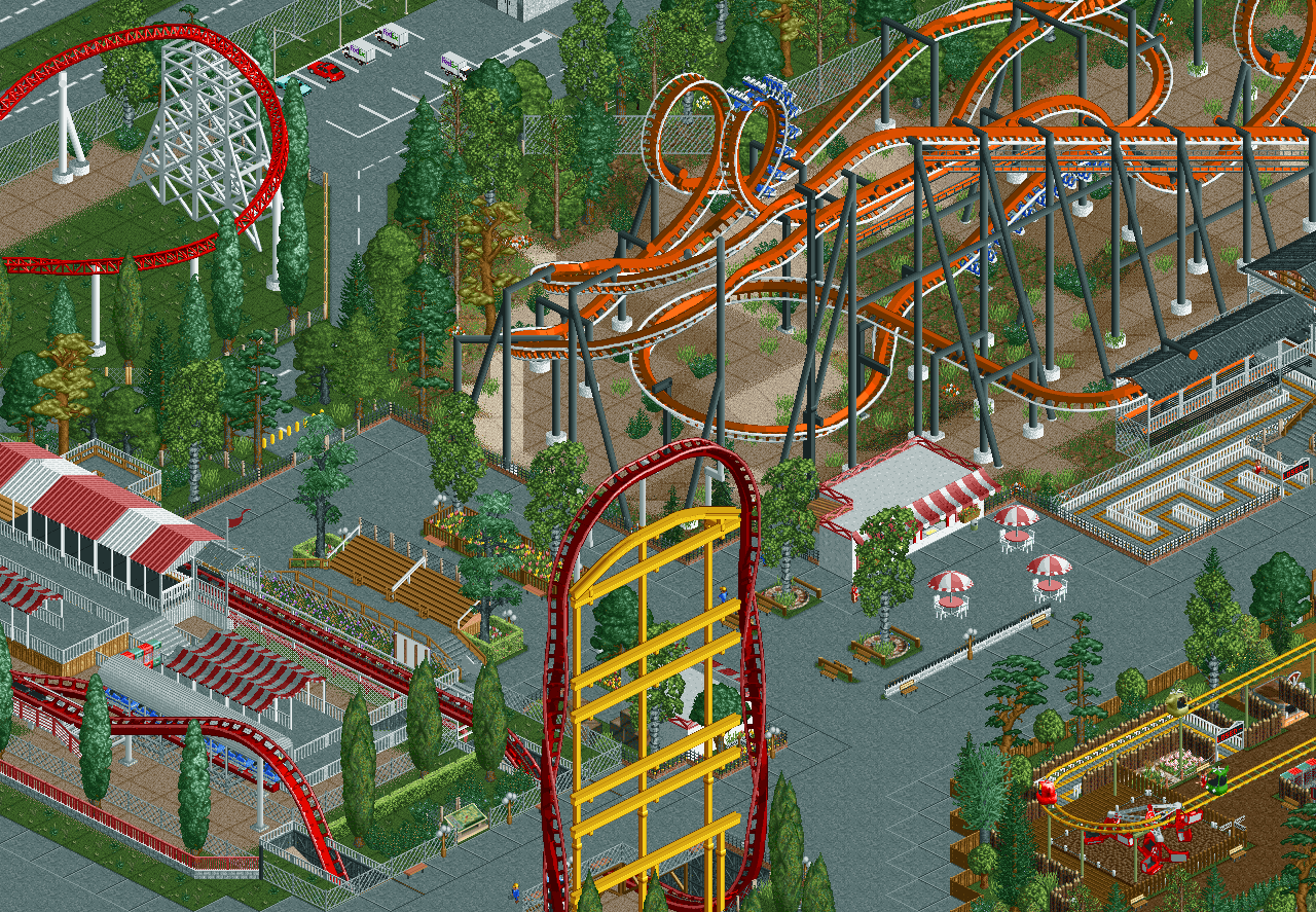
I like a lot of things you have here, like the queue are before your launch coaster, the bleachers, and the suspended looks nice. I'm not really sold on the layout of the launch coaster or the supports. Otherwise I really like everything else!
Not bad, the stand next to the launch is a great element and I like how it's framed next to the tophat. You could maybe make the station a bit more exciting, same with the ride entrance but otherwise this is nice.
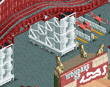
Some nice work, and quite a few things to like here. Well done! I do have to warn you about your path, be careful it doesn't turn into a big grey mass. I suggest replacing that tiled grey path with something else.
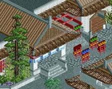
I like the seating/viewing area - good use of that path type. I agree with the comments about jazzing up the station though. Perhaps something that enhances the theme of the ride, which at the moment comes off as rather generic (or, if there isn't a theme, it might be a good excuse to develop one, even if it just ties in with the ride's name). Promising work nonetheless.
Despite the genericness and unrefinedness, this area is actually quite pleasant! I also like how retro it feels. Very 2008-esque RCT here.
Some pointers:
- I can't count the amount of different fence types on my two hands, and if I had three I would still be short. There's no logic or consistency here!
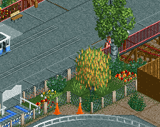
- I wish the invert wasn't facing away from the path, and the area below could be a little more attractive than an overgrown mud pit.
- Put a land texture under your paths (I recommend tan sand), so there's no grass texture poking through. It always makes your work look cleaner.
- White footers rarely ever look good, just make them all grey unless you have a good reason to use any other colour.
- Monorail supports aren't working in my opinion, the arching bit at the top doesn't even do anything! I'm also confused by the colours. Yellow or white? It's probably worth it building a custom support structure. You put in the effort for the other coasters too!
To end it on a positive note again: the drop in the launch section is badass.
 16-June 20
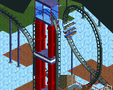
those down bits on the launch are gonna give you some killer airtime
Right? I'm super happy with how it turned out too.
RaunchyRussell Offline
I like a lot of things you have here, like the queue are before your launch coaster, the bleachers, and the suspended looks nice. I'm not really sold on the layout of the launch coaster or the supports. Otherwise I really like everything else!
Not bad, the stand next to the launch is a great element and I like how it's framed next to the tophat. You could maybe make the station a bit more exciting, same with the ride entrance but otherwise this is nice.
Some nice work, and quite a few things to like here. Well done! I do have to warn you about your path, be careful it doesn't turn into a big grey mass. I suggest replacing that tiled grey path with something else.
I like the seating/viewing area - good use of that path type. I agree with the comments about jazzing up the station though. Perhaps something that enhances the theme of the ride, which at the moment comes off as rather generic (or, if there isn't a theme, it might be a good excuse to develop one, even if it just ties in with the ride's name). Promising work nonetheless.
Thanks everyone, really appreciate the replies!
Despite the genericness and unrefinedness, this area is actually quite pleasant! I also like how retro it feels. Very 2008-esque RCT here.
Some pointers:
- I can't count the amount of different fence types on my two hands, and if I had three I would still be short. There's no logic or consistency here!
- I wish the invert wasn't facing away from the path, and the area below could be a little more attractive than an overgrown mud pit.
- Put a land texture under your paths (I recommend tan sand), so there's no grass texture poking through. It always makes your work look cleaner.
- White footers rarely ever look good, just make them all grey unless you have a good reason to use any other colour.
- Monorail supports aren't working in my opinion, the arching bit at the top doesn't even do anything! I'm also confused by the colours. Yellow or white? It's probably worth it building a custom support structure. You put in the effort for the other coasters too!
To end it on a positive note again: the drop in the launch section is badass.