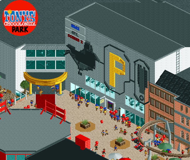
Screenshot / Pathé Tony's Chocolonely Park
-
 15-July 20
-
Tony's Chocolonely Park
-
4 of 4
- Views 3,286
- Fans 0
- Comments 9
Community Forum Software by IP.Board
Attached Thumbnails
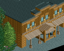
I like the logo, but overlap across the buildings is odd. I'd consider better defining where one ends and the next starts, and they could use some variation to break up that facade from being one giant wall.
Overall, there is a lot of atmosphere and nice details going on here and some of the other screens from this project. I think the main issue is the scale is resulting in huge areas of one blank texture, such as the roofs or facades or some of the path. Efforts to break that up will help I think. For example, you could expand those planters into oval flower beds and help break that up a bit.
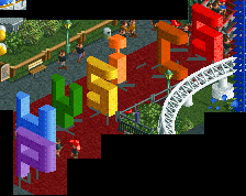
Nice mural! Perhaps a little on the large side but it works. FK makes a great point, which I didn't notice at first, about the way the buildings bleed into eachother.
This is pretty solid, however I'd try to be consistent with your roof textures. I think I could four different colors/objects used in this screenshot alone which is quite distracting. Just a personal preference I'd never use that path object for roofs because it blends with the path, two things you really want to distinguish from each other.
Keep experimenting with textures/objects and detailing, you've got a great start here but its perhaps a little rough around the edges.
I think you've generally done a great job with the mural, I only wish you didn't use so many different textures. The bottom of the cock as well as most of the P is clearly lighter than everything else. There are normally coloured objects out there that you should use instead!
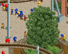
I would definitely make the legs longer first.
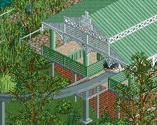
I do appreciate you showing us your reference material. Not many do that.
I've seen guys with the bottom of their cock lighter than the rest, so I think it is fine.
.
Oh wow, this looks great. I actually went to a Pathé for the first time the other day, good job on this!