Screenshot / Interregnum
-
 26-July 20
- Views 1,473
- Fans 0
- Comments 4
-
Description
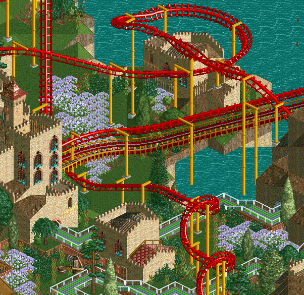
The year is 1410. With the death of the heirless Martin the Elder, the Aragonese crown has no rightful successor. The stability of northern Iberia is at stake: will the regional parliaments agree on a new king, or will blood be spilled in the valleys of Aragon?
-
Full-Size
-
No fans of this screenshot
-
Tags
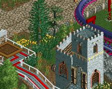
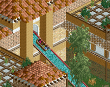
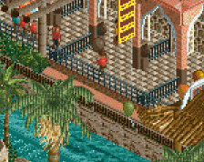
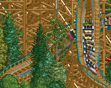
ooh, zesty. I think the catwalk probably doesn't need to be red+yellow; castle and the big flowerpatches are looking good. .
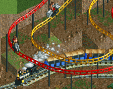
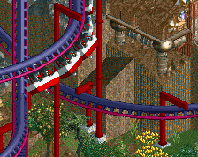
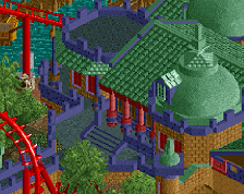
I doubt many others will agree, but to me the coaster colors and the rest of the screen don't go well together, so the screen is lacking in unity. There's many ways you could change it from adding some brighter colors to the foliage or architecture or changing the colors of the coaster. The aesthetics of the archy/landscaping/coaster flow well together though, so no other criticisms from me even if you went the low detail route when you could have used codex.
I don't mind the colours, but there probably is a better fit out there. I think this coaster could benefit from some custom supports on the lifthill - maybe. The easy style you've been doing since The Good Earth is nice but I think this is a case where you need to put more effort into one particular element to make the quality not drop through the bottom.
Loving the swathes of flowers.