also add more colour to the buildings itself, right now they're all one brown murky colour, and if you do that a lot in a park it will look really dark and lose most of it's "feel"
The screen looked really good on the frontpage, and it was still good on this screen. Looks terrible when I view the full version... Finish your screens, or crop better! You're not doing your own work justice like this. It's really not bad at all. 50%
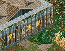
The windows between floors don't line up at all, and the bulky frame on the lower ones bother me a bit. I also think it's over-using the corner poles. The individual roof corner piece before the ride entrance bothers me a bit as well. A few pieces of wall also don't seem to serve a purpose, and I think there's a better way to implement that.
 05-March 14
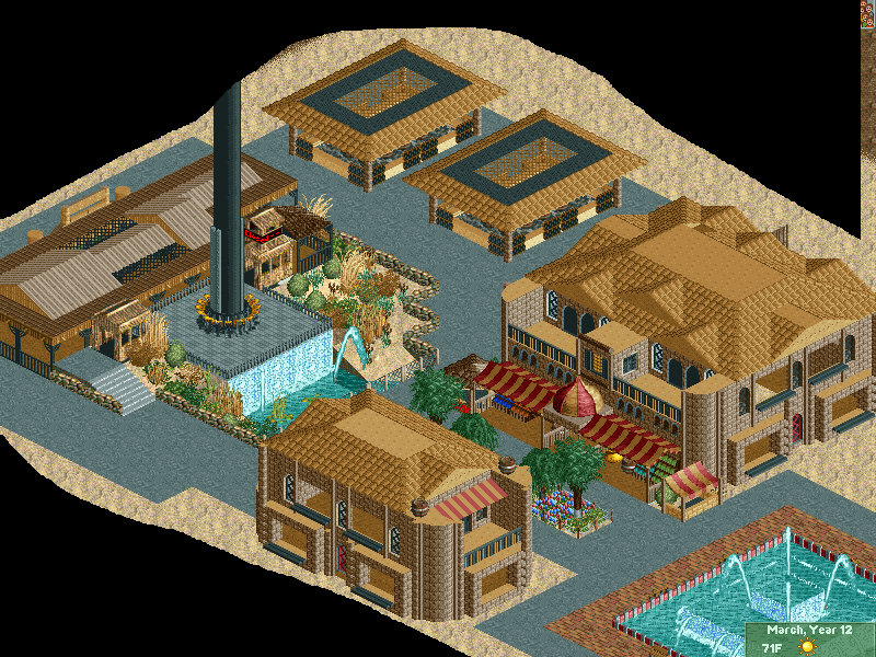
I actually like this. some of the textures could use some cleaning up, and a bit more color could help, but it's kinda nice.
what textures exactly
also add more colour to the buildings itself, right now they're all one brown murky colour, and if you do that a lot in a park it will look really dark and lose most of it's "feel"
The screen looked really good on the frontpage, and it was still good on this screen. Looks terrible when I view the full version... Finish your screens, or crop better! You're not doing your own work justice like this. It's really not bad at all. 50%
The windows between floors don't line up at all, and the bulky frame on the lower ones bother me a bit. I also think it's over-using the corner poles. The individual roof corner piece before the ride entrance bothers me a bit as well. A few pieces of wall also don't seem to serve a purpose, and I think there's a better way to implement that.
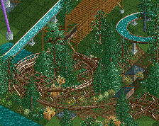
the waterfall under the drop tower is a very nice theming touch.