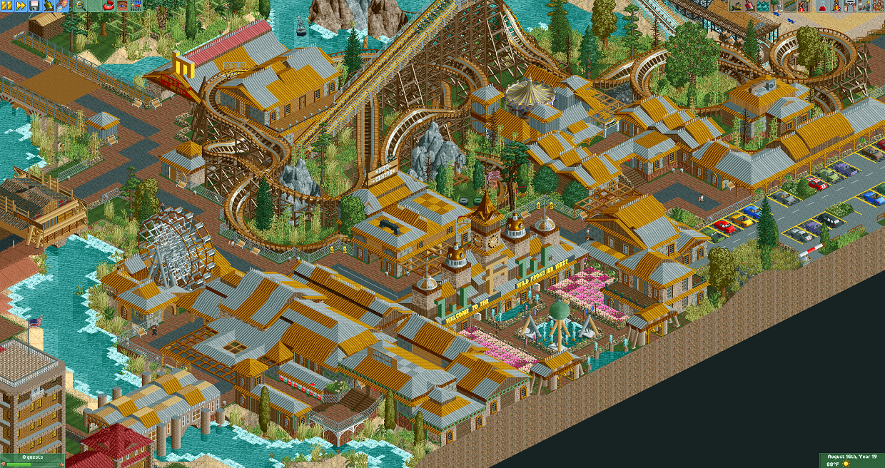
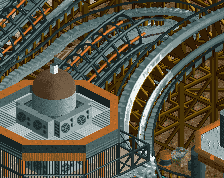
Damn... it's like a fusion of battle boy and BarnNID, which until now, would've been impossible to imagine.
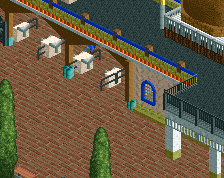
You've definitely got talent; what's missing is the refinement... there's a lot of colors that people here would probably consider ugly, like the gold, grey, and pale yellow. Imo, it almost works though and actually feels refreshing. Keep experimenting.
Damn... it's like a fusion of battle boy and BarnNID, which until now, would've been impossible to imagine.
You've definitely got talent; what's missing is the refinement... there's a lot of colors that people here would probably consider ugly, like the gold, grey, and pale yellow. Imo, it almost works though and actually feels refreshing. Keep experimenting.
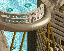
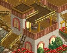
I realized that I needed to put up some more roof trim immediately after posting it. This is a more updated version.
I actually like that big building on the side with the gold and grey rooves. The other smaller buildings look a bit stripey/checkerboardy which takes it down a notch a bit. Maybe just use one roof type/color for smaller buildings and keep the big building to stand out?
Damn... it's like a fusion of battle boy and BarnNID, which until now, would've been impossible to imagine.
Actually reminded me of a less refined mix between Coasterbill and theflowdiskord. Coasterbill because of the checkerboard patterns and theflowdiskord due to the overall building style and busyness.
I agree with Jaguars comments, there are too many ugly colours and I also feel like the screen looks like a sea of stole steel roofs. I also feel like the path is covered a bit too much by the buildings and looks very blocky. You could break up the path by adding in some planters and by overall adding some breathing space. Not a bad start though and it does show potential.
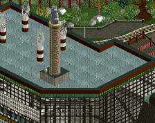
this screen is pretty cool, i've actually really liked the stuff you've posted on this project so far. I agree that parts of this screen look pretty weird though.
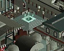
I dont mind the colors of the rooves you used here but i think the end result kinda just blends into itself too much. It looks like everything here is just one building that was copied and pasted on to itself. (other than the entrance area which i think is great). some changes in elevation of the buildings and maybe adding in some diagonal sections would help out with this IMO.
I also think this screen is missing a lot of the small details that really make it pop.
Anyway I do think this screen is cool, I'm only giving the feedback because i think you are showing a lot of talent with this.
Damn... it's like a fusion of battle boy and BarnNID, which until now, would've been impossible to imagine.
I agree that our styles would probably fit well together, it would be cool to build with you at some point
 30-November 20
Damn... it's like a fusion of battle boy and BarnNID, which until now, would've been impossible to imagine.
You've definitely got talent; what's missing is the refinement... there's a lot of colors that people here would probably consider ugly, like the gold, grey, and pale yellow. Imo, it almost works though and actually feels refreshing. Keep experimenting.
I realized that I needed to put up some more roof trim immediately after posting it. This is a more updated version.
Attached Thumbnails
I actually like that big building on the side with the gold and grey rooves. The other smaller buildings look a bit stripey/checkerboardy which takes it down a notch a bit. Maybe just use one roof type/color for smaller buildings and keep the big building to stand out?
Actually reminded me of a less refined mix between Coasterbill and theflowdiskord. Coasterbill because of the checkerboard patterns and theflowdiskord due to the overall building style and busyness.
I agree with Jaguars comments, there are too many ugly colours and I also feel like the screen looks like a sea of stole steel roofs. I also feel like the path is covered a bit too much by the buildings and looks very blocky. You could break up the path by adding in some planters and by overall adding some breathing space. Not a bad start though and it does show potential.
this screen is pretty cool, i've actually really liked the stuff you've posted on this project so far. I agree that parts of this screen look pretty weird though.
I dont mind the colors of the rooves you used here but i think the end result kinda just blends into itself too much. It looks like everything here is just one building that was copied and pasted on to itself. (other than the entrance area which i think is great). some changes in elevation of the buildings and maybe adding in some diagonal sections would help out with this IMO.
I also think this screen is missing a lot of the small details that really make it pop.
Anyway I do think this screen is cool, I'm only giving the feedback because i think you are showing a lot of talent with this.
I agree that our styles would probably fit well together, it would be cool to build with you at some point