man I love this. Agreed about the teal rooves. They'd look awesome if it weren't so close to the water. Can't wait to see this with full peeps and liveliness.
Thanks for the kind words. The teal rooves is a good suggestion which I actually didn't really notice at all. But now that you mention it it does kind of blend in with the water. I will check out some other colours to see if it looks better.
Also sorry about the horrible crop but its my trademark.
Little bit puzzled about the community score. The first vote was 80% and now 4 votes in its at 63%, meaning that the average vote of the last 3 scores was 57%. (Could also have been 1 low vote and 2 high votes). Would like to hear the reasoning behind that, especially since it doesn't really match with the comments so far. If you don't like something atleast give feedback so I can improve it .
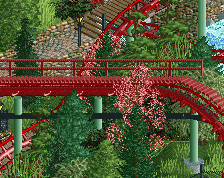
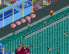
Not a bad screen, coaster at the bottom right looks good especially, even though I'm not a fan of the colours.
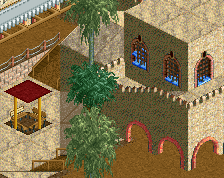
For the rest of it, there's a couple of odd choices from what I can see. First of all, the windows on the left hand side, the grid style, I'm not sure they fit in with the style. I definitely think you can find some other windows that fit in better.
The roof overhangs are also a bit weird; you have trim pieces on the flat bits, but the corners don't have anything. I'd just take the trim pieces off the flat bits, I don't think they're adding much other than making the object count go up.
The landscaping could also do with a bit of cleaning up with that wall type.
Overall, really solid work. Roof work is good (other than the trims), and the entire right side of the screen is top quality. I do feel like it's very rough around the edges though.
When I saw the screen this morning, it had 2 votes and was at 53%. If you say the first vote was 80%, that means 2nd vote must have been 25%. Quite harsh.
Thanks for the kind words. The teal rooves is a good suggestion which I actually didn't really notice at all. But now that you mention it it does kind of blend in with the water. I will check out some other colours to see if it looks better.
Also sorry about the horrible crop but its my trademark.
Little bit puzzled about the community score. The first vote was 80% and now 4 votes in its at 63%, meaning that the average vote of the last 3 scores was 57%. (Could also have been 1 low vote and 2 high votes). Would like to hear the reasoning behind that, especially since it doesn't really match with the comments so far. If you don't like something atleast give feedback so I can improve it .
yikes. That weird score is probably my fault. I accidently voted it a 25% somehow. My B. I do agree with nin as well as the fact that the bottom right section is just very messy.
@trav, thanks for the feedback. The roof trims are a good call and probably a result of me building on autopilot. Will try removing them and maybe even try out some different things to see if I can make it look less odd.
The rock wall is indeed a bit messy in places. Will try to make it look better as well.
@nin
How would you give it more character make it less stale?
It is not just the crop, but also the composition of the screen in general. There is no focal point, and if there is, for me it is a red and white line in the water. Coaster looks good though, as does the building structure.
How would you give it more character make it less stale?
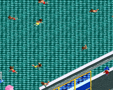
Perhaps a bit of set dressing, like barrels, boxes, etc. Just another layer of "life" to make it feel lived in. Same goes for your level of detail and shapes, everything is so clean-cut that its coming off as sterile. Add some crunch!
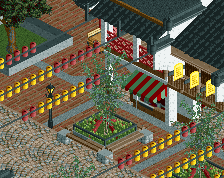
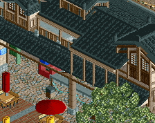
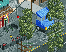
Just a little screen to show I am not dead yet. Working on 3 different parks atm which effectively means I am not making real progress on any of the three :p.
 06-March 21
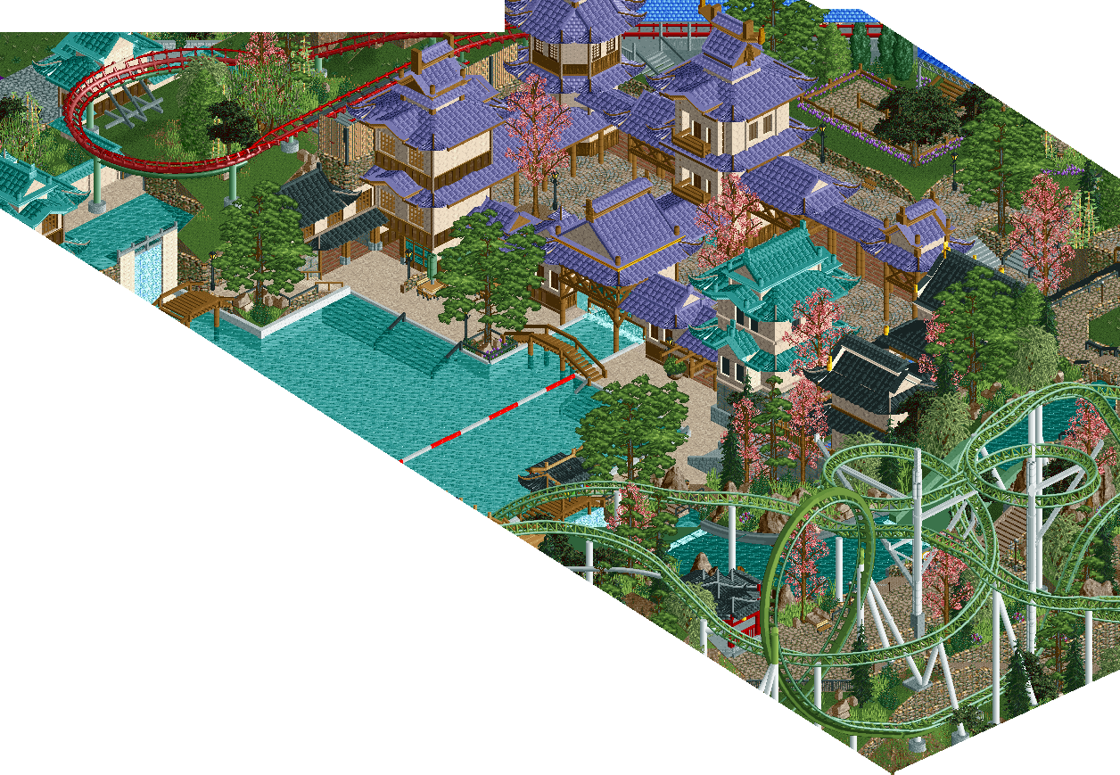
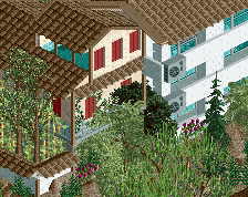
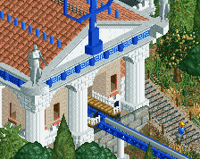
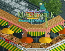
I'd advise against teal roofs in the vicinity of water. The purple roofs are gorgeous. And the screen is gorgeous overall.
man I love this. Agreed about the teal rooves. They'd look awesome if it weren't so close to the water. Can't wait to see this with full peeps and liveliness.
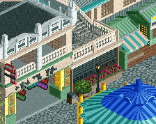
This screen is such a horrible crop, please stop torturing us. The purple, brown and beige combo looks really brilliant here.
Thanks for the kind words. The teal rooves is a good suggestion which I actually didn't really notice at all. But now that you mention it it does kind of blend in with the water. I will check out some other colours to see if it looks better.
Also sorry about the horrible crop but its my trademark.
Little bit puzzled about the community score. The first vote was 80% and now 4 votes in its at 63%, meaning that the average vote of the last 3 scores was 57%. (Could also have been 1 low vote and 2 high votes). Would like to hear the reasoning behind that, especially since it doesn't really match with the comments so far. If you don't like something atleast give feedback so I can improve it .
.
I was wondering why this had troll votes.
Not a bad screen, coaster at the bottom right looks good especially, even though I'm not a fan of the colours.
For the rest of it, there's a couple of odd choices from what I can see. First of all, the windows on the left hand side, the grid style, I'm not sure they fit in with the style. I definitely think you can find some other windows that fit in better.
The roof overhangs are also a bit weird; you have trim pieces on the flat bits, but the corners don't have anything. I'd just take the trim pieces off the flat bits, I don't think they're adding much other than making the object count go up.
The landscaping could also do with a bit of cleaning up with that wall type.
Overall, really solid work. Roof work is good (other than the trims), and the entire right side of the screen is top quality. I do feel like it's very rough around the edges though.
When I saw the screen this morning, it had 2 votes and was at 53%. If you say the first vote was 80%, that means 2nd vote must have been 25%. Quite harsh.
yikes. That weird score is probably my fault. I accidently voted it a 25% somehow. My B. I do agree with nin as well as the fact that the bottom right section is just very messy.
If I can use that phrase - ... very balanced
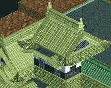
This crop is kind of atrocious and you've got one too many roof colors going on in a small area, but I'm excited to see this a bit more finished.
@trav, thanks for the feedback. The roof trims are a good call and probably a result of me building on autopilot. Will try removing them and maybe even try out some different things to see if I can make it look less odd.
The rock wall is indeed a bit messy in places. Will try to make it look better as well.
@nin
How would you give it more character make it less stale?
@scoop
Same question as for nin.
@battle boy & cc9
Thanks!
There may not really be a focal point or a composition to the screen but a cross section is still attractive and fun in my eyes.
Horrible crop. Great screen. I love a good Cheetah Hunt inspired tower.
Perhaps a bit of set dressing, like barrels, boxes, etc. Just another layer of "life" to make it feel lived in. Same goes for your level of detail and shapes, everything is so clean-cut that its coming off as sterile. Add some crunch!
I really like the lavender coloured rooves