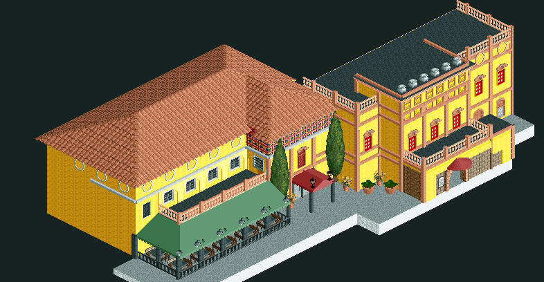
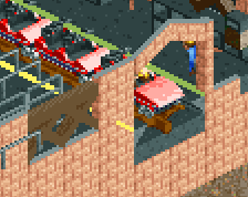
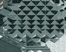
Building on the right could use a bit more texture on the yellow walls to make it more visually interesting and the building on the left could have the roof broken up somehow to make it less monolithic and, again, more visually interesting, but I think you’re on to something here.
I remember this! It's quite good. Have you noticed the inconsistent window colours though? That's something I'd fix. And maybe a way to break up the large tile roof, a small chimney or two on the back side can already do wonders.
As someone who loves italian rct, i mustg say good work. I agree with Liam about the window colors tho and maybe also take a closer look into the path, i think you can do something more interesting than grey here.
Lovely work. The main issues regarding the windows, roof and path have already been adressed, so I'd say to def keep those in mind. Really liking this though; feels sunny and warm
 15-June 21


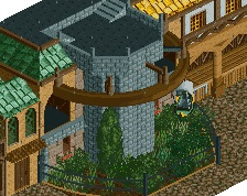
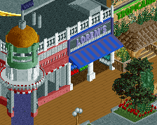
I remember this! It's quite good. Have you noticed the inconsistent window colours though? That's something I'd fix. And maybe a way to break up the large tile roof, a small chimney or two on the back side can already do wonders.
As someone who loves italian rct, i mustg say good work. I agree with Liam about the window colors tho and maybe also take a closer look into the path, i think you can do something more interesting than grey here.
Lovely work. The main issues regarding the windows, roof and path have already been adressed, so I'd say to def keep those in mind. Really liking this though; feels sunny and warm