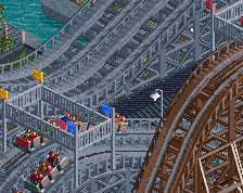
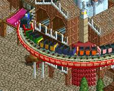
Screenshot / Main Entrance
-
 27-September 21
-
Mahoning Gardens
-
2 of 8
- Views 2,074
- Fans 3
- Comments 12
-
Description
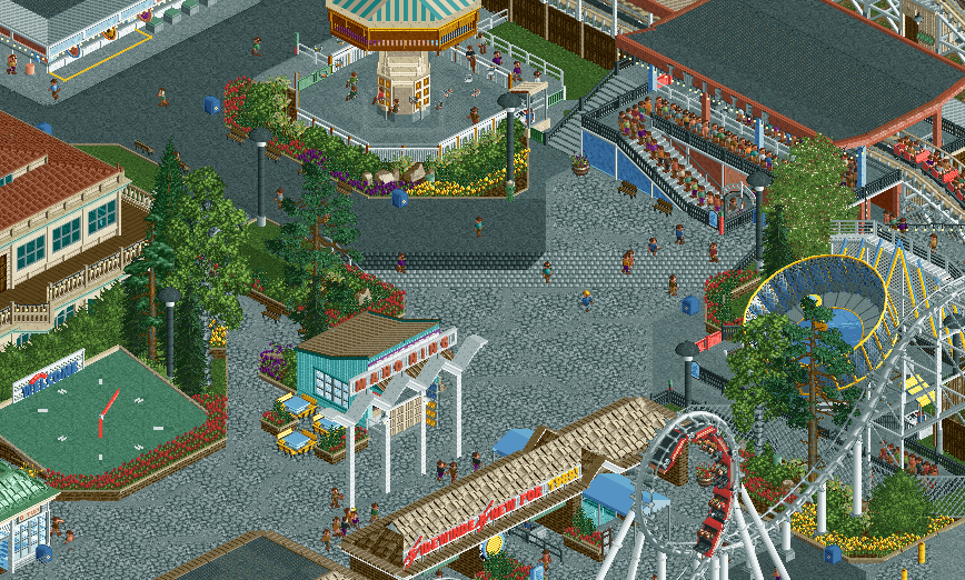
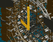
The Main Entrance to Mahoning Gardens, featuring the new for 1989... Sidewinder! In addition, the crown jewel of the park, Mr. Twister is shown, a masterpiece designed by John Allen for the 1966 season, still manages to pull a crowd nearly 25 years later.
-
Full-Size
-
3 fans Fans of this screenshot
-
Tags
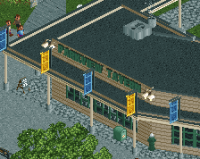
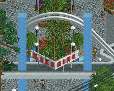
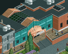
Maybe try some diagonal steps instead of the roof texture?
The clock thing is so sick
Oh yeah that's the good stuff
Not as good as the other screen, but every element in this screen is very good! The clock is great.
Maybe it's the crop, but judging from this screen the area lacks any focal points. There's nothing to draw my attention.
The one thing I dislike is the placement of the 2x2 blue building in the middle, right behind the \/\/\/\/ sign. It aligns in a bad way. Can you swap the building witht he red flower planter behind, detaching the building and the sign?
Love the clock, looks so clean! Also really like the subtle curve in the coaster station roof.
Not a fan of the tile roof steps or the colors. It's an entrance area, could do with more splashes of color.
wonderful
Yeahhhh, I was curious how that would come off, it'll be changed to improve readability.
As for the stairs, I'll test some things out. Like I said in the last screen I'd love a plain textured version of those pieces ideally, to avoid having stairs entirely.
Thanks for the feedback everyone. Keeping me motivated!
Could be the crop also, but I think for me what's missing is some taller trees towards the top of the screen near/around the swinger. Feels a little empty compared to the rest of the area that has some taller foliage flanking almost everything else.
Speaking of everything else, it's great. Glad to see you back at RCT again, dude!
Great screen. I agree with everyone else about the readability of the sign and the shop. I like the vastness of the grey path, but it is really empty right now, while it would be full of peeps in real life. Maybe add some kind of little scene there? An entertainer surrounded by peeps or a small ice cream vendor or promotion stand?
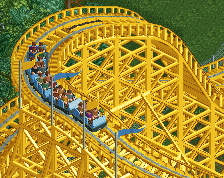
Also not a fan of the Sidewinder being in front of the entrance. Swinger could use some more swings too.