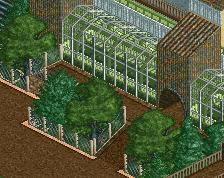
Looks sort of unfinished so far so I can't say much. The telescope, like we saw in the Discord, is nice. It seems much more detailed than the rest is so far but I'm sure that you'll fill it in. Like the Blimp in the right of the upper middle. I'll reserve the rest of my criticism for a more complete screen.
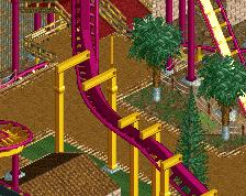
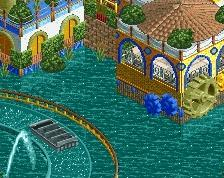
Area could benefit from some tighter colour management. The building on the right feels out of place especially, it's heavy on cold greyscales while the rest of the area is all warm tones. The yellow trim is just confusing. Building shape is weird too because everything else is very thin and vertical.
I like what you're doing as a whole, you're clearly advancing your game here!
Youre getting there, keep going! I agree with Liam its time to think about your colors. reallife rookburgh has a really clear and subtle color scheme going on that is an important reccuring theme for the area. I think this is the biggest room of improvement to discover for you at the moment.
Despite the fairly huge scale this is really charming. Nice work on the airships and telescope. I think adding some more peep-level details would really help. Maybe a small bridge going onto the lower airship so peeps can walk on it?
 21-January 22
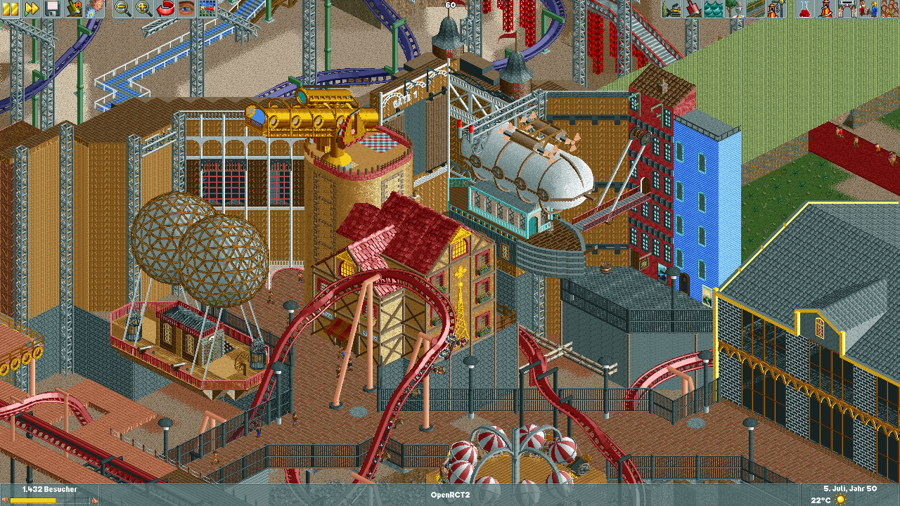
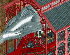
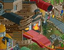
Looks sort of unfinished so far so I can't say much. The telescope, like we saw in the Discord, is nice. It seems much more detailed than the rest is so far but I'm sure that you'll fill it in. Like the Blimp in the right of the upper middle. I'll reserve the rest of my criticism for a more complete screen.
Area could benefit from some tighter colour management. The building on the right feels out of place especially, it's heavy on cold greyscales while the rest of the area is all warm tones. The yellow trim is just confusing. Building shape is weird too because everything else is very thin and vertical.
I like what you're doing as a whole, you're clearly advancing your game here!
woah! Great work brother! Keep up the improvement!
...I will try my best
Youre getting there, keep going! I agree with Liam its time to think about your colors. reallife rookburgh has a really clear and subtle color scheme going on that is an important reccuring theme for the area. I think this is the biggest room of improvement to discover for you at the moment.
Despite the fairly huge scale this is really charming. Nice work on the airships and telescope. I think adding some more peep-level details would really help. Maybe a small bridge going onto the lower airship so peeps can walk on it?