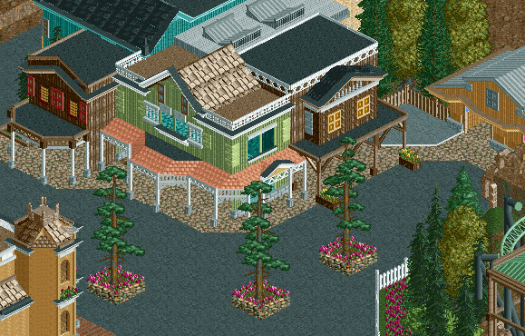
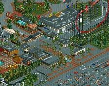
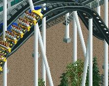
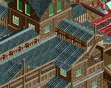
I think that support on the right side of the screen is floating in mid air (though I know you said it was unfinished). Other than that this is outstanding.
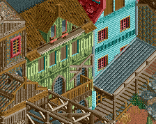
The green building in the center is gorgeous, love that roof detailing.
I'm iffy on the window facade of the brown building on the right, seems a little boxy in comparison to the other buildings.
Also, the scale of the main building cluster makes the light brown building on the right (bathrooms?) look off by comparison. I would just increase the height of that building, or at least make the door higher.
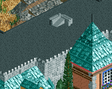
You can hide those little blue dashes in the pirate roofing by coloring the entire block black (instead of black and blue). Just keep the outermost blocks their current color since the sides are exposed.
Otherwise, this is really good. I like all of the different textures you're using. Nice stuff.
Thank you all for the kind words, certainly makes it feel nice to be back to building
Thanks nin for the roof tip.
Fk, the building is indeed a bathroom, and when I went back to adjust the height, I realized I've accidentally created and optical illusion where the building appears shorter than it is. The crown moulding is a half tile out over the path, so there is an extra base block that then hangs over the path partially blocking the facade of the building and making it appear shorter. I went back and tried to make this less apparent but I actually like having the illusion there, kind of a cool little thing that only looks weird because of the games isometric view.
I'll post an updated, bigger, screen when I get it in a more finished state. Also, I'm not sure whether this will be a park or design yet, time will tell I guess.
Very nice work with the green building and the peach roofs on the awning. Everything else looks great too, and I don't think anything looks too boxy. If anything, I'd say it fits in with the limitations of wooden walls. Good stuff!
I can't blame you for keeping visual illusions. My Swoon Followup is all about disillusioning space, so i get it, thought for oddly different reasons, lol.
 31-March 14
I can smell the moonshine
MAVERIX IS BACK <3
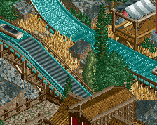
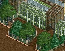
a really nice woodland feel without having that many trees, the building on the left feels like it could use more details though
I think that support on the right side of the screen is floating in mid air (though I know you said it was unfinished). Other than that this is outstanding.
The atmosphere is wonderful.
The green building in the center is gorgeous, love that roof detailing.
I'm iffy on the window facade of the brown building on the right, seems a little boxy in comparison to the other buildings.
Also, the scale of the main building cluster makes the light brown building on the right (bathrooms?) look off by comparison. I would just increase the height of that building, or at least make the door higher.
You can hide those little blue dashes in the pirate roofing by coloring the entire block black (instead of black and blue). Just keep the outermost blocks their current color since the sides are exposed.
Otherwise, this is really good. I like all of the different textures you're using. Nice stuff.
oooh, good tip nin
I love the way the awnings look. The flower colors in those planters... not so much.
Thank you all for the kind words, certainly makes it feel nice to be back to building
Thanks nin for the roof tip.
Fk, the building is indeed a bathroom, and when I went back to adjust the height, I realized I've accidentally created and optical illusion where the building appears shorter than it is. The crown moulding is a half tile out over the path, so there is an extra base block that then hangs over the path partially blocking the facade of the building and making it appear shorter. I went back and tried to make this less apparent but I actually like having the illusion there, kind of a cool little thing that only looks weird because of the games isometric view.
I'll post an updated, bigger, screen when I get it in a more finished state. Also, I'm not sure whether this will be a park or design yet, time will tell I guess.
Very nice work with the green building and the peach roofs on the awning. Everything else looks great too, and I don't think anything looks too boxy. If anything, I'd say it fits in with the limitations of wooden walls. Good stuff!
I can't blame you for keeping visual illusions. My Swoon Followup is all about disillusioning space, so i get it, thought for oddly different reasons, lol.
You too coastermind!!!!!
Really nice Wild West facades. Not an easy thing to do.
I want to mate with that orange wall bit
^Is there a comment of the year award? Because that just won it.
i don't know, do we really want rastafari orange stone orangutangs?