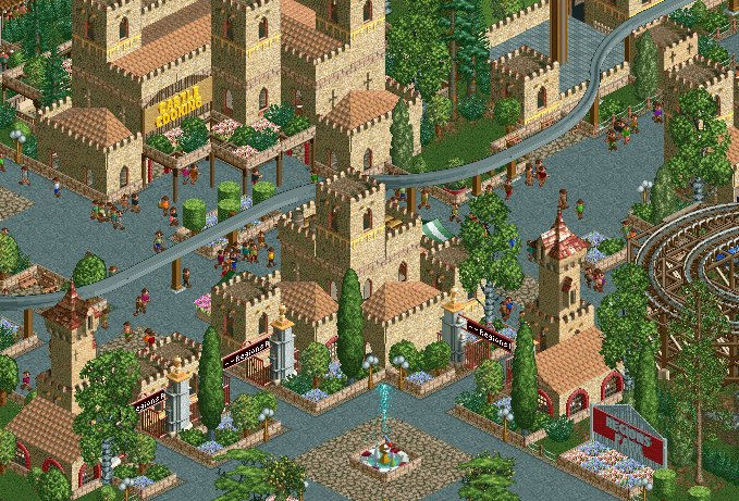
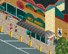
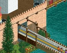
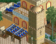
Pleasant entrance, but the park sign is horrible in its blandness and dissonance. Monorail also looks like an afterthought rather than something deliberate and part of the design.
Pleasant entrance, but the park sign is horrible in its blandness and dissonance. Monorail also looks like an afterthought rather than something deliberate and part of the design.
Looking forward to seeing more.
Elaborating on the sign, having two signs split across both visible sides of the turret between the entrance gates spelling "REGIONS PARK" would have been a more dramatic way to welcome guests than the smaller and less integrated sign shoved off to the side. Also take the peep's-eye view into mind for moments like this; try to visualize looking up at my sign idea from the path and seeing if the fountain or the Steve Tree would obscure it.
 28-February 22
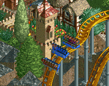
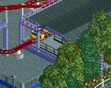
Can never go wrong with style of aesthetic in the game, and you've done a nice job with it here.
Pleasant entrance, but the park sign is horrible in its blandness and dissonance. Monorail also looks like an afterthought rather than something deliberate and part of the design.
Looking forward to seeing more.
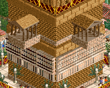
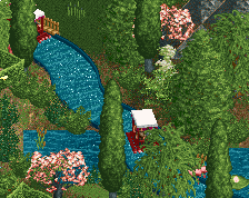
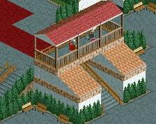
This was my fav part of the entry! Gorge and cute.
Elaborating on the sign, having two signs split across both visible sides of the turret between the entrance gates spelling "REGIONS PARK" would have been a more dramatic way to welcome guests than the smaller and less integrated sign shoved off to the side. Also take the peep's-eye view into mind for moments like this; try to visualize looking up at my sign idea from the path and seeing if the fountain or the Steve Tree would obscure it.