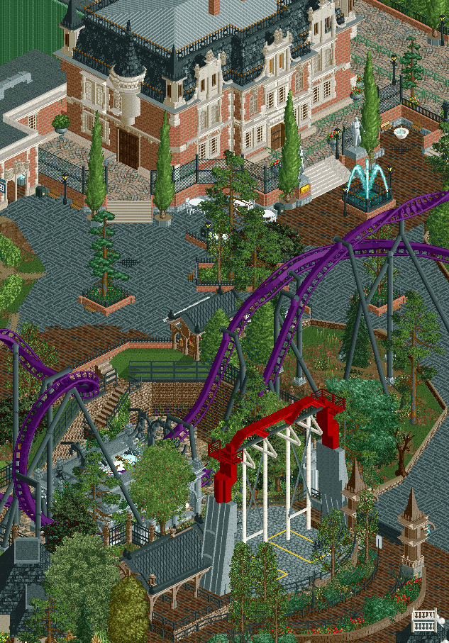
Okay wow that looks great. A bit as though your realism is taking the next step. Very exciting. I love the saturated colours, the macro pit, the (more) soulful cleanliness.
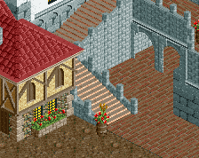
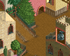
Not liking the chain link fence around the manor. I’d assume there’s a more ornate fence you could try! Looks like a temporary construction fence to me. Everything else is superb
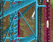
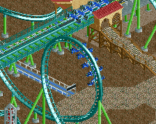
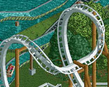
I love the large space you've designed here! I think you can make it a bit tighter stylistically, your object choices (regarding shapes, textures and colours) is a tad too random for me at the moment. Not even going to count the number of fence types. That's nit picking, a real problem is the lack of clearances around the custom flat. No way that's going to operate without hitting buildings and/or trees...
 20-April 22
Okay wow that looks great. A bit as though your realism is taking the next step. Very exciting. I love the saturated colours, the macro pit, the (more) soulful cleanliness.
Super nice. I would try some darker colours for the Manor - at the moment it's a bit too bright compared with everything else.
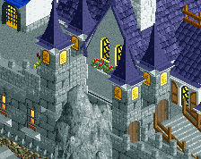
Love the manor. Love the composition. This is amazing work.
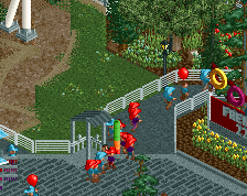
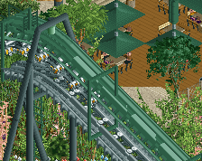
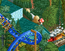
great castle big interaction with the swing and nice themed area
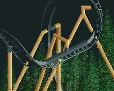
Glad to see some rarely used textures and scenery objects.
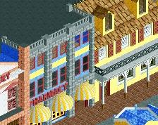
The architecture is great as always.
Very nice work. Looks nice.
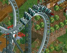
Although, i'm not sure about the grey brick pathing. Feels a bit unnatural to me. But that could just be me.
I also echo Ottersalad. The fence is insulting to the manor. It takes away it's beauty.
I love the large space you've designed here! I think you can make it a bit tighter stylistically, your object choices (regarding shapes, textures and colours) is a tad too random for me at the moment. Not even going to count the number of fence types. That's nit picking, a real problem is the lack of clearances around the custom flat. No way that's going to operate without hitting buildings and/or trees...