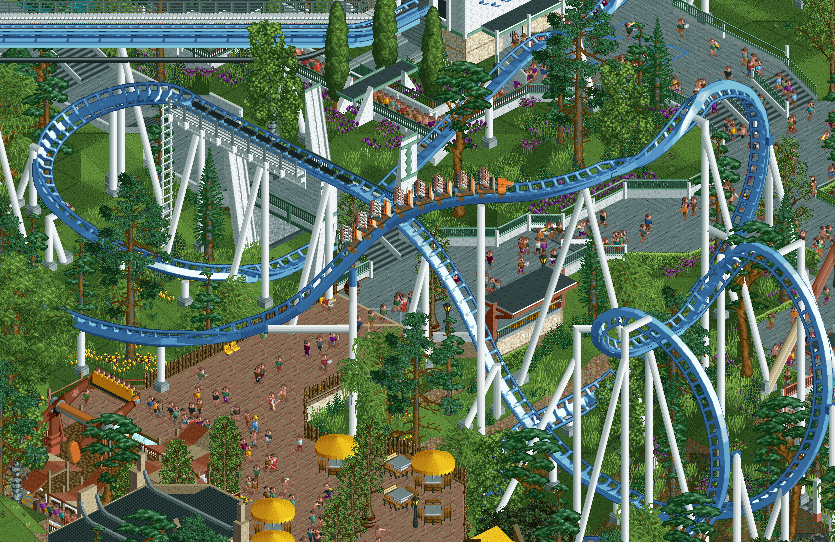
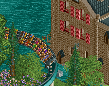
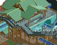
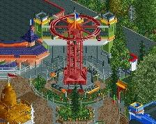
Yeah this is one of your best screens. Not sure about the support over the path though, doesn't seems structurally sound or believable. Some of the ride detailings come through better here which I do like and it certainly elevates your whole style.
At this point your landscaping/foliage is probably the weakest aspect of your building, just a bit simplistic, but thats very minor compared to everything else which I like a lot.
Really nice screen you got here. Coaster colors are great, plenty of atmosphere here. Kudos for not using new diagonals or weird dimensions. I don't like those.
I do agree with G Force you need to adjust the hanging support over the path. That would not work irl.
There's something about how you can build realism, yet it still maintains it's Faasness. Lovely screen, looking forward to seeing more from this project.
Quite decent. I like the overall pastel colour scheme, and the adventurous verticality which seems intentional. Well done on that. I also quite like the sparse foliage, although it looks as though more love would've been possible for it. I don't like the track going over the path like that. It looks somewhat accidental, and you'd think a diagonal path moving straight forward would maybe have been a more fortunate choice. But diagonal paths have their own annoyance to them, so I understand.
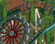
And it's curious that after more than 20 years people would still use rapids lifts as stairs. Is that the actual ride like in LL or just it turned into an object?
Quite decent. I like the overall pastel colour scheme, and the adventurous verticality which seems intentional. Well done on that. I also quite like the sparse foliage, although it looks as though more love would've been possible for it. I don't like the track going over the path like that. It looks somewhat accidental, and you'd think a diagonal path moving straight forward would maybe have been a more fortunate choice. But diagonal paths have their own annoyance to them, so I understand.
And it's curious that after more than 20 years people would still use rapids lifts as stairs. Is that the actual ride like in LL or just it turned into an object?
It's a ride, definitely easier to work with now in open with tile inspector, but it's an odd carryover from the past I guess. Does look nice though, especially here all dressed up.
Agree on the crossover for sure, also seems a bit awkward they'd go all out to build that weird support over the path but then just put another one down on it anyways.
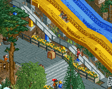
this is great, it feels like a more refined and matured version of your style.
i agree about the comments on that one support, i think it would be fine just putting a regular one in the middle of the path. other than that there is not much to fault here i think, if i were you i'd probably also add some more mud/grassy mud texture under some of the foilage instead of having the grass everywhere.
I don't mind that one support. The real world is quite often more bizarre than you would imagine in that regard and I therefore think it's plausible a park would do something like that.
Overall I like the colour and object choices in this. Like BSG said, it feels like you're modernising and updating your style, but still keep that typical Faas-touch that makes your work so recognisable and loved by many.
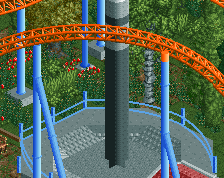
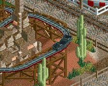
My advice is that there feels like there is a little fence anarchy but at the same time, it doesn't? It's a weird balance with the little area change at the bottom left -- does there really need to be an area swap there? If anything I rather see you introduce splashes of brick throughout the whole area with tarmac rather than separate the two. I think that would up the consistency and make for an overall cohesive area for the coaster.
In the spirit of fences, maybe push some spots back away from the path. I get you need them for protecting guests from the coaster, but having them a tile away from the path with some mulch/gardens/planters could boost the atmosphere and allow more chances for interesting foliage clusters.
Overall, good stuff, maybe your best! Looking forward to this one on the parks page.
 07-June 22
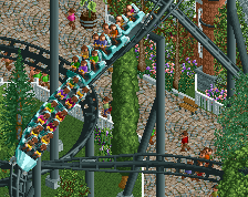
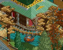
I love this.
A nice atmospheric Faas screen. You always pull it of.
Yeah this is one of your best screens. Not sure about the support over the path though, doesn't seems structurally sound or believable. Some of the ride detailings come through better here which I do like and it certainly elevates your whole style.
At this point your landscaping/foliage is probably the weakest aspect of your building, just a bit simplistic, but thats very minor compared to everything else which I like a lot.
Really nice screen you got here. Coaster colors are great, plenty of atmosphere here. Kudos for not using new diagonals or weird dimensions. I don't like those.
I do agree with G Force you need to adjust the hanging support over the path. That would not work irl.
There's something about how you can build realism, yet it still maintains it's Faasness. Lovely screen, looking forward to seeing more from this project.
It's a ride, definitely easier to work with now in open with tile inspector, but it's an odd carryover from the past I guess. Does look nice though, especially here all dressed up.
Agree on the crossover for sure, also seems a bit awkward they'd go all out to build that weird support over the path but then just put another one down on it anyways.
easily one of the rct players of our time
The RCT player ever
this is great, it feels like a more refined and matured version of your style.
i agree about the comments on that one support, i think it would be fine just putting a regular one in the middle of the path. other than that there is not much to fault here i think, if i were you i'd probably also add some more mud/grassy mud texture under some of the foilage instead of having the grass everywhere.
I don't mind that one support. The real world is quite often more bizarre than you would imagine in that regard and I therefore think it's plausible a park would do something like that.
Overall I like the colour and object choices in this. Like BSG said, it feels like you're modernising and updating your style, but still keep that typical Faas-touch that makes your work so recognisable and loved by many.
I do agree with Leon!
My advice is that there feels like there is a little fence anarchy but at the same time, it doesn't? It's a weird balance with the little area change at the bottom left -- does there really need to be an area swap there? If anything I rather see you introduce splashes of brick throughout the whole area with tarmac rather than separate the two. I think that would up the consistency and make for an overall cohesive area for the coaster.
In the spirit of fences, maybe push some spots back away from the path. I get you need them for protecting guests from the coaster, but having them a tile away from the path with some mulch/gardens/planters could boost the atmosphere and allow more chances for interesting foliage clusters.
Overall, good stuff, maybe your best! Looking forward to this one on the parks page.
great
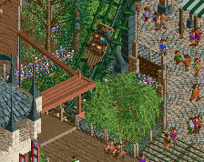
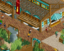
Layout is all tucked in there very nicely, like somebody planned it that way