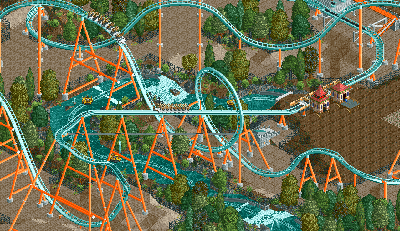
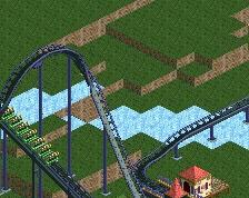
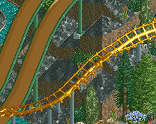
O_o yeah that first drop is pretty bad imo; colours are lovely though. There's no need to travel 270 degrees when 90 would do fine, also that loop seems unnecessarily awkward but perhaps you have a reason for that.
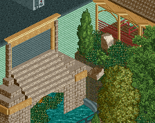
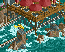
This is really nice. I don't love the little fence piece at the bottom of the waterfall though, it would probably be on an angle to help guide the rafts... right now if a raft was too far to the right it would go down the waterfall, pick up steam and slam head on into a barrier... then probably get stuck there.
That's a minor critique though... other than that this looks awesome.
If you're planning on using the crooked house hack to make that ride track invisible i'd re-work the layout to avoid diagonals.
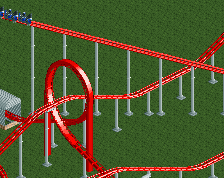
I agree with what everyone has said about the first drop. Look at drops like on Superman Krypton or Alpengeist. Same type of drop but really try to match the way it flows around and down. This is the perfect spot to use that downward banked turn IMO.
i don't know how you made such an unusual drop look good, it's really awesome, especially the interactions with the waterride. but i wouldn't keep the ground underneath it as sand though. the area around it is very lush and all, but then suddenly there's nothing
Yeah, I'm not quite sure what you're planning on doing with that rapids ride. It seems odd to just leave it like that, but there's really not a hack that would work with what you've got now.
i'd personally bank the drop for aesthetic purposes, but it's rather nice now. i also like your attention to coaster interaction which as it seems beings some much-needed life into the screen.
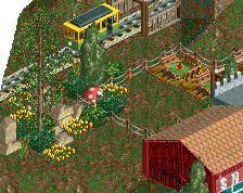
i don't think all of the trees need to be fenced off like that, and i'd work on smoothing out the landscape (e.g. sand, "wet" sand made with roof tiles, dirt, etc.)
i don't like the supporting much either, especially the beams connecting all of the supports together. it looks bad
I really like the colors too. Maybe not the white train (as I think it's too similar to the track), but the track is a nice alternate to the normal Kraken scheme.
That first drop does look unusual, but I definitely think it works. I like the classic interaction of coaster over rapids (reminds me of Drayton manor) and I think the surrounding foliage is nice. I'm interested to see what you'll do with the station.
Tried some new custom scenery I havn't worked with yet and also tried to do some 'good' coaster interaction. The open area at the station will be some kind of plaza.
 10-April 14
Looks pretty cool! Excited to see how this will turn out.
Lovely colours.
O_o yeah that first drop is pretty bad imo; colours are lovely though. There's no need to travel 270 degrees when 90 would do fine, also that loop seems unnecessarily awkward but perhaps you have a reason for that.
Rapids ride looks promising
I like the drop. It's something different for once.
I also like the drop, and as the king of flow, my opinion is the only one that counts
The only thing I would fix with that drop is have the steep turn higher up so it comes straight after the unbanked small turn.
I also assume you are going for realism, but not necessarily a specific manufacturer, which is nice to see.
This is really nice. I don't love the little fence piece at the bottom of the waterfall though, it would probably be on an angle to help guide the rafts... right now if a raft was too far to the right it would go down the waterfall, pick up steam and slam head on into a barrier... then probably get stuck there.
That's a minor critique though... other than that this looks awesome.
If you're planning on using the crooked house hack to make that ride track invisible i'd re-work the layout to avoid diagonals.
I agree with what everyone has said about the first drop. Look at drops like on Superman Krypton or Alpengeist. Same type of drop but really try to match the way it flows around and down. This is the perfect spot to use that downward banked turn IMO.
i don't know how you made such an unusual drop look good, it's really awesome, especially the interactions with the waterride. but i wouldn't keep the ground underneath it as sand though. the area around it is very lush and all, but then suddenly there's nothing
Yeah, I'm not quite sure what you're planning on doing with that rapids ride. It seems odd to just leave it like that, but there's really not a hack that would work with what you've got now.
I agree with Faas and Louis about the drop.
i don't think all of the trees need to be fenced off like that, and i'd work on smoothing out the landscape (e.g. sand, "wet" sand made with roof tiles, dirt, etc.)
i don't like the supporting much either, especially the beams connecting all of the supports together. it looks bad
I really like the colors too. Maybe not the white train (as I think it's too similar to the track), but the track is a nice alternate to the normal Kraken scheme.
That first drop does look unusual, but I definitely think it works. I like the classic interaction of coaster over rapids (reminds me of Drayton manor) and I think the surrounding foliage is nice. I'm interested to see what you'll do with the station.
I kind of like the supporting. They're unconventially laid out and unconventially colored, but it doesn't look bad.
Really reminds me of Cannibal from Zippo's Wacky World of Wonders. Which is of course a good thing.