Screenshot / The Lonely Planet – Skydive!
-
 11-November 22
-
The Lonely Planet
-
4 of 10
- Views 1,192
- Fans 1
- Comments 8
-
Description
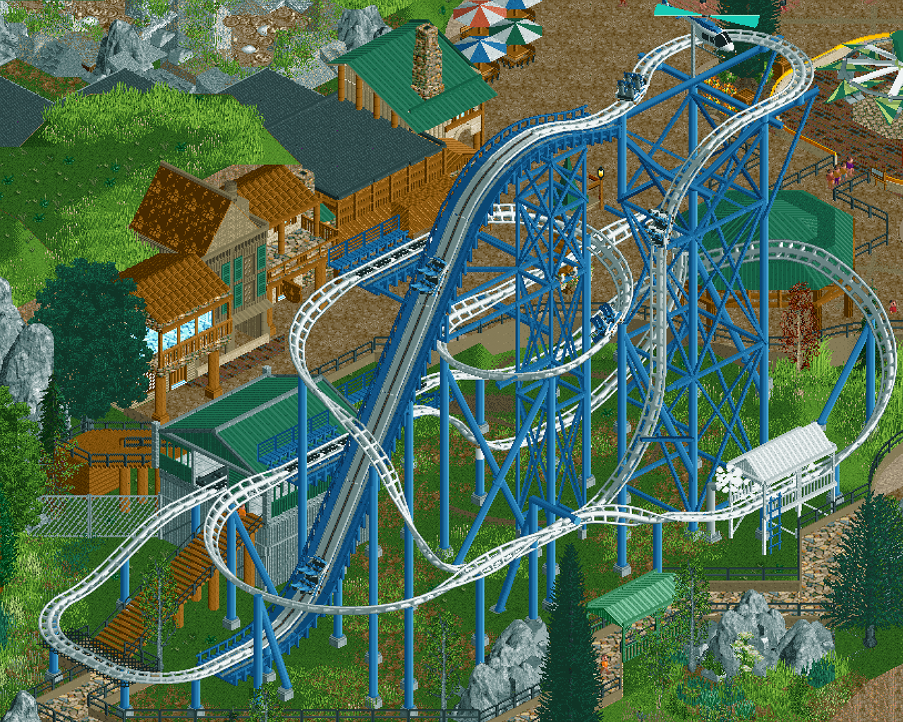
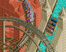
Skydiving in New Zealand should be at the top of everyone's adventure bucket list. From the Bay of Islands and Taupo to Abel Tasman, Queenstown and everywhere in between, there's always a drop zone nearby! Here at the Lonely Planet, we love it that much, we've captured that experience in a ride!
-
Full-Size
-
1 fan Fans of this screenshot
-
Tags


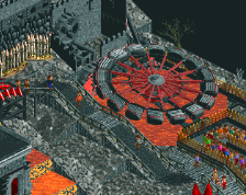
Great use of the new elements! I like the deviations chosen from the real life model. I'd love to see some more integrated rock work/theming going around the coaster rather than it being in a field. Still great progress though!
Horrible zoom level
But nice content, I especially like the color scheme. Good to see you active again J K
Thanks Six Frags, I really don't know how to make the screens any better? I think it needs Zoomed cropped by default right?
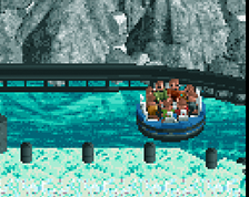
Wow! That coaster really pops. Nice design.
Love it. So clean.
What's going on with the ghosted-ish little platform on the right?
I look forward to seeing more of the "naturalisticness" of the theme, as that's its main selling point I think.
Thanks Posix
It's a ride themed to skydiving so we've got a mist section at the very end so the riders are diving through the clouds.
The signposting could be a lot clearer for sure!
I think for the screen zoom quality you set the scaling factor in options to 1.0?
Looking at this on a phone, the brown roof on the building behind the coaster looks too close in color with the path.