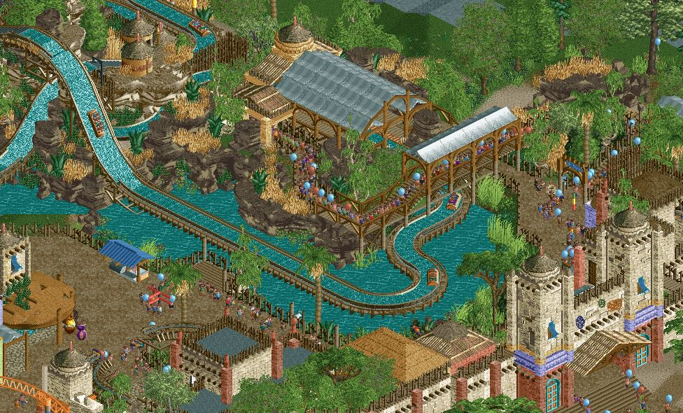
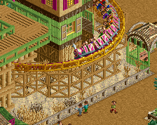
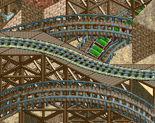
Wish there was a way to hide or do something more custom to the standard supports on the upper drop. But I love how those interact together. This is beautiful.
This is really nice, yeah. Rockwork and foliage is top notch. Because I like it, here comes the monthly "Steve Nitpicks Someone's Screen:"
I think there's a dissonance with old versus new objects here. You're like halfway between an old and new meta. Commit to one.
Rather than use the Toon canvas roofs for the station, use the Fisherman awnings, for example. Rather than a tarmac flat roof, use the black-colored SF path texture. Instead of the Toon thatch roof *and* the other CSO thatch roof, drop the Toon one and use the other one more and in consistent color schemes.
Speaking of color schemes, I think making the tan structure at the back of the station beige to match the huge gates would make your dead grass pop more.
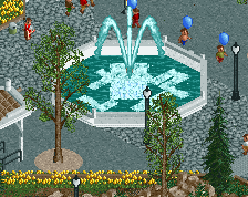
And lastly, why hide your underwater stuff? I think a brightly colored land texture under the pond here with foliage and rocks and everything would add some more welcome depth and detail.
Second Steve's comment on the water stuff, more details like that would help this. This feels a bit more "big picture" which I do like, gives the ride more of a unique identity.
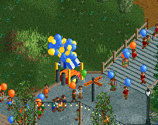
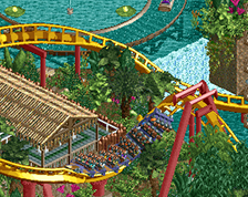
It's not often I would consider balloons to be an integral component to a screen but the way they are partially obscured and curve behind the foliage really adds some nice depth to the screen. I like how you've got a second color as well, although the rust colored ones are a little dull. A red, yellow or white would look nice and vibrant like the blue.
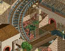
The whole queue area is nice, with the track snaking under the bridge and it looks very natural with the rock work. The waterline is great. I didn't even notice the opacity of the water until it was brought up (LL); is that an object or do you just have opaque water manually turned on? I personally like the look as I'm used to it but it would be an opportunity to add even more detail.
I agree with the wood supports at the top of the drops, where the merge is, needing a little clean up. But I like it at the base of the drop. I like the blending of old a new techniques and you've used a lot of objects well to add a needed splash of color here and there. I'm not 100% on the egyptian blocks, especially like at the base of the drop where the two are rotated the same way. Overall this is an awesome screen. Great job.
 12-February 23
Wish there was a way to hide or do something more custom to the standard supports on the upper drop. But I love how those interact together. This is beautiful.
super nice! i really dig the rockwork, looks so organic.
Very nice Jappy. Almost has a disney vibe because it's so themed.
I love it, great atmosphere, Great texture on the wall. Feels very animal kingdom, like the Tuscan house is just off screen around the corner
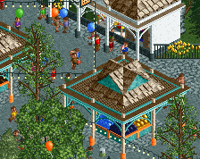
Really nice work, Jappy. The level of theming is great. Just missing some final polishing to push this to the next level.
This is really nice, yeah. Rockwork and foliage is top notch. Because I like it, here comes the monthly "Steve Nitpicks Someone's Screen:"
I think there's a dissonance with old versus new objects here. You're like halfway between an old and new meta. Commit to one.
Rather than use the Toon canvas roofs for the station, use the Fisherman awnings, for example. Rather than a tarmac flat roof, use the black-colored SF path texture. Instead of the Toon thatch roof *and* the other CSO thatch roof, drop the Toon one and use the other one more and in consistent color schemes.
Speaking of color schemes, I think making the tan structure at the back of the station beige to match the huge gates would make your dead grass pop more.
And lastly, why hide your underwater stuff? I think a brightly colored land texture under the pond here with foliage and rocks and everything would add some more welcome depth and detail.
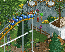
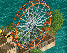
Big fan of this. That double drop is also really nice. Theme is top notch!!!
It's not often I would consider balloons to be an integral component to a screen but the way they are partially obscured and curve behind the foliage really adds some nice depth to the screen. I like how you've got a second color as well, although the rust colored ones are a little dull. A red, yellow or white would look nice and vibrant like the blue.
The whole queue area is nice, with the track snaking under the bridge and it looks very natural with the rock work. The waterline is great. I didn't even notice the opacity of the water until it was brought up (LL); is that an object or do you just have opaque water manually turned on? I personally like the look as I'm used to it but it would be an opportunity to add even more detail.
I agree with the wood supports at the top of the drops, where the merge is, needing a little clean up. But I like it at the base of the drop. I like the blending of old a new techniques and you've used a lot of objects well to add a needed splash of color here and there. I'm not 100% on the egyptian blocks, especially like at the base of the drop where the two are rotated the same way. Overall this is an awesome screen. Great job.
really nice short logflume you need to install my new boats i released on the side of NE in my Tab that looks better than the old one
busch garden vibes