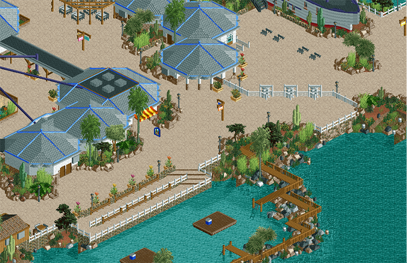
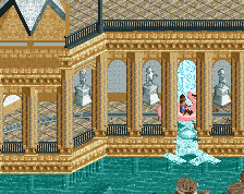
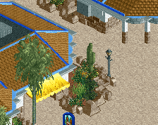
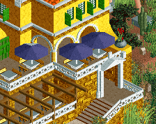
Screenshot / Updated Seaquarium Entrance
-
 02-May 14
-
Seaquarium Curaçao
-
2 of 17
- Views 2,285
- Fans 1
- Comments 10
-
Description
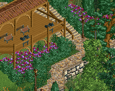
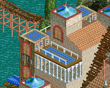
The Seaquarium entrance area, as shown last year, updated and wider screen crop. Obviously a little rough around the edges, no screen is finished until the park is finished.
edit: I'll add a reference pic this time... I won't change the angular shape of the buildings or the blue trims or anything like that. That's a part of the semi-recreation here. http://www.villapaulina.nl/media/dolphinacademy5.jpg?id=13f1530f601e748&width=800&height=600&method=max -
Full-Size
-
1 fan Fans of this screenshot
-
Tags
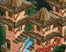
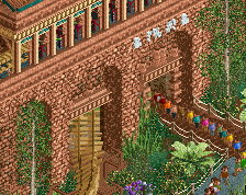
The grey roof makes it seem a lot more generic and realistic. If you're going for the slightly hotter feel, maybe try a light brown wooden or thatch roof?
Rest looks good of course, although I think the path is a bit overpowering as it's so bright.
The new color of the roofs is much better, and it has it effect on the surrounding too. I like this, it has a nice atmosphere.
85%
Still very nice Liam.
Perhaps a bit too systematic and rule-based.
So many wonderful little details here and there, but i'm still not liking those roofs. Compared to the textures and details of the rest of the screen, they are really one-dimensional, and i'm not a fan of the blue edging. I would look at other forms for the roofs.
FK
I prefered the brown roofs.
Since Liam's link is un-clickable and virtually un-selectable:
http://www.villapaul...=600&method=max
This is a great improvement. It feels a lot better now.
Looks alright. I think you can do better still.