-The blue diagonal parking bays seem a bit too wide.
-The fountain is lovely, but the trees surrounding are too close IMO, there isn't enough path space between them.
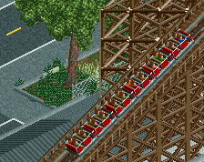
-Try and vary the land texture under the coaster a little bit. Use some darker sand (roof texture coloured brown) and perhaps some dirt or red sand too.
 05-June 14
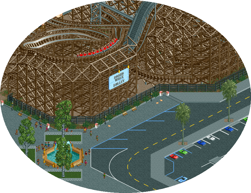
It's looking really good
Couple of suggestions:
-The blue diagonal parking bays seem a bit too wide.
-The fountain is lovely, but the trees surrounding are too close IMO, there isn't enough path space between them.
-Try and vary the land texture under the coaster a little bit. Use some darker sand (roof texture coloured brown) and perhaps some dirt or red sand too.
Great stuff though.
^This, especially the second point.
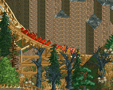
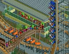
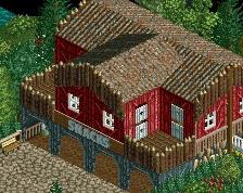
I really like that slight change in elevation using the 1/8 tile wooden plank, and the sign is a nice colour contrast.
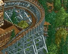
This looks much better! The area has now come to life a little.
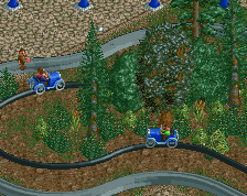
That's an imorovement!
- I would delete the tree above the fountain and move the fontain a bit up higher so the path won't be so narrow.
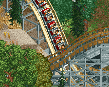
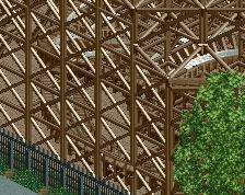
I love that roof over the drop.