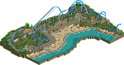
Park / Crystal Beach

Park_1351 Crystal Beach

24 Comments

  • turbin3%s's Photo
    Hey,
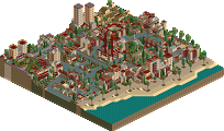
    here's my latest failed desig, called "Crystal Beach".
    Its score was 11,75.

    Overview:
    Posted Image


    Download:
    Attached File  Crystal_Beach.zip (416.89KB)
    downloads: 240

    Comments are welcome,
    Yannik.
  • trav%s's Photo
    I thought this was design worthy, especially compared to some of the more recent ones.
  • Maverick%s's Photo
    This looks strikingly similar to my NoLimits coaster "Rising Sun" with two exceptions.

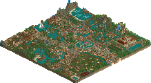
    1. My helix went left
    2. My 2nd half is shorter

    With that said, this seems to be pretty solid. Although it feels like it has two endings; the turnaround by the entrance, and the dive under the station. I would have used one or the other, not both.
  • turbin3%s's Photo
    Sorry, I don't know this coaster. I neither play No Limits nor do I watch onride-videos.
  • SSSammy%s's Photo
    it felt like you'd taken a huge step back. there was no atmosphere and it just looked like a coaster in a place. nothing pulled me in. there was no immersion.
  • JoeZia%s's Photo
    this one is actually pretty cool. I always loved beachy themes. However there is already a bunch of that here.

    Cool colors = I like.
    Detail= nice, could be better.
    Scenery = Neatly done.
    Building = you could use some more

    perhaps another noncoaster ride?

    Overall, I agree with sam.
  • ACEfanatic02%s's Photo

    it felt like you'd taken a huge step back. there was no atmosphere and it just looked like a coaster in a place. nothing pulled me in. there was no immersion.

    I agree. It seems more like an area themed to a beach rather than an actual beach. (But with no evidence of a surrounding area.)

    That said, I don't think that's the important part of a design.


    What you have here is a very solid layout. But that's all it is; solid. As part of a larger park it would work well, but a design needs to bring something new and fresh to the table. Not necessarily new elements or sequences (though I do give you props for the butterfly turnaround, nicely done) but interaction with scenery, architecture, paths, and terrain. Especially for a hyper, it's essential for a good design. And this just doesn't have it.

    -ACE
  • JoeZia%s's Photo
    I'll call this awkward devilution. as in your work went down the toilet for once.
  • Jaguar%s's Photo

    I thought this was design worthy, especially compared to some of the more recent ones.


    Then you thought right.
  • prodigy%s's Photo
    I also think it should be a design, I think a 13,... would be the right score for it. Your last design was definitely better, but that changes nothing on that this one is also a really good one.
  • Rhynos%s's Photo
    Good looking coaster, but it seems like the coaster is out of place. It's too big for its placement. I think there needed to be something to ease the eye from the large coaster to the cozy seaside town. Maybe a mountain or something involving some landscaping.

    Still, archy was nice, coaster design was great, and realism was fine, but it was missing the glue in it all.
  • Louis!%s's Photo
    Whilst the layout is nice, I feel it had the wrong theme. As said above, it didnt really fit the seaside/coastal theme.
  • Nokia%s's Photo
    design worthy.
  • Maverick%s's Photo

    Sorry, I don't know this coaster. I neither play No Limits nor do I watch onride-videos.

    Oh I wasn't saying you copied it, just that the layout is similar. I don't think I ever finished the support work on my NL design before my computer crashed. That's all. :)
  • John%s's Photo
    I thought overall it was a pleasant little area. I really liked looking around at all of the little details.

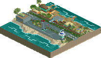
    The coaster was lacking, though. Despite being a "fun-sized" mega coaster, it seemed pretty tame and appeared to slug along its course without much energy or pizazz. The MCBR really killed it; being only 125 feet and not particularly lengthy (and not in need of the extra blocking capacity), it didn't make a whole lot of sense for it to be there. A couple of camelbacks would have been a nice substitute.

    Overall it was enjoyable, if a tad generic.
  • GameWorldLeader%s's Photo
    not bad, needs more scenary but not bad
  • Dotrobot%s's Photo
    you should check the date on this gameworldleader.

    the latest post on this was 2010-07-01. Almost a year ago D:. it's okay to bump things when you have something really meaningful to say but the player responsible for this has grown decades from this failed attempt so it wouldn't be wise to give advice on anything but his latest work ^^.

    not to sound rude but just thought you should know 1 of the no-no's here before you end up like one of our more undesirable new members.
  • K0NG%s's Photo
    But Dot...the reason the release forum was re-opened was to encourage feedback. This isn't like bumping a dead topic in the AD. Or one of FantastiCo's religious topics. He's new enough that he's probably never seen this before...so, commenting on this release isn't a terrible thing.
    That being said, it would have come off better if he'd actually had something to say.
  • Liampie%s's Photo

    not to sound rude but just thought you should know 1 of the no-no's here before you end up like one of our more undesirable new members.


    Replying on releases is a yes-yes.
  • RRP%s's Photo
    thumbs up for the bump.I hadn't seen this before