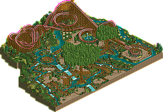
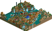
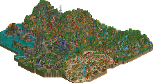
Park / Lotusflower

Park_1544 Lotusflower

9 Comments

  • Comment System%s's Photo
  • turbin3%s's Photo
    hey split, sorry for the low vote, but the only good thing i could find was the layout.
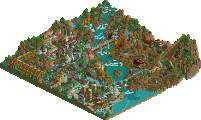
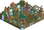
    the custom trees were ugly imo and all the wooden-track too.
    mayra was much better :)

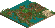
    looking forward to your satellite-project, it looks amazing atm!
  • SSSammy%s's Photo
    really? i thought the layout was shit and everything else was kinda charming. the design accolade for me hangs heavily on the layout, and it didn't really carry it for me.
  • Roomie%s's Photo
    I thought the layout was fairly poor. But loved the surroundings. The use of the track as guides for the water flow really appealed to me. I can see why it split opinion though. :)
  • Lowenaldo%s's Photo
    I really liked the queue through the roots of the tree.
  • AvanineCommuter%s's Photo
    I personally loved this design but I can see why certain people won't. I liked the layout although it isn't the strongest, there were great ideas in play, and aesthetically it's unique and wonderfully fun to look at.
  • Splitvision%s's Photo
    Ah well. :D I had a hunch this one wouldn't make it. I was pleased with the layout and most of the surroundings, but I can understand that the whole composition and concept didn't really hit home with enough of the panelists. Thanks though to everyone who liked it. I don't know when I'll be able RCT2 more in the near future, as I've begun studying at an university, and the schedule the first month is crazy. We have a thing called "nollning", which I have no idea how to translate but it involves lectures in the morning and afternoons then activities (drinking) at night, every day the first month. So I'll be busy, but if I find any free time I'll try to finish up my more potentially accolade winning projects.
  • Wicksteed%s's Photo
    I found the curved bridges quite exciting. the rest was okay.
  • Liampie%s's Photo
    I liked the layout and the side-friction track as well. I voted 55% only because there was too little to see and no architecture at all. The layout wasn't strong enough to win design by its own, it needed backup but there wasn't any.

    You can do better anyway. :)
  • Evil WME%s's Photo
    Wow, I just saw this get released unnoticed.

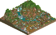
    I thought the layout was really good. Fast-paced and fun. It looked good to me, and it was original with good ratings to boost.

    I remember not liking the theming much in the beginning, and it could have, possibly, been pulled off a bit better. However, as I was looking at it more, I started to like it more. I liked the symmetry and how certain parts made me feel. Really, I was amazingly, pleasantly surprised when I saw this.. and I'm a bit surprised I was one of the only ones that felt this way!

    Anyways, I adore your approach to RCT from what I can see and will be looking forward to what you produce in the future! Keep at it, there's room for improvement!