Park / Urchin

Park_215 Urchin

12 Comments

  • Corkscrewed%s's Photo
    Posted Image

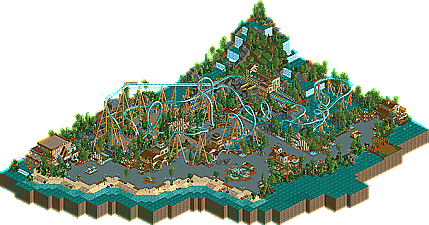
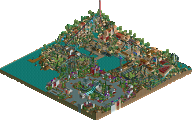
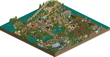
    NE is proud to showcase our sixth and final IAAPA2 exhibit, Urchin, by Fable Nemesis Chris Artist! This beautiful design takes us to a lush, tropical, and watery setting, where the most ferocious Urchin ever found takes riders through seven heart-pounding inversions. And since urchins don't have legs and need not a floor, neither does this coaster. Check out artist's beautiful floorless coaster today!
  • Ge-Ride%s's Photo
    Cool! It reminds me of Kraken. Awesome atmosphere.
  • Geoff%s's Photo
    Oh wait, nevermind. My badddd.. just looked at my pm's.

    I really like this. Great coaster, and the atmosphere flows nicely. It feels like it's a bit unfinished and rushed here and there, but overall it's pretty neat. Nice job!

    Edited by Geoff, 12 December 2005 - 08:00 PM.

  • Steve%s's Photo
    Sort of iffy coaster layout. Everything else was top notch, despite some slightly uniform waterfalls in the back corner of the map. Very nicely done, Chris.
  • X250%s's Photo
    Coaster layout was great, the vertical drop after the immelman loop is such a fuckin good idea! The colour scheme was very 'Kraken' like, those two colours work together surprisingly well. Good job, and nice to see you back.

    -X-
  • posix%s's Photo
    chris let's get you rct2 :)
  • artist%s's Photo
    Thanks cork. I love the logo, really cool.

    And dont worry this isnt my last rct work trust me as long as posix exists i wont be quitting :)

    thanks again
  • mantis%s's Photo
    Far too pretty to be called an Urchin, but names aside, pretty good! A bit cliched, but I guess that's not too big a problem. Good at what it's aiming for, I think.
  • AustinPowers%s's Photo
    nice logo :|

    I'll check the park out tonight

    Edited by AustinPowers, 13 December 2005 - 04:59 PM.

  • ][ntamin22%s's Photo
    Bad logo.

    the rides not bad for a Kraken clone.. and i like the atmosphere.
  • Kumba%s's Photo
    Very good design, I really liked that atmospher on and near the path and that "Search for the species" lookout spot was a great idea. But yeah it is too Kraken like and that has been to sooooo many times it sould not really be done anymore. Also I liked what you did with most of the wooden pole work, but in a few spots you stacked poles and they were floating in mid-air, that just looks stupid. And my last beef is the coaster layout, it was not that great all around, but it had its bright spots, like the start and part after the verical drop, witch btw is just something I don't think B&M will be doing any time soon, tho it is a cool idea, then was the super slow interlocking corkscrews at the end, it sould not take a coaster about 8-9 seconds to get to the second one.

    You have improved loads, thats needless to say, but I think you need to work on your coasters and originality more.
  • JKay%s's Photo
    I got a chance to download this last night.

    Wonderful job Chris. Great atmosphere especially. The colors were warming as well. Not much to complain about, other than your foliage, which always seems overdone. Still, great job and I'm glad you're still alive around here.
  • J K%s's Photo
    I liked the way you did the 3d cinema. And as Kumba mentioned above i liked the use of your wooden poles. I loved the vertical drop, it really made this coaster unique. Apart from that i found it ok nothing ground breaking but a very aestheticly pleasing design, with a harmonious atmosphere. I also liked the tropical setting and the waterfall in the corner was done well. Probebley my favourite design along with solaris out of the six. Good job.