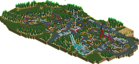
Park / Infineon
-
 12-November 12
- Views 3,221
- Downloads 839
- Fans 1
- Comments 12
-
 60.38%(required: 65%)
Design Submission
60.38%(required: 65%)
Design Submission
Liampie 75% chorkiel 70% In:Cities 70% posix 70% Goliath123 65% Maverix 65% 5dave 60% Coupon 60% Jonny93 60% Pacificoaster 60% RMM 60% Sulakke 60% pierrot 45% Phatage 40% turbin3 40% 60.38% -
1 fan Fans of this park
-
Download Park
839
-
Objects
314
-
Tags
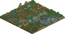
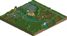
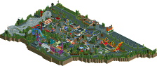
Similar Parks
-
Greendale
-
Swallow Falls
-
PineHills
-
Thunder River National Park
-
Blue Oak Amusement Park
-
Ancient Worlds
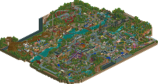
It's on a good technical level obviously but for me with the focus being almost 100% on the coaster and not so much on a themed environment the layout should have been stronger.
Also I think that the area as a hole wasn't cohesive enough.
There was a lot of path but none of the supporting rides seemed to have a real intent...I always have a problem with areas that seem to be put together kind of randomly...what I'm trying to say is I could switch the supporting rides around, they could be replaced by anything, it would make no difference, because there's no real reason behind their placement.
Everything else was nice, if you work on these things for your next design and try to put things into more of a context then I'm sure it's gonna score.
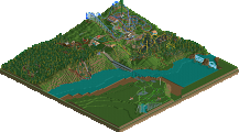
Trying to recreate a local area is also why there's no water whatsoever on the map (other than it being the single most overused filler in RCT history, and I wanted to get away from that) - the only water on the flat bits here is tiny, tiny streams connecting the mountain ranges, that would be smaller than a quarter-tile's width in RCT.
I'm glad people seem to think my architecture is improving over Skyline, though.
I liked the archy, felt it was an improvement, but it was weird. again it looked awesome zoomed out, but when zoomed in just looked abit odd. Like, you had alot of fun shapes, but after a closer look there was something missing, and too much layering on 2x2 buildings.
So, i liked this, but it was just so hard to pin down why i didn't love it. I did love the landscaping however, felt original and thought out.
FK
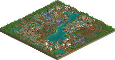
The diagonal hill had a terrible flow ,it should've had a steepness to make it look better like FK-Coastermind mentioned.
I can learn from your foilage placement ,that's for sure ,because that was very nicely done.
Better luck next time.
Don't get me wrong, overall I really liked the coaster, the theming, the surroundings, the foliage etc. All up to design quality. It's just that you seem te have failed in framing the coaster at its best.
P.s. the name sounds like a pokemon.