Park / The Hound
-
 17-March 14
-
The Hound (Finished)
- Views 2,124
- Downloads 381
- Fans 0
- Comments 9
![screen_641_Lifthill [Update]](https://www.nedesigns.com/uploads/screens/641/641_thumb.png)
-
Description
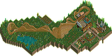
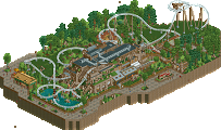
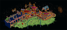
The Hound is the newest addition to a small, family-friendly park. The park finally decided to build a big roller coaster to make the stay even better for teens and adults. The Hound itself is a modern GCI Wooden Coaster with an Out and Back Layout.
I had a lot of fun building this project, especially because I didn't think much about how NE will see some aspects of it. I just build the whole thing and feel, that this is my best RCT2 work so far. -
No fans of this park
-
Download Park
381
-
Objects
174
-
Tags
![park_4086 [H2H8 R1] Tahendo Zoo](https://www.nedesigns.com/uploads/parks/4086/aerialt3817.png)
I'm kind of surprised that this still doesn't have any responses.
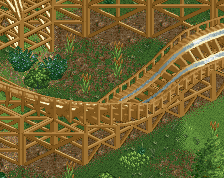
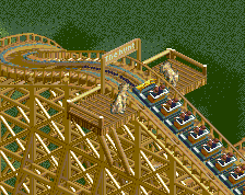
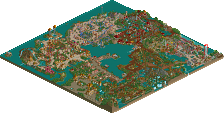
There's not really much here in terms of surrounding or architecture and I don't really understand how you have black tiles in an NCSO park but I actually liked the layout quite a bit (though it doesn't seem very GCI like). My favorite part was probably the initial run out to the turnaround with the double up, I actually thought it kind of fizzled out at the end but the out and back section was pretty good.
Obviously this isn't close to being design quality since there's not much going on but if you spend more time refining your next coaster I'm sure you'll take a big step forward.
Thanks for the comment!
About the Blacktiles: Half of NE says, that you shouldn't use them in NCSO, and the other half says, that it would still look better. I actually aim on understanding NCSO as a style of play. I use some CSOs (like Blacktiles, invisible paths and support blockers) because they actually don't change the look of the game (because there are black tiles in the game, just not on the spots we would like them to be). I know some would say this isn't NCSO, but as everything that's visible on this map is NCSO, I treat it as such.
The problem I had with NE was, that i always felt pressured, to go to the standards of how a park or design should be. And that almost stopped me from playing RCT2, because I personally thought building wasn't worth the time without sharing it. I started this park with the wish, to just build something I enjoy. And i do enjoy the "small park" feel this submission gives me. There is not really much there, but I made do with the skills I have, and I'm not a good NCSO builder. In fact, I still struggle to achieve a kind of architecture you guys would call "medicore" so in this park, I kinda ignored architecture as such (as you can see from the extremly simple buildings). But I think the most important thing is, that I enjoyed building it.
About the Layout: The Layout is pretty much based on "White Ligthning" in Fun Spot America (just a little bigger), for I really liked the layout and build something like it:
http://www.youtube.com/watch?v=G_gwNaopZtc
Well said.
+ignoring architecture in this one resulted in a drastic improvement of everything else (foliage, landscaping, even the coaster layout).
But not when zoomed in
Idk, I think using blacktiles in ncso shouldn't be a problem. I mean, we are looking at the park and not the map, so it shouldn't matter what's around the park borders.
Plus I built this on a pretty large map, so using black wood would be way to much work
BigB Offline
next time, do a .zip Folder with a blacktile and a non-blacktile Version....
The surroundings are great, compared to ur last works.
BigB Offline
/irony
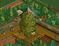
A cute little design. I liked the golf course.
-Flower colours were far too random and messy.
-I'm no expert on layouts but I felt it lost its flow at the end.
-Experiment with textures in your architecture. Don't overuse them though but your buildings were a bit basic.
Overall, not bad. 45%.