Micro Madness 2014 / [MM2014 R2] Shotguns? vs. Roomie vs. Stoksy
-
 30-July 14
-
 Liampie
Offline
Liampie
Offline

limited space, unlimited madness
Round 2
__________________________________________________________________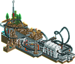
Shotguns? (#4) - Black Mesa Research Facility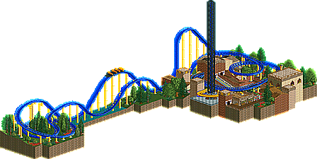
Roomie (#2) - Furious Falcon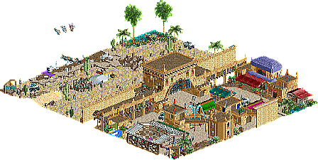
Stoksy (#5) - Sands of Time
__________________________________________________________________How to vote?
First of all, check out all the entries in this match. If you can't view one or more entries, for example if you don't own LL, then please, do NOT vote.
Once you've viewed all 3, select your favourite in the poll above.
After 3 days, we will close the poll and the highest scoring entry will proceed to the next round.
Comments on the individual parks have been disabled, so please leave your comments below.
Anyone found to be voting on their own match up will be disqualified from voting.
Anyone found to be voting when they cannot view all 3 entries will be banned from NE.
Votes are public and so any cheating of the system, betrayal of honesty or mistrust will be picked up on and will be dealt with. -
 csw
Offline
csw
Offline
Very close between Stoksy and Shotguns. Roomie's was solid but not quite up to par with the other two. My vote goes to Shotguns in the end. It wouldn't be as close if you had used music. I think Stoksy's effort here could earn him a wildcard spot though.
-
 wheres_walto
Offline
wheres_walto
Offline
I wish that I could vote on the two matches today...
Stoksy: everything on your map was of such great quality. You've quickly emerged as a top active player on this site and I'm really looking forward to seeing what else you'll build. The same can be said for you Shotguns; you made a great little park with excellent execution. Although I'm familiar with the Half-Life games, I never played them myself so it didn't quite resonate with me as much as it did with others. You guys are both getting so damn good and you are both deserving of moving on.
-
 inthemanual
Offline
inthemanual
Offline
Voted Roomie. Shotguns' was fantastic, and so was stoksy's, but both felt a lot like parts of a larger whole, while Roomie's seemed to stand up the most on it's own. Shogo's also really only captivated me from one angle, and stoksy's black-tiling ruined a lot of the immersion of his map for me.
Also, my buzzards were better.
-
 Ling
Offline
Ling
Offline
The ideas in Black Mesa were great, but little things brought it down. For instance, how Resonance Cascade was just a little too fast throughout, Blast Pit didn't actually operate, and the station building was lackluster. There were also so many broken up buildings for rides and paths and cutaways that I wasn't always sure which was which and it made a lot of the buildings look unnecessarily incomplete. Since the road above ground seemed to be ruined, which would put this after the nuke, the facility has no damage but there are no Xen alien details or walking robots or anything that could have been some clear shout-out details.
I'm not sure how I feel about Furious Falcon. The layout is nice and classical and definitely works in this setting. The foliage composition is good and the structures are at least alright. Colors are pleasant. Perhaps it's just that this entry feels incredibly "safe". Very much a design-style format, just on a micro scale. I did like the atmosphere but it definitely needs more room to breathe.
Sands of Time is kind of tragic for me - the details here, especially in the 3x2 structure in the wall, are magnificent. Sadly I have no idea what's going on with the rest of the map or why the trucks disappear into blackness. The black tiling detracts from it as well, although on reflection I'm not really sure why. It's not just because it actually cuts into the map from certain angles, something about it is just off-putting.
Vote: Shotguns?
-
 Xeccah
Offline
If i was really able to finish this (only built this in ~2 days), i would've actually did a complete top section with the military storming in and shit. I plan to actually do that kind of stuff on these later two rounds though
Xeccah
Offline
If i was really able to finish this (only built this in ~2 days), i would've actually did a complete top section with the military storming in and shit. I plan to actually do that kind of stuff on these later two rounds though -
 5dave
Offline
5dave
Offline
Black Mesa - Shotguns?
Again really nice entry. The coaster was solid and the idea behind it too. What I didn't like about the coaster were the missing custom supports and the banked turn after the brakes, but that's no big deal actually. I loved the station structure and all the underground parts, also the fact that it was full of peeps too. Really great work here! My only suggestion would be more story-related details (scenes from the game with frozen staff maybe?).
Furious Falcon - Roomie
Another cool coaster layout, but here again it's missing a great theme and idea to make it pop. Pity you were so stressed during the contest, but major props for sending something in and keep going! The effort turned out nice, I especially liked the layout and the colors here. Good job!
Sands of Time - Stoksy
Interesting micro - I really liked the city wall being the transition of the market to the desert. Also there was a lot to see - the archeologists, the hidden stalls, the mirage and that flying carpet - well done! The hacking was a bit sloppy and made it all look messy in the end. Layout and architecture of the map was really solid and the truck ride was convincing. The map is a good example that you don't need a rollercoaster to make an interesting micro.
"MFG" -
 Stoksy
Offline
Stoksy
Offline
Shotguns: Would have loved to see the top layer; I think that this would have made it a truly great entry. The coaster was pretty good, as 5Dave said it would have been nice to see some custom supports but I still this was a really good micro! Not as good as your round 1 but the peeps added a lot I thought. Despite my having no experience with Half-Life I agree that it would have been cool to see some more references to the source material.
Regarding my park; I have to admit that this is probably not the best I could have done. It was less 'inspired' than my round 1 entry as I had another idea for this but it didn't really eventuate. The 'odd' blacktiling was purely to hide the Mirage from appearing until it was on the actual map. I was a little divided about whether or not to cover the entire thing or just leave a few tiles beforehand; deciding that I would just show important detail(s) ie the underground bit. The idea was to have the transition between a market place situated in the desert and how there is often no transition between the desert and the city. I admit that I probably went a little overboard with the rockwork but am quite happy with some of the things in the park; ie the monster trucks and the tomb.
Unfortunately can't view yours in game Roomie, but I find it quite impressive that you've basically managed to make a design on 225 tiles.
-
 Roomie
Offline
Roomie
Offline
I cant view any of them right now (at work) but from the overviews its no surprises I'm last. The ride lacked any sort of theme which didn't help and I'm still struggling to get good theme ideas i can run with.
In a week I had to move house it was never going to be easy to get a park out but I'm glad i did and I'm pretty happy with it considering the time restrictions The irony is I'm at sea now and have all the time in the world to do a micro. But sods law. I guess I might actually work on a park for once.
-
 Chocotopian
Offline
Chocotopian
Offline
3. Furious Falcon.
Despite the lack of theme, as you've said, I felt that this had a cool atmosphere. I personally would've said that ‘birds’ is a perfectly suitable theme, and it’s only a shame that you couldn't develop it further. The part where the coaster leaves the main area and circles over the foliage was a very nice part – very much mimicking a bird, I thought. The main area felt a bit cramped, but I guess that was somewhat unavoidable. It would've been nice to see peeps in the park, especially as the entrance was right there, but at least the rides were operating and adding some movement to the park.
2. Black Mesa.
I’m afraid the only mention of Black Mesa I've heard was on Portal2, and I'm pretty sure they were just mocking them, so I don’t really have an understanding of their architecture. Sorry about that. Still, what was there was impressive, and it was clear that there was a solid theme. I particularly liked the queue area, with the underground section where the peeps stand between the lightning thing (?) and the coaster as it soars past them. Good architecture and a strong coaster. Nice work.
1. Sands of Time.
I loved this! It definitely gave off the Arabian theme to me, and I could almost feel the heat of the place. The two separate sections were both very well done, and the little touches of the camels, vultures, people and small scenery all added to the theme. Some nice hacking to get the desired effects, without the intrusive glitching and whatnot. Nice colours, nice atmosphere and a great entry overall. 1st place from me.
-
 FK+Coastermind
Offline
FK+Coastermind
Offline
Roomie: It was good, very enjoyable, but as the trend has been in this contest, it needs more innovation or something unique. This just didn't feel as exciting as the other entries.
Shotguns?: This was really good, i love this game, so i love the theme. The coaster was fun, the interaction with it's surroundings was top notch, and i loved the archy. My problem with this; however, was it seemed to be missing the details. Obviously, you said it wasn't finished, so that was the missing bit, it just felt like an amazing foundation without the finishing touches. With a specific reference to a game like Half-Life, it really needed a bunch of little references and bits to link it together. and that was what Stoksy seemed to have
Stoksy:Big surprise for me, this micro was just so fresh and interesting, and you managed to keep me interested the longest, yet without a coaster. All the little details from the camels to the carpet, and overall just the macro look of it, was very impressive. For the most part, it looked so nice and clean, except for all the weirdly placed black-tiles and such. Archy was tiny, but it was also very well done, can't wait to see more from you in the future.
Vote: Stoksy
-
Liampie
Offline
Voting Closed
Winner: Shotguns? with 9 votes (proceeds to next round)
Runner-up: Stoksy with 7 votes (proceeds to wildcards)
3rd place: Roomie with 1 vote (is eliminated from Micro Madness 2014)

Tags
- No Tags