Micro Madness 2014 / [MM2014 R3] FK+Coastermind vs. Liampie vs. Stoksy
-
 24-August 14
-

 Louis!
Offline
How to vote?
limited space, unlimited madness
Semi Finals
__________________________________________________________________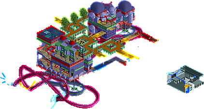
FK+Coastermind (#2) - Master of Portals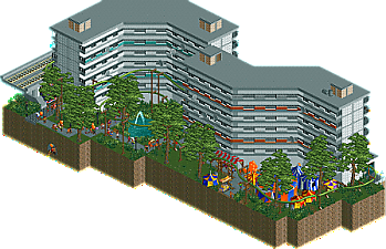
Liampie (#1) - A Slice of Bijlmer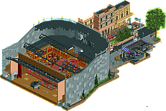
Stoksy (#6) - Angel Concert Hall
__________________________________________________________________
First of all, check out all the entries in this match. If you can't view one or more entries, for example if you don't own LL, then please, do NOT vote.
Once you've viewed all 3, select your favourite in the poll above.
After 3 days, we will close the poll and the highest scoring entry will proceed to the next round.
Comments on the individual parks have been disabled, so please leave your comments below.
Anyone found to be voting on their own match up will be disqualified from voting.
Anyone found to be voting when they cannot view all 3 entries will be banned from NE.
Votes are public and so any cheating of the system, betrayal of honesty or mistrust will be picked up on and will be dealt with. -

 Stoksy
Offline
Fk: I love you Fk! This was just perfect, my favourite park of the round and probably the tournament so far. How you managed to integrate portals into 225tiles I will never know but this was an incredible combination of details, life, interest, and Fk goodness. If I had to pick a favourite part it'd definitely be the subtle height illusions. I thought it took perfect advantage of isometric view in order to show completion despite some areas being hidden by black tiles. Totally loved this!
Liampie: Lacked your usual level of detail I thought. The difficulty with having a single building as the focus point is the necessity of either a lot of details on the outside, or interiors. Unfortunately, I don't really think you did either here. I looked at some pictures of it (quick google search) and it certainly looks quite accurate in comparison to the source material but I definitely feel as if you could have gone so much further with it. I would have perhaps suggested expanding on the 'ghetto' theme, maybe attempting to have some graffiti on the building, and instead of the food stalls underneath the railway had that as a rundown area with homeless people, rubbish, fire in a barrel etc. Nonetheless, despite it's simplicity I really liked the festival actually; somehow the colours just popped really well and it provided a nice contrast to the concrete of the building. Overall, I think the execution was accurate to the actual building, but you just built it from the wrong time.
-

 oli414
Offline
Wow, this is a hard...
FK, The amount of detail is just amazing! Although some stuff might be a little bit to random in my opinion.
Liampie, I don't think you came up with the idea to make this while you were sober ^,^ I really like how you've managed to make a "colourful" and fun looking place out of a place that is quite cheerless in real life. You could have done better on detailing although I understand that there's not a lot of detail on these bijlmer buildings.
Stoksy, I don't really know what to say! The details are overwhelming and it looks very realistic. The way you did the "roof" on the concert hall made it hard to see depth. -
 inthemanual
Offline
Stoksy: this'll probably be the meanest thing I ever say to you, but your theatre was way too much of a big blob for me, and I couldn't think of it as anything other than a giant box that a first time RCT'er made, except you used track instead of plain walls. And while you did detail it, and give it an interior, and do a lot of things to distinguish it from that style of building, it was obnoxiously large and had an extremely uninteresting form which really brought it down for me. The street facades were wonderful, and I liked the way you did the Breakdance. I can't hlep but think it didn't quite fit in here though, and the flying music notes seemed weird to me too.
Liam: I didn't understand this at first. Then I read your write up, and it cleared a little up for me. I still don't completely understand what you were going for here though. If you wanted a faithful recreation and tribute to these "ghetto" buildings, I know you're capable of something like that; and if you wanted a slum themed park I know you could pull that off brilliantly as well. This fell between the two for me, and as such seemed worse than either. My whole rant so far has been about your idea rather than your execution, so i'll talk about that as well: the names made me laugh, again, and the fair, while it didn't quite seem to fit, provided a breath of color that this needed. I think the buildings were nicely done as well, and had some new ideas that I don't think i've seen in RCT architecture. I think the biggest flaw in them is simply that they're based on boring buildings.
FK: This didn't ring as strongly with me as your previous entry did. I liked the ideas, and we talked about them, but I would have loved this so much more with so much more. This didn't seem to fit in a micro (literally) because I would have loved to see more of it, or at least get more story and understanding about what's happening here. I love the colors and textures, but I felt like it could have used something more neutral to hold it together, it felt too alien and unreal without a bit of brown or gray or white or black anywhere.
-

 Faas
Offline
1. Stoksy
Solid entry. Fun atmosphere, and the bulkiness of the concert hall didn't bother me.
2. Liam
Oh how I hate Amsterdam. Fun little entry, but nothing spectacular. I know a bit about the Bijlmer and Le Corbusier, so that was a fun touch for me.
3. FK
I love the portal games, but somehow I think your execution is a bit of. I can't seem to enjoy the (in my eyes) random shit floating around and I don't know what the rest was supposed to represent, I'm sorry. -
 RCT2day
Offline
1.) Stoksy: I had an idea like this too! Anyway, fantastic street side architecture and the use of the new break dance was likewise very good. The concert hall itself had a beautiful interior (by RCT standards) and I actually enjoyed your use of the monorail track to make the exterior walls. Loved the Ragtime music thrown in there too. Only complaint is the sign above the main entrance to the hall; if you're going to do a sign like that, you have to really be careful and make sure it looks good from most angles.
2.) FK: Loved the portal theme. It was fun to just watch the coaster from each angle. But unfortunately, that's all it had. Don't get me wrong, I liked it a lot but the execution of the surrounding area seemed to be not up to your usual par. Still a really solid entry and deserving of praise.
3.) You should have used this one a round earlier. I really didn't understand what was going on even after reading the description. I normally love your stuff but this was an exception. Were you rushed or something in making this?
-

 5dave
Offline
A Slice of Bijlmer - Liampie
I don't really know what to think about this one - I guess it's some kind of social mockery on a certain part/quarter of Amsterdam? It seems to me it's a theme you wanted to do because of your studies, which is really cool! The structure looks kinda drab (which you are going for I guess) and the rides seemed just scattered around to make it lively. After reading the writeup I seem to understand more, but still it's a a risky theme for a semi-finals entry. But I guess you didn't plan to enter the finals anyways.
Angel Concert Hall - Stoksy
Really beautiful street scene, but I wished the theater facade itself would have been nicer. The interior of the theater on the other hand was really good. I loved all the details you've put in there. The whole backstage areas were great and all the staff working there too. Maybe adding a circus underground to make it work would have been a good idea and could have added a nice queue in fron of the theatre. But all in all it was really cool entry! Oh, and it's Hans Christian Andersen.
Master of Portals - FK+Coastermind
What a cool idea it was. I wanted to do something like this in my entry too, but turned out way too boring. You really stepped up your game in round 2 and now even more. Really amazing stuff there and shows what you can really do on such a small scale. Awesome work!
"MFG" -

 Ling
Offline
Master of Portals reminds me a lot of Transistor for some reason. I feel like I need a little more elaboration, though (as I always do with your work lately).
Slice of Bijlmer looks like something that might have a lot of references if I knew what I was looking for. Looks like a derelict apartment building, but there are satellite dishes and lots of people. Suspended coaster was alright and used the space well.
Angel Concert Hall takes it for me. I think it does need to be a bit bigger to allow for foyer, concessions, restrooms, offices, things like that - it already feels massive but when I think about it there are still some things missing. Interior was brilliant, though, and the custom ride worked out really well. Loved the architecture of the nearby downtown buildings even if they're all shades of brown.
-
 Coasterbill
Offline
It's a tough decision between Master of Portals and Angel Concert Hall. The Portal idea is great but the detail of the theater and surrounding area is awesome. I ended up voting for Angel Concert Hall but it barely edges out Master of Portals. The little details like the Piano and the maintenance man up in the rafters really made it for me though.
-
 JJayMForce
Offline
A Slice of Bijlmer- Liked the entry, even though I didn't really get all the references. Very lively and fun, the architecture looked nice as well. The tents and all the booths looked cool too, and I enjoyed the overall look and feel of the whole thing. You certainly know what people like and how to compete well in these competitions, you're a true vet.
Edit: Because i'm silly and didn't read the park description I didn't get the full effect of viewing at first. Your words add a lot of depth, and another layer to the park. Very cool, indeed.
Angel Concert Hall- Good job Stok, nice entry. I loved the colors, the little details and all. The archy was nice, and also the trackitecture. Certainly one of the best constructed theaters I've ever seen in the game, with the peeps and all, lovely. Also, great music choice, with you playing piano, very cool. Probably one of my favorite micro's of the competition.
Master of Portals- Classic Fk, but with new twists and ideas is always going to be a recipe for something special, and this certainly was. The idea for the portals, and how you can see them only from the angle of entry is awesome, not sure if it's been done before, but really neat idea. I feel like I could have enjoyed it slightly more if I played Portal, but it was still so good. I thought the archy and surroundings were good too. Nice entry dude.
-

 geewhzz
Offline
Stoksy, um wow? best one of the competition for me, irrc.
And to think BG is complaining of there being no quality and no developing "n00bs" ha! -

 Chocotopian
Offline
3. Master of Portals.
A clever idea, but other than that I'm afraid this entry didn't hold my interest. The colour scheme was a bit odd, in my opinion, and gave it a sort of washed out look. I actually preferred the style of the little entrance area, as that bit reminded me of the portal games, and I feel that an entire Aperture inspired entry would've looked really cool from you. The architecture was certainly unique, but I couldn't really work out what the buildings were, or what they were for. You created some nice isometric illusions though, and the big wheel fitted in well. A decent entry, but just didn't click with me.
2. A Slice of Bijlmer.
The structures certainly reminded me of the drab, uninpired council blocks we have over here, and so I actually liked the way you recreated this effect. The rides and their significance were somewhat lost on me (is garbage throwing a common thing for this area?), but the coaster did provide a nice addition to the garden area. Given the idea and inspiration, I believe you did all that could be done while remaining true to the source, but in that respect I think a more exciting area should've been chosen. This definitely has its own atmosphere and works well as a diorama, but for a micro I think something more jam-packed would've suited.
1. Angel Concert Hall.
I thought everything here looked brilliant. Yes, the hall itself was somewhat basic in shape externally, but I admired the way it flowed with the landscape, and the effect of seeing through the roof was very smartly done. A nice début for Render8's ride, and the simple yet elegant detailing on the street buildings gave the whole area a classy touch. A great little piano model, and an impressive design all round. Voted this 1st.
-

 Liampie
Offline
So few comments and votes!
 This round shouldn't end until there's more response in my opinion.
That's one of the things I find so interesting about the Bijlmer. On the one hand there's poverty, lots of concrete, lots of crime, a major plane crash for extra drama... On the other hand there's the joy and colour that comes from the Surinamese immigrants (among others), which is represented in the micro with the Kwaku Festival and the lively market. By the way, I was completely sober while making this!Liampie, I don't think you came up with the idea to make this while you were sober ^,^ I really like how you've managed to make a "colourful" and fun looking place out of a place that is quite cheerless in real life. You could have done better on detailing although I understand that there's not a lot of detail on these bijlmer buildings.
I didn't understand this at first. Then I read your write up, and it cleared a little up for me. I still don't completely understand what you were going for here though. If you wanted a faithful recreation and tribute to these "ghetto" buildings, I know you're capable of something like that; and if you wanted a slum themed park I know you could pull that off brilliantly as well. This fell between the two for me, and as such seemed worse than either. My whole rant so far has been about your idea rather than your execution, so i'll talk about that as well: the names made me laugh, again, and the fair, while it didn't quite seem to fit, provided a breath of color that this needed. I think the buildings were nicely done as well, and had some new ideas that I don't think i've seen in RCT architecture. I think the biggest flaw in them is simply that they're based on boring buildings.
I mostly agree with this. I had to come up with a micro last-minute again and went with this. At first it seemed like the best of the worst ideas I had, but during the construction I felt the urge to tackle this theme on a large map with more realism. The Bijlmer has a lot more to offer! I might do it, but it won't be a theme park. I've been thinking of making larger Amsterdam-themed maps for years now.I don't really know what to think about this one - I guess it's some kind of social mockery on a certain part/quarter of Amsterdam? It seems to me it's a theme you wanted to do because of your studies, which is really cool! The structure looks kinda drab (which you are going for I guess) and the rides seemed just scattered around to make it lively. After reading the writeup I seem to understand more, but still it's a a risky theme for a semi-finals entry. But I guess you didn't plan to enter the finals anyways.
Not really a mockery, just a tribute to a fascinating bit of (architecture and/or planning) history. Indeed I wasn't planning on making it to the finals. But I wasn't planning on making into the third round as well... If I do make it into the next round of course I'll come up with another crappy idea! Poop and concrete, what's next? Bacon?
Graffiti would've been good, but I think the micro would've been even more cluttered which takes away from the theme. Homeless people would've been out of place, rubbish on the whole map was planned but didn't work out well enough (notice how the handymans don't clean?)... The market is exactly in the right spot, under the metro viaduct. But of course this is quite specific knowledge, the suggestions are fair if you're not familiar with the theme. On a larger map I could've communicated the concept much better. It's just a crappy micro I made!Lacked your usual level of detail I thought. The difficulty with having a single building as the focus point is the necessity of either a lot of details on the outside, or interiors. Unfortunately, I don't really think you did either here. I looked at some pictures of it (quick google search) and it certainly looks quite accurate in comparison to the source material but I definitely feel as if you could have gone so much further with it. I would have perhaps suggested expanding on the 'ghetto' theme, maybe attempting to have some graffiti on the building, and instead of the food stalls underneath the railway had that as a rundown area with homeless people, rubbish, fire in a barrel etc. Nonetheless, despite it's simplicity I really liked the festival actually; somehow the colours just popped really well and it provided a nice contrast to the concrete of the building. Overall, I think the execution was accurate to the actual building, but you just built it from the wrong time.

Thanks for the comments so far! My turn to comment on the others:
Stoksy
I LOVED the outside area. Perfect architecture, perfect tram with surroundings, great atmosphere and somehow that Break Dance looked great in that spot (great work on the new flat, render8!). Pretty much perfection! The interior was well done as well, especially the piano. The exterior of the concert hall was very disappointing, however... I hoped to see a cool, detailed and atmospheric facade on the front like the other buildings you did, but instead I got a concrete wall even worse than my Bijlmer stuff with minimal detailing. Too bad. Still, really impressive work Stoksy! Despite lacking a major ride, one of the best micros of Micro Madness so far! Hopefully next time (if you go through of course) you'll incorporate a tracked ride.
FK
I can see why this isn't everyone's cup of tea, but I think you did great! The architecture was really nice and the concept worked pretty well. In some places I found it a bit too Colorflood-esque (that style is getting old FAST!), but the less abstract features (architecture) made up for it. The ferris wheel was cool and you made a good decision to include trees (well done). The floating and glitching bits in the blacktiled parts of the map were a bit annoying, but that's not a disaster. Overall a very nice and complete micro!
I'm glad I don't have to choose between the two of you. -

 Louis!
Offline
Voting Closed
Winner: Stoksy with 41.5 points
Runner-Up: FK+Coastermind with 20.5 points
3rd Place: Liampie with 10.5 points
Stoksy & FK+Coastermind go through to the Final -

 Liampie
Offline
Yes, I'm out!
 Congratulations Stoksy and FK! Great job both of you!
(to others: more replies are still welcome...) -

 FK+Coastermind
Offline
Finally have the time to respond to all of this
Stoksy-A really great entry here, with so many huge positives. You are, for me, the surprise of the tournament. I was intrigued by your work before MM, but you have impressed me in so many ways with this contest. it's funny, your work reminds me so much of Cocoa, who is also from Australia. Dare i say we are seeing the rise of an Australian Style?
The micro had moments of pure brillance, and a few that didn't quiet work as well, but the good was so good it outshined the risks you took. The non-concert facades, the tram, the flat ride, were all SO well done. Perfectly detailed, really interesting, the subway lines, just all really interesting and well done. The interior was also ace, between all the details, the frozen staff, the piano. I'd say the thing that actually sold the concert hall interiors was the peeps walking around, really created this amazing atmosphere like a show was about to start and stragglers were rushing to get their seats.Would have loved to see some interiors on the other buildings, as they were already sectioned properly.
The few parts that didn't really work seemed odd. The interior of the concert hall was so different form the outside, they didn't match. It seemed like a traditional grand interior with a futuristic metal outside. I think a more renaissance or city beautiful styled theater exterior would have better suited it (and made this entry untouchable). I wasn't a huge fan of the ice cream truck, as i think it can be better done in rct2 where it can't in LL. You really couldn't see the truck very well here. Also, the main entrance to the concert hall had all these unusual conflicting items. The floating music notes, the angel, the ice cream truck, it was a bit hectic. I loved the music notes themselves, but they seemed a bit out of place.
Overall, i loved this though, the good parts were ace. Glad to have you in the Final and excited to see what you will come up with in the future.
Liampie-I really don't think this is a bad entry, rather, it lacks from what MM entries really need to be successful: variety. With such a small area, viewers really want to see a lot of different looks and interesting ideas and concepts. This entry had some unique architecture and a nice cohesiveness to it, but it just didn't seem to entertain the eye that much. There weren't a ton of cool ideas or looks to see, and so it came across as a little dull. Maybe getting some interiors in there would have helped, but i think this may have just been a difficult topic to cover in a MM park. With your last entry, you played exactly to what MM loves, tons and tons of ideas (shitty ones at that, Eh?), but this just didn't capitalize in the same.
My Park-Thanks to all the responses on my park, it was received just about how i expected it to, with mixed feelings. When i submitted it i had mixed feelings, so i was expecting it to be a bit of a hard pill to swallow. Unlike my past entries, this park really wasn't spearheaded by a specific idea. I had ideas of what things i wanted to build, but not an overarching concept to bring it all together. So i started building and experimenting, much in the same way i do with surrealism parks, and saw what came of it. There are parts i was super happy with and parts i wasn't, but just didn't have the time or more the energy to redo.
I don't really see this park as being the same surrealist venture as Colorflood or Swoon. Those parks don't take place in any sort of "reality" or "dimensions" but are more just landscapes for color and movement and texture. Here i intended this to be a sort of dimension between dimensions, with a loosely related Portal theme to give it some clarity.
I was most happy with the illusions, which i think entertained some and annoyed others. I have been very interesting in abusing the isometric view of rct for awhile now, and this was the perfect opportunity for that. I know some people felt really confused looking at floating pieces of coaster or random floating poles, but it was more that i didn't want you to see them except in context of the rest of the park. I would have hidden them from every few but the one i wanted, but i couldn't get black tiles high enough to do it without blocking the rest of the content. I was really happy with the walkways looking like they stacked wrong from every angle.
Then there were things i wasn't happy with. i redid the coaster a number of times, and i wanted it in there for movement, but it really didn't add too much IMO, and was a bitch to handle. The portals it goes through are cool, but working with so many floating black tiles made things look a little messy, which i wasn't ecstatic about.I also would have liked more happy peeps, but micros are difficult to keep peeps happy in, lol.
Overall, i'm really glad some people liked this (so surprised 5Dave did, my style is usually not your cup of tea, especially this), and super excited to be in the finals. I promise not to dissapoint with my final entry.
FK
 Tags
Tags
- No Tags