(Archive) Advertising District / Little Project
-
 28-October 05
-
Alienated
Offline
Dusting this off and hopefully finishing it.
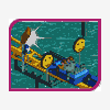
Not much info to give on this except that the first screen is the entrance and the second screen is abit of a mine train in a forested region.
Estimated 40% complete... and I tend to be a slow worker.
Enjoy, comments and suggestions appreciated.
Entrance
Mine Train -
 RCTCA
Offline
I like the mine train and you have great archy, but maybe not use the 1/4 tile as often, as a suggestion. Keep it up.
RCTCA
Offline
I like the mine train and you have great archy, but maybe not use the 1/4 tile as often, as a suggestion. Keep it up.
-Parkmaker-
-
 Ride6
Offline
That enterence screen is stunning I must say. But the "window" organization on those buildings seems a bit scattered, could use some revision. And I'm not fond of those redish wooden sides on the jagged rocks in the centerpiece there either. Otherwise that's a beautiful screen, so bright and uplifting thanks to the color sceme, flowers and wide space building the atmosphere to amazing heights.
Ride6
Offline
That enterence screen is stunning I must say. But the "window" organization on those buildings seems a bit scattered, could use some revision. And I'm not fond of those redish wooden sides on the jagged rocks in the centerpiece there either. Otherwise that's a beautiful screen, so bright and uplifting thanks to the color sceme, flowers and wide space building the atmosphere to amazing heights.
The 2nd screen I'm not liking. Too many of the same trees (use some full tile ones man) and the ground doesn't need to be so sporatically jagged. The architecture could use a wall texture that's "window friendly" too, maybe the grey?
So basically I like (more like love) the enterence, don't like the minetrain.
ride6 -
 X250
Offline
The entrance screen is amazing, wonderful use of yellow- makes the area look very warm and welcoming.
X250
Offline
The entrance screen is amazing, wonderful use of yellow- makes the area look very warm and welcoming.
The second screen is okay too, the red flowers work well. But cut down on the use of tall quarter-tile-trees.
-X- -
 Corkscrew
Offline
Wait a minute... isn't this the same park as the one with the minetrain you showed here two years ago?
Corkscrew
Offline
Wait a minute... isn't this the same park as the one with the minetrain you showed here two years ago?
But anyway, I really like the entrance plaza a lot. Probably one of the most beautiful LL screens I've ever seen, altough the mini golf stuff and fountains are looking kind of odd.
The mine train area somehow reminds me of Benni's in Coral Creek, but it's a bit too dull to my likings. Not like it's bad, not at all, you successfully managed to give the spot a very natural and woodsy feel, though I personnally prefer more bombastic and bright things like what you made in the first pic.
Great to see you're back in business, Alien. Good luck with the project, I can't wait to see how the complete park turns out : ) -
 mantis
Offline
It's pretty awesome. I think you could do more with the centrepiece of that plaza, but apart from that it's looking great.
mantis
Offline
It's pretty awesome. I think you could do more with the centrepiece of that plaza, but apart from that it's looking great. -
Alienated
Offline
Wait a minute... isn't this the same park as the one with the minetrain you showed here two years ago?

Yes, revamped though. -

RMM Offline
Well at least its LL... . You get points just for that.
I agree with a lot of what was said here. In the mine train area lighten it up just a bit. Put in that spruce/pine tree. The full tile one. And just put some flat/hill like spots in there with some larger actual rock with no trees or nuthin. Maybe put some bushes on it. The first screen is great. Fun to look at and its nice and peacful. But the middle of the plaza, try gettin rid of some of them trees. It looks too crowded there. Some of them 1/4 trees would look nice there. Just try some of this and see how it works out.
If the rest of the park can be the detail and high quality of the first screen it'd be great. It just looks like you took your time on the entrance area and then you kinda slacked off on the mine train area.
But yea its pretty good overall.
Also: your missin a fence somewhere near the gardens but Imma let u find it. -

inVersed Offline
I really like this, it has a brillant atmosphere and pretty good archy. The only real flaw in this is the foliage which really isnt working for me.


Tags
- No Tags