Park / Quarry Adventure
-
 25-December 20
- Views 4,830
- Downloads 710
- Fans 2
- Comments 18
-

-
 70.00%(required: 70%) Gold
In:Cities 80% bigshootergill 75% posix 75% robbie92 75% chorkiel 70% Cocoa 70% RWE 70% Xtreme97 70% Jappy 65% Scoop 65% WhosLeon 65% nin 60% 70.00% -
Description
Here it is. My first ever completed RCT2 project. I appreciate all the feed back everyone has given me over the span of this park! This park definitely helped me learn quite a few good tricks and building techniques. I am looking forward to starting a new project.
-
2 fans Fans of this park
-
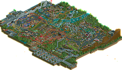
Full-Size Map
-
Download Park
710
-
Objects
490
-
Tags
![park_4800 [NEFC] Ghost TowNE](https://www.nedesigns.com/uploads/parks/4800/aerialt5001.png)
Cool, Xmas release, congrats!
The park is basically a G_Force park with twice the path, and half the foliage. That's not necessarily a bad thing, but it does mean that there's gonna be lots of comparisons. I also think it's pretty comparable to the newest Maverix park; the setting is very similar, and it has that generic Americanism going for it.
The entrance plaza is very cool, probably one of my favourite areas of the park. Ticket booths are great, and the coaster Gatekeeper'ing over the entrance is always gonna be cool. I do think the fountain is a bit messy, and I also think the entrance building is quite small for a park of this size, but I can let that pass because it's aesthetically good.
It's a bit weird how you go past the entrance into basically a vast expanse of path to me, with 2 carousels from what I can tell? But this vast expanse of path has 2 directions, straight forward, or to the left.
This is where the park gets a bit weird - to the left, you have some great architecture, that looks like it's ripped straight out of Coors. If you go straight on, you've got a very cool station for the Wing Coaster, and then opposite is a building that's almost identical to stuff from BGA.
This carries on throughout the park too; Gee's Desperado turnaround has found a new home, and the area around the Top Spin and that section of the flume looks very inspired by Coup's latest park. It's not necessarily a bad thing to take inspiration from others, but I'd love to see you turn it more into your own thing, because you obviously have skill.
Looking past that, my last, and probably biggest, major gripe with the park is the layout. There's far too much path in areas, such as the bit between High Roller and Hydra. The fact that the park is also split in 2 is also not great for me; I think if you had somehow connected the walkway under Hydra's loops with the bit by the Top Spin, it would have worked a lot better, but as it is right now, it's basically a giant U and if you're on one end of the U and wanna go to the other, either you queue up for the Cable Car or you take the long walk past the entrance.
The coaster's themselves also don't feel quite as strong as what I would expect for a park like this. I like High Roller and FireHawk is fantastic, but Talon feels like a messy layout and was a huge miss for me. The whole area feels messy and unfinished actually.
The architecture throughout the park is great though, and that's obviously where your parkmaking shines. Sure, it might lean on other builders for the forms, but you make most of it fit pretty well. As I already said, I really like the entrance building, think that's fantastic, as is the little facade to the left of it. Log flume station is also great, but my favourite piece is definitely FireHawk's station, which says a lot to me cos it feels completely fresh in Rct, rather than borrowed from elsewhere.
Overall, I think this is a decent release, with a few things to work on. I'd go 75%, a solid gold release to finish out the year. Looking forward to what you build next!
this is a lovey bit of warm american realism. there's some good parkmaking here, especially in the entrance area, with a few fantastic buildings scattered around this part (notably the two storied balconied building near the 4d coaster). there's also a fair bit of awkward parkmaking to work through here, with some big lumpy paths and strange overall layout, and some awkwardness in landscaping and overall park identity. that said, I really liked the emphasis on interaction for some rides, with the flume being a highlight. I love where it goes around the top spin and the invert. good stuff for a first release!
I think "warm american realism" is a good description, and something I would love people do from now on. Most realistic parks follow the protocols too strictly and consequently lack that warmth. This was different. It's amazing to see what can happen if you combine it with such meticulous and clever ride design. You created rides that look clean and fun simultaneously and I really enjoyed it. I also think you found good ways to incorporate a moderate amount of theming, as I suppose would be considered accurate, and made it look convincing and ride enhancing. For example the impulse's station. The top spin is glorious of course, but so are most of the rides really. If I had to name areas where I might see potential improvement, it could be aesthetical depth. Your colour choices shy too much from very vibrant and contrasty colours for example, almost as if you wanted to be "safe" visually. I think this could be more expressive, more daring, next time.
RaunchyRussell Offline
I really appreciate you taking the time to leave an awesome, detailed review! Being my first time ever trying to make a full scale park, I definitely needed some outside inspiration. I really did love making the entrance to the park and was worried about the scaling at the time. A lot was learned making this park and will absolutely be applied to my next projects!
Thank you for the review! The layout is definitely awkward compared to most parks. I really wanted to do something different in terms of park layout and it almost payed off! The bit about the topspin is my favorite part about this park. The topspin was actually the first thing I built and set the tone for the rest of the park.
Thank you for the kind words! I'm glad I could pull off the warm aesthetic as much as I could, although it did got lost in some spots. Designing the rides were a blast. I enjoyed making all of the station buildings, while trying to implement something fresh to each one. Some rides (Firehawk and Treeline Twister) I really wanted to pull off that believable, yet interesting station design. I do agree I shy away from bold colors, but my next park shall be a little more daring in that aspect!
Layouts/rides all look pretty strong which is great to see from a first big submission. Hopefully you continue to build and improve with your future projects!
Cool release of the year! The entrance area and the intamin coasters are awesome. I also enjoyed most of the architecture. Although it was a bit simple in places, with the best example probably being the high roller station, you managed to add a good amount of life and detail to it. Another highlight of this park are the custom flats, not only the big top spin, but also smaller stuff like the swinging ship are executed quite well.
The most room of improvement i see in this park is in the aspects of composition and landscaping. I agree with cocoa that the overall layout of the park with big path islands combined with some unusual but sadly in my eye not working landscaping choices like the grey lotr rock islands next to plain grasslands put this down a bit. On the edges the park also felt a little bit rushed and especially the foliage could have used a little bit more depth in my opinion.
All in all this definitely is a fantastic first release though. Can't wait to see you carry on and improve.
I liked the park overall. My favorite roller coaster was the launched red one. I liked the aesthetics and it was good enough to keep viewing it even though some of the rides were fairly typical for the realism tradition. I wish that screaming squirrel or whatever kind of coaster that is functioned as a working ride. I probably enjoyed it more than I would have if it were a perfect layout because that would have sucked out a lot of the character. I hope that you make even better work in the future. I would have commented earlier but I had to update my Open RCT2 to view the park.
Fun park, but there are some issues that trav mentioned that I can't igore either. My main issue would be the big expanse of path between Hydra and High Roller. This could work if you added some extra interest to the path to break it up. More signs, benches, bins.... That sort of stuff. Now it feels kinda cold. This is very noiceable in that area but it lingers on slightly over the rest of the park itself. It's related to what Posix said about your colour usage, where you shouldn't be afraid of using some more heavy contrasts.
Now on to the good stuff because there really is quite a lot of things I like here.
I love the integration of the park in the landscape. It's a noticeable trend that these realistic park seems to go away from the more flat maps to being more hilly and terrain focused and I love that. The quarry feel comes out best in the right hand park and is pretty well done. But be careful with your usage of LOTR rocks. They don't mix well with the normal landscape and it should be clear if they're man-made or actual landscape.
The archy and ride design, though clearly inspired by other parks, is really good. You have skill and I'd love to see you hold on less to other people's work and go for it yourself, you got this. I love the leaf-shaped station for Treeline Twister, and the setting of Talon's station and queue is awesome.
Some points of improvement, but def a great release. You can hold your head up high.
Just wanted to say, I enjoyed the park a lot, all critique I would have has already been written, but overall the park is really really good, even more so for a first release. I voted 70% overall, and wanted to vote so this would at least get to the accolade panel. I'm glad to see this got gold, whilst leaving scope for you to improve in future.
I didn't get much time to explore the park as I'd like, so I can't comment too much but definitely a huge well done on this release, I hope you're ambitious with your next project because the fundamentals were all present here.
Congrats on the gold accolade, was a borderline call for me but went with it in the end since I think there's a lot to like about this.
The ride design was great throughout - the intamin woodie has a very smooth layout, one of my favourites, and I liked the double zero-g on the wingrider. The smaller coasters like the S&S Freespin and intamin launched invert were fab too, loved the inventiveness of the latter with the leaf station being a really strong thematic element and the curvature of the surrounding path structures really helped.
Overall the architecture was another highlight, especially the entrance building and the collage of buildings to the left of it. The hp stone wall was used really nicely here for the modern looking style. A lot of the other architecture throughout the park does resemble other builders' work as others have mentioned which I think hinders the park from having its own style. However I'm not really bothered all that much by it since you're still developing your personal style and it helps to mimic other work to build technique and understanding.
I also really enjoyed the midway games building with its strong blue/yellow/red theme and the backdrop of the coaster lift. The area around there is perhaps a bit too sparse and could have benefited from some more well-developed planters. I think there's a bit of a discrepancy in the path style having too many straight lines here too, contrasting with the heavy use of curves on the other side of the park. I did also find the name "treetop copters" a bit ironic given how few trees there were haha.
There were a few things that let this park down and I think fixing them could have bumped this up a bit if done well. The main one of them was the path layout, which consisted of two dead ends (and an underground path since it would obviously cause peep issues). This felt like something that could have been fixed fairly easily with a small trail, so it's a shame to see it go overlooked. The other thing was that I wasn't a big fan of some areas in the rockwork and waterfall. The big square shaped waterfall to the left side in particular is weirdly out of place with the rest and doesn't feel natural at all.
Those were really my only big complaints, though there were a few rough edges in the park that held it back a bit. There were however a lot of great unique elements like the spiral shaped queues for the midway flat rides, and I loved the custom rides like the top spin. A great release either way, looking forward to more as you're clearly getting very good.
RaunchyRussell Offline
Thank you again to everyone for the strong support. I really can't thank you guys enough for the positive reviews, helpful feedback, and the Gold! More stuff coming soon! I wanna respond to every response, but have to get ready for some New Year's party. Cheers!
Eh, the shittiness that speaks out of these lines is awful. Unnecessarily harsh criticism that would need stronger exemplification to be taken seriously, sorry.
RaunchyRussell Offline
Look.
I get it. I understand there is more to parkmaking than recycling ideas and making them into your own. I did use a lot of outside inspiration to help make this. It is abundantly clear who's work inspired me, yes Robbie's work was for sure a big inspiration. I get that I should have mentioned that in the park bio. My fault.
This was my first attempt at a park and was quite happy with the outcome. Is there things I would do differently? Hell yes. Is this park anywhere near perfect? Hell no. Aesthetically pleasing? Very debatable. Is the layout weird? Absolutely, but I stand by it. I made this park for the sake of fun and love for this game.
I appreciate you taking the time to comment and the honesty of your criticism.
I 100% agree with the statement I have quoted from you above.
I actually agree with shogo here. I think 60% is a fair score for this. It's definitely not "shitiness" and "unnecessarily harsh" to claim so. I wouldn't know why a score of 60% would need any more explanation than given here by shogo, while a score of more than 70% is fine when left unexplained.
I think posix is not talking about the 60 but more about the phrasing of shogos comment, its basically just a series of statements that call all aspects of this park shit, which definitely isnt fitting at all even if you would give this a 60.
Imo harsher criticism often gets mistaken for someone shitting on someones park, while more often it is just someone not enjoying the park as much and explaining why.
That said, I did enjoy this park. It just missed a few things:
- Refinement in landscaping and foliage, emphasising a sense of place.
- More original ideas and personality.
I like how you pimped up the plaza in front of the Intamin Impulse Coaster, but I missed those touches elsewhere in the park, making a lot of the park feel a bit empty and soulless.
All in all a good park, skillfully made, and a good example of what a silver park would be imo.
65%
Here are my comments on the park. Nicely done and looking forward to seeing more!
https://youtu.be/NVkv-39Bwkk