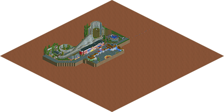
Park / Cape Royal Rocket
-
 10-October 21
- Views 1,427
- Downloads 224
- Fans 0
- Comments 6
-
Description
Mostly finished Design attempt. Submitting non-competitively.
-
No fans of this park
-
Download Park
224
-
Objects
228
-
Tags
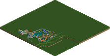
So first of all, I think it's relevant to mention the saying "you eat with your eyes first" or, to say it diferently, presentation matters. I would advise you to always call the save file you submit something presentable instead of just "cape.royal.324" and obviously blacktiling would have helped in the same way.
I am also saddened that the park has a couple of lazy bits which I don't get. Surely you could have added the missing path pieces and finished the bathroom in half an hour before submitting, even non-competitively.
Some of your architecture shows some promise (like the blue building flanking the entrance), while some falls, quite literally, flat. The layout is decent enough, but it feels more like a supporting ride in a park instead of a centerpiece of a design. The flat ride is nicely set-up but sadly doesn't work. But good on you for trying.
I think it would be best for your RCT if you sat down and focused on building a small park. Design-attempts are usually not all that conductive to skill increase.
I think 'mostly finished' is not what i would call this. There is a small woodie with an uninspired queue and station squeezed into a corner of the map and then some architecture that features some nice interesting and unique ideas, but i totally dont get the composition of it all. I think it would help you a lot to look more into realistic parks for inspiration or look into some of this site's best to get a hang of how to place your stuff with care and effort, so that the whole picture comes together.
The Red Baron flat ride was my favorite part of the map. I think it was quite solid. Foliage and backstage area probably was the worst part for me. Sadly this is probably one of the saddest foliage ive seen for quite some time here, couldnt have taken you more than one minute to make it.
All in all i think you show some potential here and there, but there is definitely still a lot of path to go for you. Im sure if you keep improving and looking for feedback and listening to parts of it, you could produce something quite good.
Interesting since this was heavily inspired by a real park. But oh well, there's a reason I submitted non-competitively.
I completely disagree.
I meant it more towards realism rct parks and recreations than existing parks in real life.
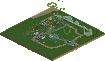
Coaster:
- Layout is solid. Smooth, well-executed, classic out-and-back woodie. I enjoyed it. The virginia reel station track is a very nice detail.
- Queue is solid, station is mostly good, but would suggest reworking the wooden texture of the base; some 4-high wall textures or a lattice structure would be a much more pleasing look.
- Trees are crowding the track and queue pretty aggressively, definitely encourage you to give your work more room to breathe and the viewers more room to look.
Flat Ride:
- Pretty great, would be a good concept to include in future projects.
- Foliage needs more clumping and density, right now it feels like it was measured and placed in exact locations. The most aesthetically appealing approach is to create sporadic dense patches of foliage to appear naturally grown. If these plants were placed there by the park as a planter or something, I would suggest adding a mulch/dirt texture underneath to really show them off.
Entrance:
- Light blue section is really enjoyable. Good use of layering and adding shapes without making it feel like layer cake.
- The flat brown sections could definitely use a different texture so it doesn't blend into the path as much.
- Your cube corner trims are pretty bulky and distracting, I would look into some objects that are a bit smaller and more detailed for this purpose.
- Green side is also solid, but would proportion the white roof brick path structure differently, it doesn't really have enough room to be a queue line, which is what (I think) you were going for.
- Path cracks would work if they didn't highlight the game's grid (not your fault). Would go hunt for a park with some path cracks/markings and adapt different objects for this purpose. Maybe something a bit more subtle, you can always stack them so it's more detailed/heavier, but a very visible object is harder to integrate/make subtle.
Main St:
- Good color variation. Middle buildings are quite solid, the two red buildings could definitely use more details.
- Would encourage staggering your buildings to make the structure less linear and make each building stand out more. Doesn't look as nice when building on a straight line because of the iso view.
Honestly solid overall, would be an enjoyable piece of RCT should you choose to continue. I hope you take everything I said above sincerely, but with a grain of salt. I'm only trying to offer my opinions on what I enjoyed and areas you could improve. I'm not attacking your work in any way shape or form.
However, arguing with people who are trying to give you constructive criticism, as I've seen from you, is a poor way of responding to it. Half-listening is what I've personally learned to be the best approach. Obviously you have a vision for what you want your work to look like. However, a lot of people could have good advice you can incorporate so it turns out even better.
You should learn to take some of the ideas/feedback, and instead of immediately disagreeing, try looking at your work and thinking why they might point out specific things. It's possible you figure out how to make your own work better because you look at it with a fresh perspective.
It's a nice map, and much more than a 'good start'. I wish you finished this and submitted it, competitively or non-competitively, but as a finished product. I took two minutes to plop down some trees and fill the void with blacktiles, and it's already halfway there!