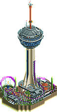
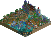
Park / Cape Canaveral's Galaxy Tower
-
 15-January 23
- Views 5,039
- Downloads 170
- Fans 4
- Comments 39
-
4 fans Fans of this park
-
Full-Size Map
-
Download Park
170
-
Objects
1
-
Tags
Similar Parks
-
Emperor of the Forgotten Realms
-
Epica
-
Happy Valley Hangzhou
-
Time's Arrow

-
Monstrocity
-
The World of Tomorrow

Cape Canaveral's Galaxy Tower (1): I think the shape of this park is really ambitious and interesting! The structure itself is unique and even with how tall It is compared to the other elements it is cohesive in how it transitions. I also liked the elements that made it feel like a park with the admission gate as well as the landscaping on the edges. The coloring was also a big selling point for me, I'm a big fan of the bold colors (purple coaster!) against the green landscaping. And the inside of the top of the tower was so fun! A lot of details in there that I really appreciated. Great stuff!!!
Batman - The Killing Joke (2): So cool!! Such a large amount of detail in this park and a great amount of narrative. The comic was a really cool addition but this park was so great it spoke for itself! A bunch of neat tricks that made this park very fun to view. The details on each building floor were so intricate, I was very impressed.A wild color scheme but I think it worked with the concept. Looking forward to more cool concepts from you!
Treasure Hunt (3): I thought this park was really cool and especially liked the way that this coaster flows through the terrain & and the terrain building in particular is really well done. The beige/browns of the land against the orange coaster isn't the most dynamic color-combination but I think the colorful elements throughout the park (umbrellas, plants) help to balance this. Great entry!
Out of this World (4): I think that sticking to such a strict color palette is a really unique challenge and yet you still have such clear and distinct elements. I like the way that you incorporate ride and coaster pieces into this build, it definitely enhances the architectural elements. A super unique vibe in comparison to other MM4 entries. Very cool park!
1. Pants - An impressive tower with a very cool coaster going around it. Imo I think the top part looks a bit too big for the structure under it but thats a very minor complaint. love the fountain the queue line very well done!
2. Iretont - f*ck, I hate how good this is. So many great details in here that the park does not need a coaster. It really has the Iretont finals touches to it. This is my number 1 for the round no doubt!
3. RWE - Amazing to see how the coaster goes through the temple and has this big turn around. would love to see an actual treassure somewhere.
4. Awesome to see you joinend the contest! Very bold choice of colours but thats something i always liked about your work. I hope you have fun experimenting with CSO and next contest you can come in guns blazing!
1) Batman - The Killing Joke by Iretont
-Concept:+++
 But great concept, colour scheme, architecture, little ride movements, inside cutaways(/cutaway view) and especially the custom music!
-Content:++
-Quality:+++
Overall; Recently been watching this new Batman movie, so I'm totally into the Batman vibe again
2) Cape Canaveral's Galaxy Tower by pants
-Concept:+++
-Content:++
-Quality:++
Overall; Man, I would LOVE to ride those rides you nicely created here. Nice concept and the execution of that concept is done really well.
3) Treasure Hunt by RWE
-Concept:+
-Content:+/-
-Quality:++
Overall; Very nice atmosphere you created here. The nicely paced coaster fits so well into the environment too. Lacks a bit more content though.
4) Out of this World by RaymondL
-Concept:+/-
-Content:+
-Quality:-
Overall; The colour scheme was what held this back for me, too monotonous and not jelling that well. The concept also wasn't very clear other than 'coaster going through a building in space'
Bah I found this the hardest round to vote on.
RWE – Beautiful park, the music, the path interaction, how the coaster swooped through the area. If you had a full scale park of rides built in this vast level of theming, It could potentially be a game changer. I'm very, very fond of this composition, you should be super proud.
Iretont – My first place choice and for good reason. It encapsulates all the elements I love about your parkmaking. The work you do around a release to ensure you nail the theme is extremely commendable with the perfect timing on the music, the CTRs added throughout and then the inner workings of characters to set the comic book version alight. I'm very, very fond of your work and now you finally have that big solo release so everyone can see how good you are. I would love to see you hit the top four. Good job buddy.
Pants – All the pants magic in one tiny micro, there was a lot to look at here and we saw glimpses of how your parkmaking has evolved from Disney Earth. The structures and rides were really commendable in the space you had and your coaster choice was super modern. I love how the elevator, drop ride and coaster all interacted (and had purpose) with the sky dome. Super clever building. If you get to round 2, I want to see the pants taken off! Go nuts... don't hold back etc. II think you'll find yourself in the top 4 if you do so.
Raymond – Great to see a release at NE, loved everything you were doing with the park. I think you just came up against three very good parks. Can't wait to see more of your work. Great colour palette you had going on and custom rides as the floating city element. Lovely stuff!
2. Pants, not the most original MM idea, but you did it to near perfection. Great coaster and details.
3. Raymond, it's a really good entry and clearly a lot of time went into it, just in a group with two outstanding entries in your way.
4. RWE, a lovely entry, just generic imo which is not a good way to go in a contest like this
Very nice showing from group B, maybe second only to group D for strength.
Pants: We’ve seen a few Stratosphere Tower inspired micros over the years, but this has to be the best. Proportions are pretty good, and it has an interior that is pretty fantastic. Of course, not including a coaster makes it a bit easier. But by no means easy. Coaster is nice and somewhat Vegas-esque, reminds me of the old fishhook coaster concept. Ground floor stuff is flawless. I’m liking the modern architecture and details like the custom lamp posts and the planet sculpture. Good stuff, pants.
RWE: You were so quick to submit, and maybe you regret it now that you’ve seen the opposition in general. But this is by no means a bad entry. It’s probably the most modern looking thing you’ve done, with the curved paths and the palette and stuff. I’m loving the colours and textures you chose. The style of the architecture is tasteful. Feels like this thing belongs in a real world park a la Phantasialand. Well done RWE!
Iretont: I didn’t expect much from this at first, a relatively (but only relatively) crude looking building. Without any rides visible. But I was wrong, this is an experience! Rotating the view to reveal all kinds of things happening as the music turns ominous was awesome. With the interiors and the object usage in general you’re indistinguishable from someone who has been building in the NE traditions for much longer. I’m impressed. The little bits of landscaping around the waste pipe is one of the things that stood out to me most, funnily enough. And that was before I spotted the alligator, nice detail. Some of my favourite details are the restrooms and the pool table. Loved dissecting this map!
RaymondL: I agree with some of what the others said, though I don’t mind the colours. This entry needed some more detail and a more clear concept to compete with the others. It was also very glitchy for me. On the other hand, I appreciate the experimentation with objects, and the movement you added with smokestacks, cogs, and of course the ferris wheel! The glass elevator was also a nice touch.
Cape Canaveral's Galaxy Tower by pants
Wow. I love your style mate. DisneyEarth was amazing, but you found a way to take it even a step further. And you added interiors. How cool is that.
Treasure Hunt by RWE
This is a nice micro. Fun layout, nice composition. The backside, especially around the launch, is just too brown and lacks some contrast. I think this micro, though fine as it is, could have benefited from one or two spicier colours in the mix.
Batman - The Killing Joke by Iretont
ACE Chemicals looks great. Really liking all the little references. This pooltable is perfect. The music really adds to the atmosphere.
Out of this World by RaymondL
Alright, let me first get my sunglasses. That’s a lot of bright whites. Even though I probably lost 20% of my vision watching this park, I do like that you went with a specific style and took it all the way.
1. Iretont, wow. That evil laugh just finishes everything off perfectly. The syncing soundtrack with all the stuff happening is so cool, awesome. On top of that we see this amazing structure with detail in all its places. Big winner here for me.
2. Pants. Your architecture doesnt ever disappoint. That station building is the true showstopper for me , though. I wish the ground level wasnt glitchy in places. Very impressive build.
3. RWE. The way your coaster interacts with the landscaping here is great. I like how the temple is nestled into the mountain. Loving all the secret viewing areas too. Coaster is a tad fast over that first airtime hill maybe. Excellent soundtrack.
4. RaymondL/Levels. Impressive structure. Colour scheme is bold, and bright. Some more refinement in places would have boosted this up, but I really like seeing you take on a challenge at NE.
Iretont: pretty much everything that a great micro stands for in my opinion. clear vision, with every little detail contributing to convey it to the viewer. i have high expectations as to what you will bring to the table next!
pants: this micro displays your architectural and compositional skill very clearly, the way the coaster interacts with the tower is awesome! the coaster layout is also really cool and convincing, such a blast to see it run through the circuit.
RWE: a very well made map. i especially like the way you embedded the pyramid structure into the rockwork so seamlessly. The layout is a tad fast in the beginning and perhaps a bit short, but it interacts with the environment well and provides a wonderful color pop with the orange track.
RaymondL: also great. this park grabs you the second you open it due to the stark contrast between the void and the structure you've made. i especially like the smokestack because of how simple but effective it is
I could tell there were lots of details going over my head in Batman. I couldn't really figure out what was going on, or why the Joker ride was a maze that didn't seem to exist and no one was on (so couldn't tell what set piece it was supposed to be tied to). But, the sheer amount of stuff happening was insanely impressive.
Galaxy Tower easily gets my vote. Love that it feels like a mish-mash of Speed and the Stratosphere in Vegas. The use of a train that lacks sprites kinda sucks, but seems like that's the order of the day right now with these new pieces. Oh well.
Treasure Hunt was a solid map, but the coaster felt out of scale for it. Too big, too fast, train too long. The big setpiece drop was neat, but the far side of the map looks like there was something very obviously planned to be there... that got cut when you realized you were over on tile count. Makes the map lack a bit of balance.
I liked Out Of This World, but it didn't seem quite fully formed beyond the extreme color aesthetic. Hard to tell what is going on, even with cutaway view.
1. Batman Playground - The outside of the building is great for starters. But its the detail that pushes this over the edge for me. Its busy but not overwhelming. Batman logo and Car pulling, up guy drowning, blackjack and forklift driving are the kind of things that add character for me and set this one appart
2. Booty Hunt - When I imagine something I want to build in my head, it looks something like this. You nailed all the things I love and strive to be better at. Fantastic rockwork, path placement is perfect. Placement of launch track beside the queue line is perfect. And the big drop clearly visible from the path to its right, diving down into the water flanked by fountains is park making at its finest. Huge fan.
Baby Stratosphere - It hurts me to have this in 3rd. I love Vegas, have stayed there before. The Coaster concept is perfect, executed perfectly. Great colors, I cant fault anything, wins so many other groups for me. It just a preference thing, I like the other two slightly more.
Space Snow Apartment - Great color scheme, love the bobsled track for the rounded shape. Propeller is cool.
pants / Cape Canaveral’s Galaxy Tower – Lovely, clean structures, and a clear setting. Cool coater colours (I’m always impressed by contrasting colours that still compliment the scene) and very authentic surroundings with the manicured planters and deco.
RWE / Treasure Hunt – Pleasant little area, with the coaster interacting well with the terrain and structures. Good job on the smooth, rounded balconies and viewing areas too. Personally though, I felt that I had seen everything fairly quickly, so would’ve appreciated something more to explore… a treasure hunt for the viewer too. But still, a well composed submission.
Iretont / Batman–The Killing Joke – Absolutely brilliant. I’m not a Batman fan by any means, but I loved the structure you created, the movement throughout, and of course, the incredible storytelling and synchronicity. I don’t think I’ve ever restarted a park more than this, in an attempt to witness all the little details and actions going on. This park is exactly what I was striving for, but dialled up to 11. Well done.
RaymondL / Out of this World – The propeller was a neat feature that sold the ‘floating fortress’ idea effectively in my eyes. Nice flow on the coaster, with the half loop spanning the levels being a good focal point. Bold choice with the colours (and with my screen always in nightmode I know it was already softened), but fitting for the sci-fi theme, and I thought the tracitecture walls and piping was done well.
I voted: 1st Batman, 2nd Galaxy Tower, 3rd Treasure Hunt, 4th Out of this World
Match
Conclusion
The poll is now closed. The formula to derive the results is:
As replacement, RWE is invited to submit a park for Round 2 (QF). If there is a drop-out their micro will be chosen at random as replacement.
Iretont: Amazingly timed storytelling, great atmosphere, tons of small detail and fun things to discover and explore. Amazingly presented entry overall.
Pants: A great centerpiece tower and a fun take on a coaster built into a tower. Supports and station at the bottom are well done too, and the detailed interiors added a lot as well.
RWE: A nice layout with some good interaction with the terrain. I like the rockwork and ruins, also the overall shape of the map.
Levels (RaymondL): A cool big structure, nice to see some "DKSO" building methods applied to a MM entry.
I thought RWE's was the strongest of this matchup. I appreciated the graceful composition and the way it all supported itself.
Pants was strong, but the height of the tower relative to everything else meant my attention was divided.
Iretont had a nice narrative and architecture
Raymond: Loved the colors and style here, I just unfortunately liked other things more!
Pants: Lovely entry. Very well polished and I like how you made the tower look good without having to rely on very excessive detailing. It all just looks very clean. The coaster was cool too.
RWE: I really liked this entry, the coaster was cool but I felt like besides the coaster it was lacking density a bit. Still a good entry though.
Iretont: Also a very cool entry, if I had to really choose this could have possibly been my nr 2 spot. I like the story element and overall everything was well put together. I was just missing a ride of some sort, I know that is not really required for a micro but it could have pushed it over the edge for me.
Raymond: Also a very nice entry. Love the style you got going on and I am a sucker for themes like this. I liked the coaster lift through the glass, thought that was a nice touch. Hope to see more work from you in the future!
Otsdarva Offline
Out of This World - RaymondL

I like this for its experimentation with strongly contrasting and limited colors. It somehow feels lifeless, even with the moving gears, smoke objects and ferris wheel/watermill and the rotating machinery at the bottom.
I think if there was a clearer, deeper message about the theme, this could leave a more lasting impact.
Treasure Hunt - RWE
Aw man, I love this theme's execution. It looks like a classic 'design' micro built around a rollercoaster in a theme park setting. There's lovely views from pretty much every angle. The rockwork is super smooth, and this palette definitely helps with that through its browns.
With so much brown, I think the gold and purple bits definitely helped. I also love the areas with the curvy paths. That whole combination of railings, brick edges, the umbrellas and tables, and a coaster going above or besides was beautifully cozy. Those sections were my favourite part of this.
One thing the browns made difficult to see was where the pyramid has flat slopes downward just below the coaster, which also goes downhill. It seems as though it's supposed to be a flat decline, but the color is blending so easily with the walls near the water and it makes for a confused impression of what that part is. Perhaps it needed a darker/lighter shade. I'm so late reviewing this that perhaps it's been mentioned already.
I suppose in a competition setting, it'd have helped if there was a twist on this theme, since we've seen it done many times, RCT or otherwise.
It's probably just me who is unable to notice, but it's shocking that the level of competition has risen so much that an entry like this only got a score of 10.5. I wouldn't wish for anyone to drop off, but I sincerely wish to see what you build for R2 regardless of whether it's used! Also looking forward to the expanded map of this
Cape Canaveral's Galaxy Tower - pants
The micro detailing here really hooked me in. The clean execution helps the experience so much, and allowed me to go into higher zoom level to fully appreciate it. Staff as easter eggs are always a plus too. Also, it was quite pleasant to see some degree of interior work on that tower deck! It's already a lot of work that went into making this for sure, but I imagine a full-blown dedication to the interior work would just take this to the next level for me.
It didn't quite leave much of a lasting impact on me, however. Partly because while it's clean, there's not much there to see for me personally on a micro scale once you've scanned through it once. The tower is on a significant height with not much to look at there in contrast to the bottom. It's not as content packed as it seems at first.
Overall not much I can describe other than that, really! The execution really takes it here overall. Oh, and the coaster is pretty neat too! I'd love to ride it.
Batman The Killing Joke - Iretont
Wow. Wooooow. The sheer content here to discover. Entire bathroom stalls and wash basins; a whole lobby; office cubicles; blackjack tables and slot machines; a chem lab where scientists are injecting Bane with venom (love the green and red bottles everywhere!); the super villain meeting with the pool table next to it - it was all a marvel. Enough has been said about the bat signal by now but what an idea! Ideas-wise, this felt like a condensed H2H map. Or a small portion of one.
I think the outer building face was architecturally weak in its detailing in the parts which are meant to represent a more modernist brick building, but when it's holding such a packed interior within it, there's not much I can knock it for. It'd simply enhance this even more.
Overall, such a fun micro which represents quite a lot of what I find great about micros. It shows confidence for not incorporating a coaster and still taking the comfortable win. Truly worthy of the praise it has received from the community. Extra praise for picking custom music that instantly took me into the Batman universe. I intend to revisit this one many times in the future.
---
If I could have voted before time, I'd have gone with #1 Batman the Killing Joke.
#2 is so incredibly close for me, but perhaps I'd lean Treasure Hunt. It's composed beautifully and I find it holds my attention more, even if the theme is a standard affair.