Park / Platform 117
-
 28-January 24
- Views 1,244
- Downloads 90
- Fans 3
- Comments 10
-
-
 76.00%(required: 65%) Design
RWE 85% posix 80% Terry Inferno 80% Xtreme97 80% Babar Tapie 75% bigshootergill 75% G Force 75% Liampie 75% Recurious 75% Scoop 75% Cocoa 70% pants 70% 76.00% -
Description
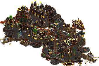
Platform 117 is steampunk inspired floating ship with a heavy emphasis on electricity, airships and light effects. Special thanks to posix for helping me for early reviewing the design.
Inspiration: Le Coeur Du Ciel, The siege of Frostgard -
3 fans Fans of this park
-
Full-Size Map
-
Download Park
90
-
Objects
1
-
Tags
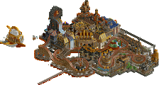
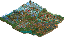
Incredible theming, I’ll begin with that. Pathing feels impeccably organic for how RCT’s grid-like system is. Architecture is outstanding. My favorite moments are the bits of curved glass and the back to the station. The face of the building is gorgeous. Perhaps the best area for me is the marketplace. Doesn’t have the same kind of wow-factor as the larger structures, but the little details add this overflowing vibrancy the map is already oozing with.
Two other highlights remain the airships (incredibly well put together) and the giant lamps. Golden light seems to be a binding element in your build, so seeing it extended to the windows and to the actual streetlight lamps is soothing to my eyes.
The map is on the smaller side, but there’s quite a bit of movement that keeps intriguing. Of course, none of it is visible with just the screenshot, so actually exploring left me with many pleasant surprises. The chain mechanism for the coaster? Love seeing that. The propellers are a classic steampunk trick, and well-incorporated. The coaster does a wonderful job navigating the space. Cutbacks are good, but I think the shining moments are when it dips under the platforms. Gives it a bigger scale than what we actually see.
While many of us are happy to see this park as a grand release (as am I), I am most excited for what’s to come. Because here, you’ve shown us that you can produce a killer layout. Put that technique in the hands of a scenery master, and it’s game over. My final score: 90%
Sephiroth Fan Offline
Look at you go Mulpje. Can't wait to sit down with this in-game and give it a good look.
When looking at this at first glance, it's easy to imagine the influences of Coeur du Ciel. You have that same vibe of palette going with its general nighttime colors, and going for those similar colors for the industrial archy throughout. There's also the hill drop for the coaster with the chain tracks, which reminds of pac's coaster in a good way.
But to only remember that first glance would dismiss much of what makes this unique. My main thought looking at it was, wow! this is so animated. There so much in motion - the chimneys: one spewing fire and others mist and fog and smoke; all the various sorts of lightning, which particularly helps imagine this as a viable place: it's high up, so no wonder the source of energy is to collect some form of lightning and static charge; and I especially love the Jules Verne-esque flying ships. They are at a very high level of quality detailing, and not having them would take so much away from the theme. I also find the archy to be quite nice overall. It is unique and adds a personal flavour that helps this creation stand apart from your influences.
In specifics, I loved the one curved path lined with markets, the color it adds is very valuable to this. The curved glass usage throughout is great too. Also love the arches in particular, as used here:
You mentioned in the Discord chat that the huge lamp lights are meant to help guide the flying ships and I can totally consider that. They are gorgeous looking, and they help consider the believability again!
One thing I feel hung up on is, some bright amber/orange color in the palette would have made this even more visually pleasing, when used to vary the lighting effect a little. At the moment, it has a very dark atmosphere - nothing off with that - but it comes with a crushed palette, brightness-wise, some occasional depth in color here and there would make it more visually interesting. From afar, there's depth in the dark colors- you have browns, greys, rusty reds, dark greens; but on the other side it's all one shade of super bright yellow to contrast. It helps with readability honestly, but with a map of this small scale, some more depth/detail can only go towards improvement I think. This is entirely subjective in my thinking, and so more of just a wish for further refinement in your vision, such that this could become a non-nitpick to my own personal taste.
I don't miss some music here, but man, a link to Spotify/YT would also have made for a wonderful first-viewing experience too!
Also wow, shoutout to @bigshootergill for that logo haha, that looks gorgeous.
I like it a lot, architecture is solid and of course the light rendering is great! The flying machines are very creative, with a special mention for the diagonal ship. These big lanterns are very well designed and add a lot to the theme and atmosphere. The sparkling effects on the lamps are such a simple but clever idea!
A few personal suggestions: it sometimes lacks a bit of life, perhaps more banners to highlight these superb facades. I don't know if your palette is your creation, but adding bright colors like blue, green or red could bring variation to the lights.
(edit : I see that Ziscor suggested the same idea, sorry for parroting)
Very cool design, totally up my alley! Actually something I feel like I would have liked to build. Love maps with lots of movement and animated objects. Great take on floating steampunk, you took this common theme and gave it your unique patented Mulpje twist.
I think this obviously takes extremely heavy inspiration from couer de ceil, which is great but does take the novelty factor one notch down for me. Otherwise, I love the tesla-era twist on the themeing and the bubbly glass boats and props are all excellent. Would have loved a tad more height variation for the path layout, especially considering its all floating anyway (tbh, had the same advice for couer at the time!). the layout is good, perhaps a little too close to a IRL megalite considering the otherwise fantasy setting. But still a fun romp. good work, and great atmosphere most of all
This is an incredible design, Mulpje. So inspirational. It feels almost very AVC-ish in a very good way. I really enjoy the overall tone and atmosphere. The layout is quite solid, i agree with cocoa i wished it would be a bit more fantastical. Also height variation is a good suggestion, especially on a small map like this and with all the floaty stuff around i feel like thats an aspect you could have explored a little more. All in all as said an amazing release that for me proves once again why you have that green name. Keep it up, Mulpje!
Didn't think I'd be the low vote on this so figured I should explain my vote.
The Cœur du ciel inspiration was a main motivator in my score. I like the idea as an exercise, building so closely off the concept of a previously produced map. However, concept is a big determining factor for me and with this it's impossible to separate your choices from the mother map of Cœur. This is clearly built at a high level, but the 1:1 parallels, especially with the multi-dimension coaster propellers and the coaster type/colour scheme put this more at the level of fan art for me.
That being said, I'm always excited to see new work from you, Mulpje! Almras Telrunya was so exciting and innovative that I don't doubt your ability to push the game forward with your ideas and execute with great detail and care. Can't wait to see what you do next.
Congrats on the design! I think I share pants' sentiment. Bit of an homage or fan art piece to me and thus I struggled to vote on it. I think the layout is nice and has good interaction with itself and this floating steampunk city. What I enjoyed the most was probably the various vehicles scattered about.
i really like this, super high quality stuff. theme is great, obviously a lot of inspiration taken but there's probably enough of a twist that it comes off as homage rather than copying. not sure whether it's a limitation of the pallette, but i do wish there was more color variation - it makes the whole map feel very samey and ultimately cuts short my interest. even changing the coaster color to something that stands out a little improved the experience for me, and i wish some of the buildings had their own little flair to give me more to look at from one area to the next.
still, i'm not very familiar with your work, honestly, but I cannot wait to see what you come up with next. great stuff!