Park / Palm Island Resort
-
 21-April 24
- Views 1,478
- Downloads 103
- Fans 0
- Comments 7
-

-
-
 Levels40%
- lowpoly surf30%
-
 monsterbux30%
-
-
 64.50%(required: 60%)
 Silver

In:Cities 70% Recurious 70% Scoop 70% Terry Inferno 70% Camcorder22 65% Cocoa 65% ottersalad 65% RWE 65% Xtreme97 65% chorkiel 55% CoasterCreator9 55% posix 55% 64.50% -
 Description
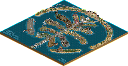
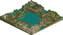
We had to make a world wonder park for the first Park Creation Contest on the DKMP server.
I chose the palm islands (Palm Jumeirah).
With the hotel "Atlantis The Palm" as a eye catcher to make it a realistic park.
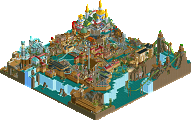
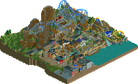
All the leafs had another theme. Space, Pirates, Candy, Egyptian and even a Steampunk.
Some other islands are still under construction with a big harbor and even with some activists to slow down the build.
Slide trough a tank with sharks, take a relaxing tour with the monorail or take a amazing helicopter tour. Diffrent coasters and rides will make it a plessant stay on Palm Beach Resort.
Big thanks to Monsterbux and Lowpoly Surf to make this thing happen and finished on time. -
 No fans of this park
-
 Full-Size Map
-
 Download Park
103
-
 Objects
1
-
 Tags
Tags
![park_4217 [H2H8/8] MS Office Suite 2003 Resort](https://www.nedesigns.com/uploads/parks/4217/aerialt3972.png)
This map is a blast. Everything is so well done here. I'm a big fan of the three of you, so it's really great to see a park of this scale. Overall map shape is excellent. Immediately recognizable as to what it is, and lends itself perfectly to showcasing so many themes.
Lots to dig into on this park, it's almost overwhelming. DKMP contest parks tend to get a bit of flak here on NE for usually being small map sizes - that's certainly not the case here. I hope to see this garner a bit more attention, because there's absolutely a ton to see here.
Congrats on the great release. Always happy to see new work from you all! This is a really special map, and you guys should be proud.
Josh
love the use of those icy tipped wooden fences as waves. very clever trick
+ wonderful macro, leaves such a cool impression. One of my all time favourites.
+ the hotel at the top of the map is so lovely, especially given the limitations of the bench (this is DKMP, right?) only thing that could have been a minor improvement is some land edge is visible inside the arch
+ great innovative flat rides throughout
+ greenland is my favourite area. Arctic Jet is so cool and the buildings have wonderful colours here.
+ project space time is right up there too, great theme and lovely dark ride
+ King Palm is a great ride for the theme and exactly the kind of thing I'd expect in a park like this and looks wonderful
+ The crystal palace structure is absolutely lovely - spotlight quality IMO for this workbench
- some areas felt a little lazy, Egypt has very little other than some temples
- I didn't understand the void area under the Baron 2024 area
- I think each individual arm of the macro clash too much with one another. I think the park needed more cohesion between each of its areas.
I hope this post shows I really enjoyed the park and gives you some things to build on going forwards. Great job all!
I agree with pretty much everything deanosrs said. There's a lot of creativity and fun ideas here, but the execution seems a bit restricted - a lot of that is due to the shape of the park itself, but that's a necessary sacrifice. I think the biggest thing I notice with regards to that is how compartmentalized and strictly delineated everything is. The quality in ride design and architecture is a bit mixed, but overall this is a cool showcase.
Overall, really interesting park. There was a lot to like here. Macro is nice, I liked the monorail in the center, the Scandinavian area was really well done..
Agree with the comments from Deano - the Egypt area was weaker than other areas. I agree that the void area was confusing, this was very realism focused until it was not. Doesn't seem that it was a practical reason for having a void texture here. And the casino peninsula was a bit weak as well. Very blocky and plain.
Still gave this park a 65% - again, a lot to like here. Some of the highs here are solid. Some pretty good ride design. Just a few areas needed another detail pass or a remake to really stick to realism or not.
Thanks for the comments guys, and for helping us to silver!
I do agree with all your points of critique, and I think the areas you mention certainly are a product of the speedrunning we had to do to get it done in time.
I'm so happy Levels brought us in to help on this project. Doing different little themes was so much fun and just what I needed at the time.