Park / Washington State Fair
-
 21-April 24
- Views 1,136
- Downloads 58
- Fans 5
- Comments 18
-
-
 84.50%(required: 70%) Gold
G Force 90% yes ottersalad 90% yes Terry Inferno 90% yes Babar Tapie 85% yes Cocoa 85% yes Recurious 85% yes RWE 85% no Scoop 85% yes CoasterCreator9 80% yes pants 80% no Xtreme97 80% no SSSammy 75% no 84.50% 66.67% -
Description
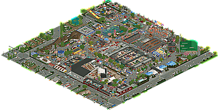
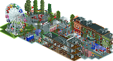
This is a semi recreation of the seasonal state fair held in spring or fall in Puyallup Washington. This fair features two rollercoaster that stay on the fairgrounds all year long but only operate during the season.
The fair has multiple stages, arenas, food courts, traveling rides & food, livestock shows, agriculture, booths, exhibits and art.
I decide to include past defunct rides as a way to show some more interesting content. I did have some map constraints by not being able to expand in a certain direction but I was able to fit pretty much all of the fair on to the map. I also had a little bit of fun doing interiors or stage shows hard to get those elements accurate.
Hope you enjoy was fun to make. -
5 fans Fans of this park
-
Full-Size Map
-
Download Park
58
-
Objects
2
-
Tags
I didn't get the chance to ride anything when I was there in 2010, sadly. I better go before the last two coasters close down.
I think something that is so cool about this is that it really has that genuine state fair vibe to it throughout. The vehicle objects kinda suck, but everything else is really, really well done.
For me without a doubt the best RCT you've ever produced. Amazing park here, with great texuring and amazing rides. You managed to portray the atmosphere of an American state fair perfect here.
One of the best parks we've seen in a long time. I think you absolutely mastered the style here and brought us a very authentic representation of this type of park. Despite how sort of chaotic everything is, it works really well, and is still super refined. Selfishly I wish there were a few more coasters but the ones you did were very well done and all quite distinct. The diagonal chairlift is a super nice touch and very well made, really impressive rgb!
Easy spotlight in my eyes, don't think there's a single moment where the immersion breaks for me. Plus, there is just so much content here, I think I'll have to spend a few hours really getting a good look at all the small buildings and structures. So glad you could finish this.
i settled on 85 yes, after considering just how long i actually spent in this park. honestly longer than most recent full scale parks---just so much to see. I spammed a lot of it in various discords so I won't rehash it all, but awesome work again
Incredible work dude. I think I will continue to come back to this park and find more little details. The level of detail here is quite impressive. I agree with Cocoa, there's so much here to hold my attention relative to other larger sized parks.
Some big highlights for me was just the overall usage of some maybe less conventional objects. Really gives a grittier vibe that is appropriate for that state fair environment. I also loved the midways and endless stalls. Fleshed-out interiors? Wild.
The coaster lineup seems appropriate for a state fair and I really enjoyed the layering to Wildcat. Good colors, great sign as well.
If Cook County Fair scored 83%, I see no reason why this can't surpass that by a decent margin. Makes me want to go to my county fair this fall for the first time in 20 years!!
Sephiroth Fan Offline
To me the biggest success here is that you made this feel like an inspired piece of RCT more than a recreation. Wow.
I spent a while on Google Maps comparing the layout of the real fairgrounds to your RCT map. And I'm just beyond impressed that you were able to take buildings and landmarks and pieces of the real thing and mold them into something that works so organically in-game.
I used to think recreations had to be a close to the real thing in every possible way, but over the years various releases have slowly changed that mindset, and this one is right up there. Such a great achievement, and it's releases like this that make me realize the end product is certainly better if you take the liberty to work with the game's limitations a bit (but also break the grid/create flows) rather than stay within rigid real-world constraints.
Great job. Looking forward to seeing the score on this one.
The amount of vision you were able to render onto the map is startling, and I feel I can say that without knowing the source material one bit. Last time you released a park I learned the word Geauga, this time I'm learning Puyallup. I love that you've developed a brand of US realism that really no one else can build. It's absolutely original and creates an access to RCT that feels new. I can't say I'm in love with it, but the skill involved is rather obvious.
An absolute gem of American fairground realism, I spent a lot of time just exploring everything here and found a great small detail or scene just about everywhere. Full of life and character, and I like the creative decisions like including past rides and the shadows throughout the park.
Also, some of the best fariground stalls I've ever seen, and I like how a couple base game stalls were worked in there and fit really well.
Congratulations on this roygbiv. It's one of my favourite releases in a while - aesthetically it's very fresh and unique with lots of unusual object choices and textures. Sometimes they stick out a bit individually but on a macro level it gives it a fun character and energy.
Also the general amount of movement and kinetics is wonderful with all the rides, flashing lights, flags and smoke etc. I thought scale was handled really well too - from massive stadiums to the smallest kiosks, everything looks convincing - and it's not easy at all to get this right on a park of this scope. Great job.
why would it only show a "2" for objects? There's a lot more than that
An amazing park! WELL DONE!
Wow, really close, I'm pretty bummed. Right up there with SFWoD for me in terms of near Spotlights that should have been. And 0.5% off of Elite Parkmaker too is just flat out unfair...
Little disappointed with the score and missing out on spotlight again but I wouldn't say its a surprise for me.
All time snub classic at the least.
But seriously this was so much fun to build and getting back into openrct with no object limits, expanded bench choices, 27 more colors to choose from was so refreshing compared to the past. Im pretty happy with how it turned out. I may post build process and ideas I had about it later but a little busy currently.
Thanks for your reviews and I hope you had more enjoyment viewing than displeasures.
Sorry to be one of the lower votes on the map, roy. The map is really good quality all round, I was more torn between the 80-85 score than on the spotlight decision but that'll be no consolation either given the final score. Anyway, this is a fantastic piece of work and feels like a natural pairing with maps like Mahoning and Cook County Fair.
I'll round up some of my favourite things:
- Individual rides were all really nice, especially the custom ones like the Matterhorn, Zipper, Zero Gravity, Atomic collider (super cleanly done) and of course the diagonal chairlift.
- The red and blue checkered chairlift stations are wonderful, great design.
- Stadium is really cool, nice focal point.
- Interiors of the exhibition halls are great, lots of fun realistic details that make the map feel more alive.
- Map is bursting with activity and atmosphere. Nailed that aspect.
A few things that held it back in my eyes:
- The big green-roofed diagonal building. Making the whole thing on a diagonal ends up looking like a big green and beige square and doesn't fit too well with isometric angles. Other instances of the diagonal buildings I felt were more palatable and subtly woven in to break the grid, but here it sticks out unpleasantly.
- The broken shallow roof style seen across a few buildings, particularly the entrance. I can see what you're going for with disused metal but I wasn't a big fan of the look and clutters up the rooflines.
Sorry if this sounds a bit harsh or nitpicky. Perhaps it clicks better with an American audience but either way it's really something to be proud of.
Sephiroth Fan Offline
Thank you Cocoa for the snub tag. Great collection of parks.