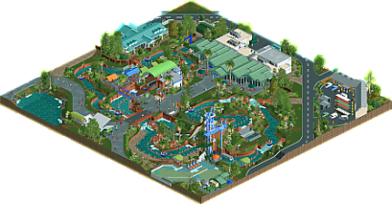
Park / Infinity falls
-
 29-July 24
- Views 1,246
- Downloads 188
- Fans 1
- Comments 7
-
 64.50%(required: 65%)
Design Submission
64.50%(required: 65%)
Design Submission
RWE 75% G Force 70% Mulpje 65% pants 65% RobDedede 65% SSSammy 65% Turtle 65% wheres_walto 65% Xtreme97 65% Milo 60% Terry Inferno 60% ottersalad 55% 64.50% -
Description
Infinity falls in seaworld orlando
-
1 fan Fans of this park
-
Full-Size Map
-
Download Park
188
-
Objects
1
-
Tags
Pretty accurate from what I can see from a POV. I like the way it's scale, there's some really nice details and it's got an overall clean style. Also like the color choices.
This was really good! Even though it is small there's a lot of good details, and just made to a high quality overall. Small scale but I think it is consistent and works well all together to make a nice product. I do think this is worthy of design consideration for sure despite not being a coaster, just really well done. The drop was maybe a little too fast though!
Excellent work on this! You've absolutely nailed the vibe. Really cool to see someone else's take on this rapids ride.
This park captures a sense of clean realism that is unique among other builders; it has a style I have not yet seen, really. The foliage was extremely enjoyable, as was the station building and the surrounding areas. I also like how this park has a commitment to a certain scale that's pretty small, but not *too* small. Great work! I really hope to see more of your work in the time to come.
Neat little recreation. Scale seems a tad small.. especially noticeable with the queue covers and what I assume is the lockers area? Hard to tell!
Probably could've used more foliage surrounding the ride itself.. it's decently themed/detailed with the ruins, the waterfall and the lift structure... but tends to have a bit too much bare grass and mud textures surrounding the ride.
Attention to detail in regards to backstage stuff is quite solid, and I appreciate the effort put into it.
I'm sad to see that this didn't get design, and by such a small margin too. This would be almost spotlight quality a decade ago. It could be because this is barely larger than a micro park, but I appreciate the compactness of it; we also always need more non-coaster designs.
With that said, there were some very minor elements of this that I was confused by, or wasn't a fan of... like the underwater supports, the top of the b&m support tower as it looks rather jagged; or one of the buildings touching the edge of the map. I'm also confused about the go-karts grill inside the larger building.
Overall though, this is a really nice and aesthetically pleasing map. The architecture is great, and I'm a huge fan of the backstage areas and landscaping as well. I feel like this could be a chunk of a larger H2H map.
When I cast my vote for this a year ago, I was not comparing it to the real-life ride but rather just observing it as a standalone RCT map. Now that I see look at pictures of the real Infinity Falls, I stand by my vote.
Your commitment to incorporating the realistic park details is excellent. The buildings are faithful to their real-life counterparts, your attention to backstage details are high, and you even included the lights around the ride, which is something that often goes overlooked even in hardcore realism like this. Path formations and overall composition work well as a whole, and you've used color in a way that feels very realistic.
I agree with Jaguar's assessment that this could be part of a larger map. It would feel at home in a full-scale park with different levels of verticality, with this being one of the areas to contrast such verticality.
But, as a design submission, it's missing something. This is a themed ride set in a rainforest, and yet, that part of the experience largely gets lost in the presentation. Without comparing it to its real-life counterpart, it still presents as a stripped-down version of a rapids ride that's realistically gritty but doesn't have any defining characteristics.
I think the key here would have been to amp up the foliage around the ride itself and giving it a more deliberately themed look rather than just having very small patches of it and surrounding the rest of the ride with bare grass. More emphasis on terrain texturing throughout the entirety of the map (rather than keeping it pretty much homogeneous around the ride and in the backstage areas) would have also helped. I'm always in favor of using foliage to shape bare grass to create negative space, but there's so much flat grass here that it doesn't really have a chance to take shape.
There's so much to appreciate on this map, and I do believe that it's a high-quality creation built by someone with a keen eye for realism. It was a very close vote for me, and I think the 64.5 score accurately conveys that it's a great submission that just needed a little bit more to push it over the edge.