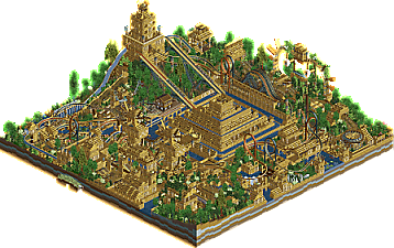
Park / City of Caracol
-
 18-May 25
- Views 467
- Downloads 116
- Fans 0
- Comments 18
-
- Johnson50%
-
Wessiesworld50%
-
 57.00%(required: 65%)
Design Submission
57.00%(required: 65%)
Design Submission
CedarPoint6 60% CoasterCreator9 60% G Force 60% J K 60% Milo 60% pants 60% Scoop 60% Mulpje 55% Turtle 55% posix 50% RWE 50% deanosrs 45% 57.00% -
Description
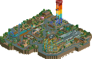
Created for Deurklinks Looping Coaster Contest, Ending up second place.
-
No fans of this park
-
Full-Size Map
-
Download Park
116
-
Objects
3
-
Tags
Always love to see a dueling coaster. I did feel some of the layout was a bit forced to shoehorn in some of those interlocking loops, but this is a pretty cool park. Congratulations on second place!
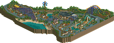
Awesome design. Love the macro composition and overall layout with the dueling lifts. I hate the bumpy flume drop. Colors are cool, if a bit monotonous. I understand what you're going for though, and I think it's largely successful. Great detailing throughout
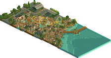
Cool map. The gold colour is very bold, comes across a bit gaudy but it's also a strong commitment to theme. I feel like at the edges of the map the shape of things gets lots due to the bright gold and texture overload. However some of the more clear set pieces such as the central pyramid and tower help anchor things. I do agree with CC9 on the layouts feeling a bit forced, though the first interlocking loop feels most natural. The foliage could use some better object choices to convey the thick jungle perhaps (the redwood sticks out for example).
Nice map, congrats on 2nd place in that contest. That was a tough one. I think the map is really cool, you did the theme mostly well imo. The gold is very strong and tends to overpower things a bit, although the darker blue water gives a nice contrast.
I think an interesting experiment could be to change the rails of the coasters to something different then gold to make them stick out a bit more.
For the layout i largely agree with what has been said already. But i do want to mention that i quite like the assortment of supporting rides here. They are a bit hard to spot, since they are also in gold, but otherwise very well done
Cool park! I like the atmosphere of this thing a lot. Honestly kind of reminds me of el dorado from H2H9. The pallette works well enough. I kinda wish you introduced some different colours into this other than the gold. Some pops of yellow, red, or blue would've been nice.
Foliage and Landscaping: I liked the landscaping in this project a lot. I've always had a soft spot for that NCSO volcano object being chopped up and used for rockwork. The big hills are also nice throughout. Honestly no real complaints about the landscaping.
The foliage was okay. The bushes need work for sure. A lot of them look like they were just spammed around with no real purpose. The trees are better, I like the objects you chose. I think some less dense areas would have been a nice breath of fresh air as well.
Architecture: I wasn't a huge fan of the architecture overall. It was all a bit too blocky and gold for me. The center piece is pretty well done but overall its just a bit repetitive. I think some separate areas with slightly different architecture styles would have done wonders for this project.
Rides and Stuff: I love the coaster layout and the flat rides. Really cool dueler, although it goes pretty fast through that first loop lol. The flume is also great and I love all of the other supporting rides. This structure was the highlight of the entire map for me.
Overall: I gave this a 65%. I'm glad I checked this park out!
I agree with most of the comments.
But when you work as a team, we had a great discussion about the points brought up.
So this is what we ended up with in the end.
and it was a nice work for sure
Some great highs, sometimes difficult to take everything in with the overuse of the gold. Really didn't take to the water colour, some great rides across the map.
I think coaster colours could've been something different to stand out more.
overall i liked this although there's a few things i'd have maybe done differently. the rides themselves are kinda what i'm weighing the most heavily as a design submission and i didn't love them.. they felt meandering without really having a key iconic moment. lots of little moments but overall didn't hold my attention too long.
i think part of this is the theme, where they're sunk pretty heavily into the surroundings, and the surroundings are repetitive and tough to really take in. very samey with the color and object usage meant that in practice nothing really stands out (apart from the central pyramid and the top of the lift hill, which both had room to breathe). i'm aware that this is probably the idea - city of gold kinda thing, but that's tough to make look good when the whole map is 70-80% that color.
some interesting object usage that i enjoyed and lots of content to look at. overall though i'd have appreciated more of a background color with landscaping/foliage/water and a little less of the bright gold everywhere to really highlight those parts.
For me there's a lot of skill here but the overall composition lets it down - everything is a flood of yellow. I found it tricksy to figure out what was going on and where all the rides were under all the scenery.
I think you guys have the skills down to score high, just some more planning at the start to design what the overall macro of the park will be like would be super helpful.
I enjoyed the bold colour in this and aesthetic choice.
Please remember that there were some limitations in these contests.
You can't just do whatever you want
The limitations of the contest don't discount what was stated in any of the criticism. I honestly liked the aestetic and think the color choice was really good here, but the layout is too obscured in a few places so it's hard to follow. There are some really cool moments of architecture too, but since it's all one color, it's very hard to find defined forms within it. I'm glad you had fun with this and you should be proud of it either way, but please don't disregard feedback like this, because it's valuable. We aren't against you, we're trying to help you meet your potential.
You are missing the point of this comment I'm affraid.
I agreed with most of the comments,
But some people do not know that there are limitations set and rules within these contests.
You can't just do whatever you want to do, with the strict rulings as placeholders.
I'm not a fan of these custom color pallets myself, They were chosen by my team mate. On solo projects you will not find any custom color pallets.
But the reason I said you can't just do whatever you want is that there were a set rules in how many maximum supporting rides, the map size, what your coaster was required to do, and what scenery to use. Those are limitations, wheter you like it, or not.
That's all. That is also why my solo projects are more free build and thought out. I'd like to construct them more like real life operational parks.
You also had only 27 days to build this, I normally construct my solo projects over 2-3 years.
Map size limitations and 27 day deadlines do not restrict a layout near as much as you're making it out to be. Everybody was given the same constraints in this contest, and there were coasters both fantastic and legible. Also, stop blaming your teammate when stylistic choices don't go over well with others.
Why would I care about external communities' contest regulations or limitations? If you're submitting the park here, we will look at it with fresh eyes. Nothing stopped you from working on the map further to undo any limitations before submitting here.
Cool map. From the aerial, i was concerned with not being able to make out the details but was pleasantly surprised. The colors for both the theme and the water are very bold but it seems work with the concept. Loved the timing of the coasters in the loops and the various statues. Not a style I could image building but still enjoyed the park. Nice work.