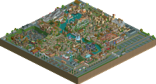
Park / [NEDC6] Met a Rebel
-
 27-April 25
- Views 0
- Downloads 42
- Fans 0
- Comments 24
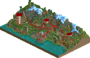
![Park_6127 [NEDC6] Met a Rebel](https://www.nedesigns.com/uploads/parks/6127/aerialm6369.png)
-
Description
A conflict between riders and a mysterious rebel. NE DC6 submission
-
No fans of this park
-
Full-Size Map
-
Download Park
42
-
Objects
1
-
Tags
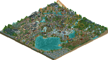
![park_6132 [NEDC6] Ramses](https://www.nedesigns.com/uploads/parks/6132/aerialt6366.png)
Never a shame to place last. Especially not when you have such originality.
Met a Rebel immediately stands out with its interesting theme and bold, unconventional art style. It’s refreshing to see a park that dares to be weird and leans fully into it. I especially liked the odd foliage choices – they fit the mood really well and gave the park a distinct, memorable atmosphere. My favorite part of the map was the landscaping and foliage underneath the coaster, which worked particularly nicely and created a strong sense of place.
On the downside, the map felt a bit bland and empty in some areas. While the theme itself had a lot of potential, it sometimes felt like it wasn't fully explored or pushed to its limits. A few more details or additional layers of world-building could have elevated the park even further.
All in all, this is a creative and courageous release. I’m excited to see where you go next with your style!
A very hard one to judge because the abstract nature of this is quite hard to take in.
+ What I will say is the foundations of your RCT is improving. The objects you’re using, the smoother shapes, the innovative choices for executing objects (like the spires used as the pine trees). There’s some good stuff in there, but clouded in an abstract tale that does nothing for a very simplistic RCT map.
- I don’t want to sound harsh but the output of RCT just doesn’t match the read-me. You have an intense theme you’re going after but I can’t pinpoint where the greater wealth slant or committing acts of violence points were present on the map (maybe the guy offering the coaster a knife on the dive loop?). It just go me confused, and I feel like I was spending more time trying to work things out than appreciate good RCT. An intense read-me paired with the simple map, kinda alienates me and I’m asking more questions than just appreciating an execution of a theme.
+ I’d love to see you tackle just a really normal generic theme that we see in the game such as a pirates theme, a medieval theme or a Japanese theme, something that the base objects can aid the theme execution. I think once the basics of parkmaking are nailed, your abstract themes will have a very welcome place in the game.
50%
Always like seeing different takes on the standard RCT look and feel. I never would have thought about doing this but I enjoyed looking around. Good job
I can tell there’s some bold, abstract ideas in mind here. I’d like not to see anyone putting the word “unfinished” out there - because this is pretty clearly a completed concept with a unique aesthetic. The aesthetic decisions are certainly out there, and successful in its own quirky manner. I think this suffers a bit from the “path surrounding park elements” issue; I’d have loved to see things integrated a bit more rather than sectioned off quite so much. 60%
Commendable effort here. Curious what some of the imagery meant or was. For example, after the MCBR, what were the black floating objects? The floating face was unique - a clear art style on display.
I think having more of anything on this map would elevate what you had going. For example, what is the Tower of Rich's, and why is it in someone's backyard? Having said that, the novel foliage and landscaping under the coaster was cool.
This is so different dude. Not in a bad way either, it's just so different from what anyone else is doing and I seriously dig it. The name speaks for itself.
+ Aesthetic is real funky. Trees are definitely the highlights for me, and of those the big ones with the ringed patterns take the cake. Also love the flowers made of the rounded blocks.
+ It's nice seeing you take your style to a full-scale design and work on that macro. Your abstract and simplified style has a lot of potential but it also needs a lot of those basic design fundamentals to really make it shine.
+ Narrative concept is really cool and I think it will separate yours from many of the other entries. Almost gives me a retro adventure ride vibe. Pretty ballsy too!
- Even if you were a little worried of the narrative turning some away, I feel like it could have been handled better than having it dip halfway through. Going back, rewording and changing themes as much as you're comfortable with (neutering yourself sucks), and having it last the whole ride would have made it work better IMO.
- As some have said, some bits do feel kind of unexplained. A good practice would be to design a park with this kind of narrative so it doesn't require a readme.
- I feel like it was easy enough to make this peepable. Not a huge flaw but a minor nitpick.
I like the abstract, made from building blocks landscaping and foliage, It's a unique style.
Architecture I think is a bit sparse, I think a few extra details, maybe some peeps and possibly going even more abstract in style would elevate it a good bit, to match the nice work done with the landscape.
Overall, very creative and I hope we see more abstract landscape work like that in the future.
I have to say, while this may not have scored particularly well... of all the teasers, previews, and predictions of this contest, the screen you posted of this probably interested me the most.
This feels almost like a pro-tour prelim park or something out of that era in that there are constraints, like the TT scenery, and a fair amount of rough spots but there's also style and a ton of imagination behind this. Outside of the RCT meta, this submission has a classic feel, it's like early modernist art that mixes a little dadaism with some cubism.
There is a lot to appreciate here... The color scheme is beautiful, and I like the diamonds, the geometric foliage, the coaster car that goes from gold to bronze, and the strange landscaping, but it's kind of difficult to comment on.
If I could offer one bit of advice, it's to keep being Ge-Ride and building Ge-Ride parks. Everyone else submitted some variation of a coaster in a park; you submitted a piece of abstract art, and that alone makes this a standout.
Ge-Ride has ever been an avant garde builder, so I am very glad to see that they have contributed to the contest. “Met a Rebel” is a singular experience within this contest, and is a breath of fresh air in many ways.
We open into an oppressive techno soundscape which contacts with the plasticy, false landscaping. The forms presented make me think of old PS1 classics such as dream simulator, where a more free form of expression conflicts with more concrete motifs such as contemporary suburban infrastructure to create an nauseating unreality.
I believe that the main viewing angle is “inside L”, where the cobra roll appears beneath the predrop turn. There isn’t a great deal done to properly integrate the ride, other than some cursory queue interaction. There are, however, many blocky vignettes along the course of the ride. These provide intrigue for the curious viewer, but left me a little despondent due to their skeletal presentation.
All in all, I enjoyed the bravery of this work, but the execution leaves me thirsting for more content rather than leaving fulfilled. In that regard it's commendable that you continue to insist upon it, and understandable that there isn’t as much stylistic work to reflect on within RCT than other styles to help you grow.
SCORE: 50%, but presented intriguing
Unique aesthetics here, what a cool way to do the foliaging and landscaping. But that's basically the only thing I like about this entry. Archy looks uninspired and not really matching the the aesthetic of the foliage/landscape.
This was a really cool entry and I'm glad that you took the time to make it! I appreciate the uniqueness to everything on the map and how wild everything looks. I like the bits of coaster interaction that you have in this entry. This little path interaction in particular is really cute and the colour usage is amazing!
Foliage and Landscaping: I liked your bold choice to only use that artificial blocky foliage. It makes for a unique feel for the park and is really like nothing I've seen before in the game. The light weird grass colour and the rolling hills also really add some character to this park. I do wish you added some sort of weird blocky rocks to add to the atmosphere a bit.
Architecture: The architecture was probably the weak point for me on this entry. With that being said I did really like this station building below. It felt very unique and classic and also used colour to its advantage.
As for the rest of the structures, they seem a bit under detailed and coloured a bit weirdly.
Everything Else: I kind of agree that the theme that you were going for doesn't exactly come fully across in the park. With that being said I really like the out of the box and bold theme that you chose. I always appreciate someone pushing the thematic boundaries of RCT.
Overall: A really fun and unique entry. I'm glad you spent the time to create this and I'm glad that I checked it out! I rated this 60%
This was different. Funny to see such a proudly realistic layout in this setting. I loved seeing it, and I love there are people like you GeRide who completely do their own thing. Just the level of execution falls a little short if you think of parks like the H2H Nintendo map which came to my head. Some of it is a little basic. But well done on finishing an entry, and on having your own dialogue with the game.
It’s unfortunate that there are no guests in the park, although maybe that’s the point of the map? I read the readme file, but I’m still unsure if I fully grasp the message of the park. I understand it’s something to do with classism, which is an interesting concept for sure, but I was left struggling to understand all the elements of which I was observing on the map. Everything does feel artificial, which is an interesting look. It reminds me of the Lorax.
This aesthetic was a fun idea, and it gave the map a lot of personality! Your story concept was also strong, but I had trouble seeing it come through on the map itself. In a lot of areas, the design felt a bit rough and unpolished, which made it harder for the theme and narrative to fully flesh out
Very interesting aesthetic, feels fresh in terms of RCT but somehow still nostalgic to me, as if ive seen something like this before. I cant pinpoint exactly why that is though. It feels a touch unfinished though. Also some stuff feels a little unfitting, like the regular queue lines and the large tower ride. They dont seem to fit the vibe of the park and take me a bit out of the somewhat trippy and interesting theme. Still apreciate the uniqueness here a lot and i look forward to more work from you!