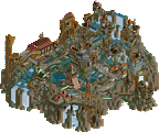
Park / [NEDC6] Met a Rebel
-
 27-April 25
- Views 0
- Downloads 43
- Fans 0
- Comments 26
![Park_6127 [NEDC6] Met a Rebel](https://www.nedesigns.com/uploads/parks/6127/aerialm6369.png)
-
Description
A conflict between riders and a mysterious rebel. NE DC6 submission
-
No fans of this park
-
Full-Size Map
-
Download Park
43
-
Objects
1
-
Tags
Similar Parks
-
Himmelfall
-
Lake of Lost Worlds
-
Spore Spreader
-
[NEDC6] Sugar Rush
![park_6131 [NEDC6] Sugar Rush](https://www.nedesigns.com/uploads/parks/6131/aerialt6367.png)
-
[NEDC6] The Metal Moss
![park_6130 [NEDC6] The Metal Moss](https://www.nedesigns.com/uploads/parks/6130/aerialt6376.png)
-
Attractiepark Valkenbeek
Struggled to score this one, it's just so wildly different from the others. There's something to celebrate in that, for sure. But ultimately I just didn't vibe with the theme or the aesthetic that much, hence my score.
Love that someone can have such a different approach to the game than others though. Appreciate that.
This is perhaps the most experimental entry so far, and while I can't admit to fully understanding the narrative behind it I can appreciate it still as a window for your storytelling. The hyper-cartoonish design choice is pretty cool and I quite like the blocky, artificial shapes for what passes as the foliage. The floating sculptures of menacing disembodied Rebels are intriguing also, but ultimately I don't think there's enough to go on for me to glimpse the full intent and the details are a bit basic. I hope you don't feel too disappointed with the score as I think you're beginning to make your ideas more identifiable within the game.
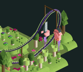
I quite like the dagger wielding rebel against the black backdrop:
I'm not sure I "get" this one as it feels a little abstract but it is fun. I feel like there are references here that I don't get but it stands out from the rest of the entries, and not in a way that is bad, just different. My favorite thing are all the trees. I'd give it a 45.
I too felt a disjoint between the way the park looked and the theme.
I was expecting something like Cirque Macabre and instead it had a bauspiel feel to it.
A lot to like and the trees and foliage were doing in a very refreshing way. There's a lot of promise here, it just ultimately lacked cohesion with the theme and needed some more tieration on some of the sculptures and storytelling.
I will respond to the comments in greater depth later but I have two things to explain first.
One is that the trains got saved wrong due to the finnicky ride editor. They were supposed to be a typical twister front piece, three floorless cars, three sitdown cars, and two standup cars in the rear.
The other is behind the disjointedness between the theme and the visual style. I was hoping I wouldn't have to spell this out, but the title is a play on words. Met a Rebel for the content, Meta Rebel for the style. That isn't to blow off any criticisms but I hope it makes a certain sort of sense.
Met a Rebel is an enjoyable and engaging map that leans into abstract design, allowing viewers to form their own interpretations of the story. While this open-endedness can be a strength, fostering imagination and replayability, it occasionally leaves the narrative feeling unclear. Still, the abstract, cartoony landscaping is a visual highlight and adds a lot of charm to the experience. Overall, it's a creative and memorable submission.
I just opened up this page to write down a few thoughts and read your title explanation ge-ride. It made this map a little better somehow. I may not really resonate with this style of building and I agree with many of the points made above, I do appreciate that you stick to the way you want to play this game. There's nothing wrong with that. There are a couple of things I do like about this map. The station's shape is very interesting and my favorite thing on the map. The trains, while they may not have worked as intended, I do like the concept you were going for and still came off well enough to recognize even without the different vehicles.