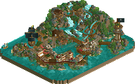
Park / [NEDC6] Mirage
-
 27-April 25
- Views 0
- Downloads 96
- Fans 3
- Comments 34
![Park_6137 [NEDC6] Mirage](https://www.nedesigns.com/uploads/parks/6137/aerialm6371.png)
-
 61.00%(required: 65%)
Design Submission
61.00%(required: 65%)
Design Submission
CoasterCreator9 75% SSSammy 75% posix 65% RWE 65% deanosrs 60% J K 60% pants 60% Terry Inferno 60% Turtle 60% Recurious 55% chorkiel 50% RobDedede 50% 61.00% -
3 fans Fans of this park
-
Full-Size Map
-
Download Park
96
-
Objects
1
-
Tags
Similar Parks
-
A Matter Of Perspective

-
[NEDC6] Sugar Rush
![park_6131 [NEDC6] Sugar Rush](https://www.nedesigns.com/uploads/parks/6131/aerialt6367.png)
-
Skullrock Refuge
-
[NEDC6] Paint the Town Blue
![park_6139 [NEDC6] Paint the Town Blue](https://www.nedesigns.com/uploads/parks/6139/aerialt6373.png)
-
[NEDC6] The Cartographer
![park_6140 [NEDC6] The Cartographer](https://www.nedesigns.com/uploads/parks/6140/aerialt6372.png)
-
Darwin Zoo Bordeaux
I like it quite a bit. There isn't much in the way of architecture but the landscaping, foliage and water is very evocative. You did a great job on the macro which is something I'll have to work harder at next time. I give it a 65.
A really sneaky speed build. I really like the station out of earth look; at first you parse it as land and then it pops up on you, kind of a less attention grabbing building. The island is nicely put together and the foliage density is expertly controlled.
Mirage is an enjoyable map that evokes a classic, nostalgic RCT feel that many of us can appreciate. Its tropical landscaping and realistic island shape bring the environment to life. The natural flow and attention to detail make it a standout, with its atmosphere being one of its greatest strengths. A great speed build!
Such a quaint little map. I didn't really register the fact that there were no "traditional" buildings until after I had moved on. As per usual, your macro is impeccable and the colors are really cozy. I know you mentioned that sometimes in game supports are all you need on discord, and I do think that some custom supports might have gotten you over that 65% hump. There's just something about them that create a level of polish that the base game doesn't offer imo. The foliage was nice too and clumped together quite perfectly where it needed to be. Well done especially with such a short build time. I'd probably be right on the money with a 60%
Similar to Milo's entry, really enjoyed the classic style and a dedication to Macro-oriented rct with this entry. I'm not sure I love the colors of the coaster in the context of this map, but I do think the aqua with the brown and almost clay color is a really interesting combo. Knowing you made this so quickly makes me wish you had more time for rct. The macro is so pleasing and sets up the map so well, but I can tell you just didn't have the time to finesse some of the finer details. There's a lot of great little touches, I just want to see you get the chance to really maximize that. Well done for a speed run though, very enjoyable entry.
I really like this! I enjoyed the neutral feel to the entire build as well as the sand castle as others mentioned. It looks like it was relaxing to build.
Of course I was secretly hoping for a higher ranking than second to last, but I did not build this to be competitive, and I think the score is more than fair, and I'm happy with the reviews! It's obviously a speed build. I had a vague vision that didn't come across fully, but the main reason for that is that a speed build does not allow for a lot of time for revisions and calibrations. The idea is actually very old, from around 200 9 when I was low key trying to plan a 255x255 pirate themed map with islands, continents and naval battles and things. One idea for that would be an achipelago of sand banks on which a fort made out of sand appeared as a mirage.
I first came up with the coaster colours which I liked a lot, and thinking about what would work with these colours, the idea of sand banks came up, and I recalled the sand fortress idea. This was good because it would allow me to work very quickly. Foliage should've been very sparse, but in the end I had so little time that it was easier to just go with foliage than to detail the land textures, which ideally would've happened. If i had another day, I would've added custom supports to the coaster as well, mainly for the lifthill, the MCBR and the other larger elements. You know I'm an endorser of default supports, but this coaster not having custom supports is not an example of that philosophy, but born out of circumstance.
In my head this is not a PT2 map build, I just used that as a starting point and I added objects as I needed them - which turned out to be not a lot of course. Again, the PT2 look is circumstance! Lastly, I made the island too big and I had to cut parts of the landscape. The underwater texturing and overall island shape was originally a bit more attractive, though I still really like how the current version looks.
All in all I'm quite happy with the map despite sacrifices and missed opportunities, and I thank you all for the nice words.
Pretty great. Love the colour and texture choices throughout and how relaxed/effortless the vibe is.
this is right up my alley, as you can imagine, glad to see that (mostly) pt2 builds will live forever. lot of artist/xophe vibes. composition feels very seamless. lot of clever implentations to keep the build speedy but still feel complete, such as the station, with the open floor plan that feels of the era it is mimicking. wouldn't have been in the spirit of speed building i'm sure but i'd love to have seen this with some big chunky supports. i feel like i'm going to get hung up on the supports on all of my reviews. also, not sure why you didn't use the ja227(?) catwalk, its such an old object that it fits the style more than the wooden track imo. very nice build, i'd probably have been a higher vote and given it a 65%
-Concept: *
Not really much of a comprehensive concept here. It's simple yet effective for a speed build like you obviously did. The desert setting is most of the concept here I feel and you went more for the aesthetic than some complicated story driven concept.
-Content: *
Other than the station and some landscaping+pathing action there wasn't that much to explore here unfortunately.
-Quality: *
It feels a bit rushed, which is quite normal for a speed build, but what is there is nice. I like the kind of throwback, easy-to-read aesthetic, with well placed foliage and nicely integrated pathways.
Overall;
I like that you went with a fun speed build. Not too complicated, just a relaxing building session with some nice aesthetics.
I obviously already knew that you would do a quick and dirty entry for this contest, as you told me before. I really like this entry. It captures the vibe very well, the sort of Oasis vibe that you were probably going for. I think the coster interaction is somewhat obvious. The cobra role, with the path before it is pretty much what I would expect. Obviously, you didn't do any custom support, so can't really add that to my review. I like the station. I'm not sure about the use of the default entry hut because it sticks out a little bit, especially with the text going around it. I think that maybe a CSO object, a house that is like the same shape but doesn't have the text, would be a little bit better. I really like the outside of the station, the earthen walls with cannons sticking out and the windows.
I think it creates a great vibe that really fits the park and the entry as a whole. The landscaping is really strong. The waves washing onto the sand, sparse trees and sometimes there are a little bit more trees and the sand and cracked ground. I think it's a really, really good vibe that you have here. The pretzel stand, I'm not the biggest fan of, because, as a Swabian, I immediately see pretzels, and I can't think it's anything else than pretzels. The highlight for me, is the plaza below the first drop, which has some great use of vegetation and flowers. The statue is really well placed.
All in all, not a huge entry in terms of what is on the map. It's not very detailed or very dense, but I really like it, and I think it could have snuck into into design score. I would say my personal score is a 65% so for me, it's just about hits the design. For probably a short time, it's a very pleasing map, and I like to look at it. There are a couple of cool details, like the shipwreck and on the back of the island, all the all the row boats that are washed on shore here, which kind of suggests that everyone is trapped here and has to ride this coaster over and over which is also fun fantasy for me.
Love the look of the island especially around the piers. Just has a nice vibe about it. Would have liked to see what more you could have done with this however it does have a classic RCT feel about it in a good way. Well done on the speed build
Good design here Liam! Your ability to speed build and still accomplish such elegant shapes is incredibly admirable. I think it probably would have taken me like two weeks just to settle on the composition of this.
It's quite simple and under detailed, but you obviously know that. I think a more robust colour scheme for the coaster and an additional ride or two would have elevated it to something that read as more than just a speed build.
I'd love to see you take on the mirage/sandcastle style again thoughhh
This entry has a nice, classy vibe going on. The foliage and landscaping are well done and add a lot to the atmosphere. I also liked the wooden support structure for the pathing, it’s a neat detail that adds some character and ties the area together nicely.
That said, the entry feels a bit simple compared to others in the competition. It doesn’t have quite the same level of refinement or polish. Also, the coaster breaking down almost immediately after opening was a bit distracting and took me out of the experience.
The above is understandable given that this was a speed build, so overall it is still quite impressive and great work for a speed build. However, it can't really compete with some of the other entries we saw for obvious reasons. I think if you had spent a little bit more time on this it could have been really good though.