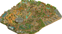
Park / [NEDC6] Cerulean Breeze
-
 27-April 25
- Views 0
- Downloads 49
- Fans 1
- Comments 23
![Park_6138 [NEDC6] Cerulean Breeze](https://www.nedesigns.com/uploads/parks/6138/aerialm6374.png)
-
![Park_6138_[NEDC6] Cerulean Breeze](https://www.nedesigns.com/uploads/parks/6138/logot.png)
-
1 fan Fans of this park
-
Full-Size Map
-
Download Park
49
-
Objects
2
-
Tags
Similar Parks
-
Darwin Zoo Bordeaux
-
Attractiepark Valkenbeek
-
[NEDC6] Sugar Rush
![park_6131 [NEDC6] Sugar Rush](https://www.nedesigns.com/uploads/parks/6131/aerialt6367.png)
-
Project Phoenix - Phase 1 Release
-
Leafy Lake
-
Sunbright Acres
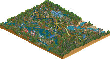
I like this entry but I must say I feel conflicted. I get a little tonal whiplash from the beach chill vibe of the coaster and landscape, while the supporting areas seem haunted themed. Both are fine, but I feel they don't really mesh together, even if they fit the spring pun. Perhaps the biggest misstep is the coaster's supports color which just didn't work IMO. However, besides that, I think what you made is actually very good. The macro feels strong and the midways are very nice. The coaster also frames some of the landscaping very well and vice versa. A nice entry overall. I'd give it a 60.
I enjoyed this quite a bit. I disagree with Mr. Brightside on the support color. I think it works. The overall path color though is maybe a little too dark for me. I really like the architecture and I think that this is worth a 65. Nice classic feel overall.
as an old PT2 kinda guy, I really liked this entry.
Rotated once from the view in the map preview, it looks so nice, really well composed and very pleasant to look at.
I had it much higher in the contest, at 8th place. It doesn't do anything overly dramatic or new, but does everything it tries to do very competently and without any real flaws.
Cerulean Breeze is another fantastic submission that captures the classic RCT charm we all know and love. The tropical coaster color scheme and detailed custom support work really help the map stand out visually. While the village area is well-crafted, a bit more color variation could have helped break up the uniformity of the brown paths, walls, and roofs, which tend to blend together and affect readability. Still, it's a strong and memorable entry.