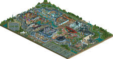
Park / [NEDC6] Cerulean Breeze
-
 27-April 25
- Views 0
- Downloads 92
- Fans 1
- Comments 31
![Park_6138 [NEDC6] Cerulean Breeze](https://www.nedesigns.com/uploads/parks/6138/aerialm6374.png)
-
![Park_6138_[NEDC6] Cerulean Breeze](https://www.nedesigns.com/uploads/parks/6138/logot.png)
-
 67.00%(required: 65%) Design
Recurious 80% deanosrs 75% SSSammy 75% CoasterCreator9 70% J K 70% RWE 70% posix 65% Terry Inferno 65% chorkiel 60% pants 60% RobDedede 60% Turtle 60% 67.00% -
1 fan Fans of this park
-
Full-Size Map
-
Download Park
92
-
Objects
2
-
Tags
![park_6122 [NEDC6] Farewell, For Worse Until Someday - 2025](https://www.nedesigns.com/uploads/parks/6122/aerialt6377.png)
![park_6140 [NEDC6] The Cartographer](https://www.nedesigns.com/uploads/parks/6140/aerialt6372.png)
I like this entry but I must say I feel conflicted. I get a little tonal whiplash from the beach chill vibe of the coaster and landscape, while the supporting areas seem haunted themed. Both are fine, but I feel they don't really mesh together, even if they fit the spring pun. Perhaps the biggest misstep is the coaster's supports color which just didn't work IMO. However, besides that, I think what you made is actually very good. The macro feels strong and the midways are very nice. The coaster also frames some of the landscaping very well and vice versa. A nice entry overall. I'd give it a 60.
I enjoyed this quite a bit. I disagree with Mr. Brightside on the support color. I think it works. The overall path color though is maybe a little too dark for me. I really like the architecture and I think that this is worth a 65. Nice classic feel overall.
as an old PT2 kinda guy, I really liked this entry.
Rotated once from the view in the map preview, it looks so nice, really well composed and very pleasant to look at.
I had it much higher in the contest, at 8th place. It doesn't do anything overly dramatic or new, but does everything it tries to do very competently and without any real flaws.
Cerulean Breeze is another fantastic submission that captures the classic RCT charm we all know and love. The tropical coaster color scheme and detailed custom support work really help the map stand out visually. While the village area is well-crafted, a bit more color variation could have helped break up the uniformity of the brown paths, walls, and roofs, which tend to blend together and affect readability. Still, it's a strong and memorable entry.
Was excited to see an entry from you Milo. This took me right back to some of the classic rct designs from when I first started downloading parks on NE. I really enjoyed the macro and the sense of fun with touches like the 'Spring Cleaning' ride. While I liked the colors, I felt the surroundings with the dark path were a bit heavy against the bright colors of the coaster. Felt a bit like two different styles pushed up against each other. Also, the swaying palms somehow felt out of place, heh. Regardless, really fun entry, exciting so see you building more consistently again!
Great landscaping!
This should've ranked higher in my opinion, it's an all-round classy entry. Not flawless, but extremely atmospheric. I appreciate that you turned a haunted house into a charming old mansion. Spring Cleaning is such an off beat theme, but together with the swaying trees, the music (default music is so good when used well), the soft colours, it evokes a feeling of a cerulean breeze indeed. Some cool moments here like others pointed outl the waterfall is beautiful, the bumper 'cars' is nicely integrated, but also the quirky coloured umbrellas for example. I like the spider theme for the bumper cars because again you turned something scary into something lighthearted - the spiders are happy because of the new life. Another spring reference. I noticed the staff names btw. SloB, RCTFAN and Titan. It's obvious who inspired you here. I can somewhat tell, but I'd like to point out that I find the architecture to be really unique. Turtle isn't far off with the X250 observation though... If any player from old times built this, it might very well have been him - compare to Voodoo Loas.
Well done Milo. Lovely surprise.
ah THERE's the thicc supports. really is a treat to see so many early/mid-2000s worship entries in this contest, feels like a nice reprieve from the (wonderful but incomprehensible) meta of h2hx. this did some of the most flattering work to the layout itself. the barrel roll into cobra roll into brake run and how it interacts with the queue, concrete dip, and hill is HOT. love this kind of archy that serves no functional purpose besides coaster interaction/looking pretty
reminds me of the good ol days before WOKE HYPERREALISM ruined all our parks!
love the use of the swaying foliage while still keeping things old school. nicely done!
-Concept: *
Couldn't really detect a concept in here, other than a PT2-era throwback park, where you took inspiration from SloB, Titan & RCTFAN (seeing the security guard list )
)
-Content: *
There was quite some content in the sense of world building. Every aspect of parkmaking was well executed and nice to investigate.
-Quality: **
This was the strongest point of the park imo; I'm just a sucker for that era of parkmaking, and you nailing SloB, Titan & RCTFAN's style/quality is the biggest compliment I can give you I think.
Overall;
Really well constructed piece here. Like I said, I love that retro NE style, with that particular way of flower placement, pathing and architecture forms. You nailing that feeling gave me a great trip of nostalgia. The subtly integrated modern CSO, like the swaying trees and animated pennants also were a nice touch and fits well.
Bold use of colors on the coaster. The pink works well with the teal and is not one I would have thought of using. I'm a big fan of allowing the use of open grassy areas and not trying to fill it with other things. Your rock work does give me some ideas on what others have been trying to tell me for the rock work in my project. Overall, I like it and congrats on completing the submission.
Such a charming entry, Milo! The old-school style and slightly confusing story make me think the map was slightly tossed off, but I'm glad we got it. Would love to see more non-competition work from you.
The landscaping behind the coaster frames it so well and I think you've found great ways for the path to interact with the coaster. The architecture is simple in its detailing but has some nice, complex shapes.
Really enjoyed this one. It’s got a beautiful, classic old-school style that feels fresh and well executed. The landscaping and foliage are top-notch and help set a great mood throughout the park. The architecture also stood out, it fits the theme perfectly and adds a lot of charm.
Overall, this feels like a really well-rounded entry. Everything works together smoothly without any major weak points. Also gotta say, the park name made me chuckle.
Honestly, I was a bit surprised this didn’t score higher overall. I thought it was one of the stronger entries and really deserved more attention.