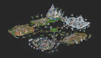
Park / Hammerhead 2.0
-
 03-October 25
- Views 2,012
- Downloads 133
- Fans 1
- Comments 15
-

-
 77.50%(required: 65%) Design
RWE 85% Turtle 85% CoasterCreator9 80% G Force 80% Terry Inferno 80% Xtreme97 80% ottersalad 75% posix 75% Recurious 75% Scoop 75% deanosrs 70% pants 70% 77.50% -
Description
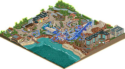
The sharks have been upgraded! With freaking lazer beams attached to their heads!
Back in 2009, over 16 years ago, I won my first NE Design with Hammerhead, a beach themed B&M flyer. While I always liked the concept and how the ride turned out, the game has evolved quite a bit since then. With that in mind, I wanted to revisit that ride I made oh so long ago and bring it up to modern standards. Both the games, and my own.
Enjoy this labor of love, and for a blast from the past, check out the original here:
https://www.nedesigns.com/park/645/hammerhead/ -
1 fan Fans of this park
-
Full-Size Map
-
Download Park
133
-
Objects
1
-
Tags
Similar Parks
-
Southern Sands
-
Indoor Egypt
-
Ptolemy II's Alexandria: 250 BC
-
Revelations of Stonehenge
-
Bocas Del Toro
-
Creag Mhòr Adventure Park
Kicking off these comments here.
This is a huge step up from your first Hammerhead, and I thoroughly enjoyed my time poking around this map. It's pleasant, it's inviting, and it's believable. I love the attention to detail you put into everything, from the impeccable supports to the street performances - everything feels intentional and well-crafted.
To me, this hits all the marks for what make a design submission great. Top tier layout, appropriate setting, fun details, and full of life in every way. Great job big guy!
I have not seen the original hammerhead so ill just comment with a fresh perspective.
Lots to love in the park. Big fan of the layout, with the rolls over the lifthill. Station interaction is top notch too and because its so open with the water there it can be seen from a lot of spots. Also loving the striking blue color scheme as a contrast to the red rocks.
Rest of the park is inviting and warm. Architecture feels solid. Loving the curves on the inside of the hotel. Parking garage next to it feels a bit week in comparison, but thats outside of the map.
Some of the spots in the park feel a touch dead to me. Wouldve liked some more movement on the beach, in the hotel and in some spots on the outskirts. Music in general wouldve been a nice addition to strengthen the already nice atmosphere.
Overall a really great park that stands on its own without knowing the OG. Great work Maverix
i love the idea of revisiting an old map with fresh eyes, skills, scenery and everything.. and what an update. i really liked this map.
everything is so clean. the surroundings are gorgeous - so many really nice understated theming choices. foliage, flower colors, palette in general, coaster colors... all perfect. great usage of half diagonals and curves to make everything feel more organic, diagonal swinging ship is really nice too. the setting really VERY real, great work.
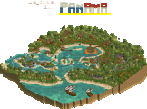
and the coaster is great too. beautiful station building, lots of track in and around there but it doesn't feel clustered, just full. love it.
little touches to really sell the atmosphere put this over the top into "great" category, for me - scenery people queueing to make the lines feel fuller (has this been done before?), band playing on the compass motif, meet the pirate area, someone buried in the sand on the beach, the forklift in the backstage (best one i've seen). congrats on a great map.
I really like the flyer! Very clean. The rockwork could use differing shades of color maybe to help it stick out and in some areas, like by the diagonal fence, I think the beige foliage you had in others would of looked nice there. It feels like it draws a line across the screen rather than blends. On a positive note the hotel is excellent, I really liked looking at that as well as your plaza. I also liked the flats here like the S&S. I always love seeing custom supports on these. I also like the detail by the parking garage. It's not glorious but the little details, like the road lines in and out making sense, are nice.
Another certified Jimmy Maverix banger. Layout has great flow and a barrage of memorable elements. The dual inline twists above the lift, the pretzel roll over the station into that big sweeping turn towards the ocean really stand out. I also love the big splashdown element near the end, but I just wish that big ol' rock had more purpose on the other side. Archi is gorgeous with vibrant colors and great shapes. Love the inclusion of the hotel complete with cutaways. My gripe with this one is that there are quite a few areas that feel kinda blank and could have just a little more going on. Some more path details to break up the beige, some differently colored Fisch rock pieces in that big beige spot near the hotel, little things like that. I'm nitpicking a really great design though, definitely somewhere from 75% to 80% for me.
Lol! Great idea to revisit your own work, and awesome reimagination here.
The double roll over lift into mid-course pretzel is awesome, and the scenery is really excellent. I like how the coaster retains its original elements, but reconfigured for the better.
Great little details, like the band playing, Pirate Bob, and the other peep scenes. Those four little buildings looking out over the water near the hotel are my favorite, half-diagonal building still blows my mind.
You, and the game, have come a long way!
Overall very likeable and great to see you revisit an older design. Cool idea. I think the layout is solid.. really a standout ride. The first drop under the rock arch and the pretzel around the station are some signature features.
There's some tiny things that I would've improved a bit.. namely the giant rock that the coaster goes thru before the splashdown. Also, some of the archy feels a bit simple as well, but thats okay when you have a great coaster.
True Classic King Mav right here! I do think this map improves upon your style that you've been steadily improving over the years. The ride design as always is superb the colors are fantastic and there are some great moments of architecture. Namely the resturaunt across from the screamin swing and the hotel. I think the one thing that would set this over that 80% threshold for me would be even more subtle crunch and details throughout the park sections. There are moments such as the door tracks that lead to backstage areas and some wear here and there, but I think you could push it even further especially with such a "sandy" theme. This looks a little too pristine. All that being said, this is a great upgrade from the original design. I would love to see some more of these get a redo because some of them definiltey deserve it.
Yes Mav! Looks great, really nice idea to go back and repurpose an old theme to see what the effect is. I've thought about it many times.
Downloading now!
Really classy parkmaking at play here. Good use of Fisch rocks!
I don't understand your choice to manually add queuing static peeps in addition to actual peeps in the queue lines though!
I understand that that's the point, but irl I also wouldn't see people walking straight through other people standing still in the queue line. Isn't part of the point of RCT that peeps can fill out the queue lines by themselves?
Now it just looks like people are constantly skipping the lines.
Congrats on the Design. Well deserved.
I really liked the overall openness of thew area. Made it easy to explore and look around. Although Im not an expert, I liked the layout especially the ending portion. I also liked the extra peeps in the ride queues to help give that busy/popular feel (I plan to "borrow" that) but i do feel they are perhaps a bit to "thick" worth of peeps.
Finally, make sure your invisible paths are not going through areas with scenery. There is a portion where there are 4 tables with peeps with a line of peeps walking right through them. Kinda takes away the feel for me. Overall, I really liked the design!
Really enjoyed this. And as others have said, nice idea to revisit an old piece of work and update it with modern techniques. The whole area feels very believable in terms of the layout of paths, rides, etc. The paths are a highlight for me actually - especially the area around the fountain with the gardens curving around it. The coaster itself is nice and flowy and I applaud your patience doing all those custom supports haha. Lovely clean architecture too. Congrats on the Design!