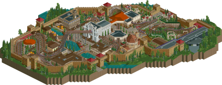
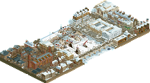
Park / Race for the Renaissance
-
 23-February 26
- Views 3,013
- Downloads 78
- Fans 0
- Comments 11
-
 68.00%(required: 65%) Design
deanosrs 70% J K 70% pants 70% RWE 70% Terry Inferno 70% Turtle 70% Xtreme97 70% barnNID 65% chorkiel 65% G Force 65% Recurious 65% Scoop 65% 68.00% -
Description
The soul of Vergilius, the Roman poet, once traveled to early Renaissance Florentia to visit Dante Alighieri and (not unlike the Ghost of Christmas Past) show him the dire consequences of a life of sin, excess and spreading office gossip. Many years have passed since then but now the time has come for Vergilius and Dante to return and (with the assistance of Great Coasters International) bring us on a ride we will not soon forget. Inferno, Purgatorio or Paradiso? See for yourself.
-
No fans of this park
-
Full-Size Map
-
Download Park
78
-
Objects
1
-
Tags

Logo by J K
1300 - 1600
Your park must be set between the years 1300 and 1600 or themed to that era.
Must feature a well known style of art or architecture from the Renaissance.
Your park must include a pair of synchronised rides (eg. duelling coasters, synchronous flat rides).
Before voting, please ensure you have viewed all entries below. The first question asks you to evaluate which park or parks have met the above Objectives the best. The second question asks you to choose the park or parks with the highest Quality. You may vote for multiple parks in each question. The poll will be closed in approximately 72 hours, after which the total vote for each park will calculated and the park with the highest number of votes will be declared the winner of the round, granting its creator(s) entry to the Grand Final.
A bit of a let down we only got 2 entries in while the time period is very interesting and the prompt was given so early... Guess I can't complain because I also did not send something in, but still...
The Polymath's Lament
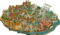
Love how this whole park is framed, a Da Vinci painting that came alive. Foliage and landscaping is really good, really setting a vibe. Archy is super, love the beige buildings with reddish roofs. Great structural forms everywhere, especially that central castle that surprisingly was not the station of the coaster.
Coaster itself was fun, flows well and the duelling trains stay close to eachother which is no easy feat. Loved the pre-lift sections and also love you guys went with a Mobius coaster, something we don't see often. I kinda do wish the coaster was supported because coasters always look so much better with custom supports but I also understand that wouldn't fit the artistic narrative of this map.
The custom paintings were unreal. Really great map and a work to be proud of.
Race for the renaissance
Nice renaissance village, the buildings are quite nice but some a bit too large. The white building where the lift pops out is def my favorite building of this map. The coasters are sweet, looking like some good old GCI goodness. I like how they first race and then go their own way, to come back again at the end of the ride.
The music was a bit of a miss for me, the Roman march on one side and the medieval music on the other side made it quite a cacaphony (I did listen with headphones, maybe it's better with regular audio boxes). I think chosing 1 of those and have a ride in the center of town would've been a better choice. I also think the whole city didn't need to be walled, if it was only half it would've got some more open space which I think this map could use.
All by all fun entry, my favorite from you so far in this contest Narc. Keep it up!
Really lovely stuff, Narc and Faas! Been loving your consistency in these realistic little nuggets and this is easily my favorite of the bunch. Can't wait to see all of these come together for a final mega-release!
+ Really fun racing layout. I'm already seeing comparisons in NEcord to The Cartographer from Ancient Worlds, but those wacky steel GCI supports give it a unique identity. The queue line is a ride in itself, especially with the diagonal entrance and interaction with all the buildings.
+ Great lineup of supporting rides! Love how Pavillion Philosophum is tucked into the turnaround in the coaster. Lonza's Journey is also a joy the way it weaves in and out of the fortress walls. The Summa slides' back facades are adorable. Pretty much every ride is memorable which is tough to do.
+ Smashed the architecture requirement with all the different types of buildings. Rough fortress walls, ornate churches, overgrown colonnades, and pedestrian buildings with realistic backstages; this really has it all.
+ The chill sections are my favorite parts. I especially love the colonnade next to the station. Really lovely manicured foliage with some great shapes. The grass objects blend the flowers into the ground really nicely. The area with the slides and the hedges and gardens also turned out really well.
+- Encasing the whole thing in a fortress is really cool. Simple archi done really convincingly. I would have liked to see more variation in those rock walls with how much coloring potential those objects offer. You could have had some big sweeping gradients instead of little splotches of brown. I personally think the top of the rock wall object looks a little noisy and a lowered path texture on top of the fortress walls would have made it look little cleaner.
+- Love the way the lift hills loom over the fortress walls; that's really good way to draw peeps in. I just feel like they'd get a little confused finding the coaster station from there.
+- Foliage is nice but could have been more lush in spots. A little grass or underbrush underneath some of the scattered pines would fill them out.
- My one gripe with the dueling coasters (outside of a few weird bumps) is I wish there were some holes in the path where peeps could look down at the pre-lift section. I also wish the wall covering the brake run had open arches instead of solid walls and windows. In general, more attention to visibility would have been nice.
- At times it gets a little cluttered and hard to follow with all the buildings blocking the paths and rides.
- As Fred said, the amount of music is a little overwhelming. I think the move here is taking Horror Style off Palazzo Portinaro since the other songs are on each end of the map.
I'll talk more about The Polymath's Lament once voting closes. Even if this feels less like TTA and more like a Head-2-Head matchup, I'm happy Daylan and I managed to do justice to the optional art requirement. Huge shoutouts to Daylan for being not just a strong second builder but someone who was genuinely excited about this park and kept my head up when things were looking rough. For now, I'll let this unfinished masterpiece speak for itself.
Only two parks! Looks like you're going head-to-head! Let's see how you compare on each of the objectives:
1. 1300 tot 1600 era
Honestly you both did fine to great! The theme was super clear even without the added description. I like the immersion you get when the park is actually set in that era instead of themed to it. But both work well!
2. Best duelers
I preferred the duelers in RftR. They were longer, interacted more with the park and each other. I'm impressed how well the Polymath's duelers work without supports. It shows how well the layouts work as brush strokes flowing through the map.
3. Art/architecture style
Definitely preferred the Polymath in this aspect too. It combines all the art forms that DaVinci laid his hands on super well. There's something to say about the derpiness of the paintings, but it's honestly fine!
So I'm gonna give you both the edge on the objectives.
4. Best quality
This is easily the Polymath. It looks a bit rushed in places, but you did a nice job tidying everything up. The score is fantastic. I really enjoy the concept of this being a painting towards the edges and I'd say you pulled it off mostly. You took a risk with the picture frame. I think I read somewhere that you did that to distance it from the Cartographer. Which is a good plan. I'm not sure I like the look of the frame though.
Thanks for submitting these wonderful maps!
one good park and one great park, for me, good work getting entries in on a longer timeframe - often harder to push yourself to actually finish.
Race for the Renaissance
i liked this park, the quality level was overall pretty good, with some little pops of excellence. the coasters were nice without being overly impressive or interesting, and probably spent a little too much time underground/indoors for my liking. i think i understand the thinking behind the lift hill supports, but they felt quite anachronistic, would have liked to see something made of wood with the same open space maybe. the two best parts were the building with the dome (wonton soup as walls was a lovely trick), the dome actually worked pretty well. and the building directly opposite it on the map, great texture and i liked the umbrellas and gardens around it.
The Polymath's Lament
this is the clear winner for me, definitely on quality and probably objective-wise too. i preferred these duellers, especially the first element at the top of the launch felt really organic and natural. good choice not to support them at all, it worked well with the slight dreaminess of the theme. i'm not sure exactly how i feel about yellow and pink as the colors but it works well enough for me not to mind.
you've picked probably the most famous person from the timeframe and you've really done it justice - loads of nods towards da vinci and they're recognizable and come across as a lovely homage. the architecture is spot on throughout, absolutely top quality work. obviously the coaster station is so impressive, and the lift hill structure is exactly what i was wanting from the other park. but the landscaping and foliage is also incredibly high quality, i was not familiar with your game. the flowers, the bush work, ground textures, mix of rock and grass, different color rockwork.. exceptional.
shoutout to the paintings, they're obviously limited but they absolutely get the point across and end up being charming rather than offputting. the map edge and canvas edges will obviously have a little comparison with the Cartographer, but feel different enough and true to the theme that it doesn't feel like copying - just an extension of the idea maybe. i would have liked to have seen even more da vinci drawings/blueprint type stuff around the map edge but that's time consuming, i get it.
great work, instantly becomes possibly my favorite map from the whole contest, and a strong contender for finals.
First off, I want to say to the admins of NE that I was really enthusiastic for the set-up of this round. Being a slower builder myself with a lot going on in real-life, set-ups like these are a great way to still compete in challenges . . . though, alas, I couldn’t pull through on this one. Nevertheless I’m glad we have two great entries for round five. First up:
Race for the Renaissance - Narc (85%) and Faas (15%)
A nice little bit of old-skool vibe mixed in with some more modern objects. The duelling GCI looks fun. Racing at the first half and then sprawling off in the second. The architecture has some nice moments; especially the white church in the centre and the one inspired by the Duomo of Florence. I think the rest of the architecture looks quite rough and lacks some form and refinement. I think using one of the smoother palette’s would’ve helped with setting the tone more.
The Polymath's Lament - BarnNID (50%) and Gustav Goblin (50%)
Damn that’s hot! What a beautiful map you guys build. I love the Stardust-Racer like coaster, but the gorgeous architecture steals the show. Also brilliant how you guys made these paintings and what a great transition into the canvas on the back of the building. Also loved the Davinci machines. Only small nitpick I could find was the macro-placing of the three ships. That central ship is just so gorgeous, but because the smaller ships are in the same colour and close to it, it’s a little hard to read in most viewing-angles. But anyway, this one’s the clear winner in my book.
Narc & Faas:
A very pleasant piece of RCT that is in the style toward which I aspire. The domed church was really nice, as were the subtle textures placed on the surrounding walls. An enjoyable entry. The dueling coasters were really charming, but the other entry beat you out on selling the time period category and the painting/architecture category.
BarNID & Gustav Goblin:
It's a clever idea, an unfinished work of art, and certainly makes it easier to play off any potentially unfinished bits. If it weren't for the brilliant painting sculptures and architecture, I would have given the other entry the vote for the objectives category because I didn't like the support-less coasters. They frankly distracted from the experience for me. Overall it was a rather brilliant entry; super cool.
Congrats to both entries for submitting something, You did something I simply did not have time for. But, I hope my meager comment on the site serves as some consolation for the community, lol.
Narc & Faas: Really like the idea for this park and I think the best one from Narc so far! Thought the castle walls were really well done! Some of the sight lines and arrangement within the castle felt a bit crammed but overall the archy was good on the buildings. Would have preferred to see a bit more of the coaster outdoors, but overall a nice dueling layout! I would say the objectives were definitely met!
BarnNID & Gustav Goblin: A super entry and very similar to my rough ideas for the round, with a bunch of Da Vinci's inventions set in a beautiful garden-like setting. So I have to say I love it just for the concept! The archy was great and overall the layout and planning were great, only the entrance could have used a bit more breathing room IMO. Also would have liked to see some coaster supports but I understand it fits with the "unfinished" theme and does work in this case. Overall, spent a long time exploring and found it easy to appreciate all the details that went into the park! And can't forget to compliment the custom music.
Congrats to both pairs for submitting high quality parks!
Race for the Renaissance - another Narc entry! Your productivity is very impressive! And the pairing with Faas obviously turned out very well - your styles blend seamlessly. The coaster layout is super fun and that initial setup of the lift and drops over the water is a lovely moment. Love the racing section at the start. It gets a little harder to follow towards the end with all the tunnels and as Gustav said, having the brake run go through more of an open colonnade might have been nicer than fully enclosing and obscuring it. The architecture across the map is strong and fits the brief - both of the big churches are beautiful. Overall a very strong and pleasant map to explore.
The Polymath's Lament - this is just gorgeous. Arguably the best architecture and foliage of the contest so far. Love all the arches and domes (you made some pretty cursed CSO objects work well haha). This, plus the paintings (!!!) hit the brief hard. The coaster is fun - at first I was disappointed how short it was and then realised it's mobius so you get to go round again! I think I'm on board with the lack of supports - definitely gives it an ethereal vibe and I guess it wouldn't make sense to have a 'realistic' coaster in a dreamlike setting like this. Anyway, this is definitely one that I'll come back to when I need inspiration. Well done guys!
Logo by J K
Round 5 - The Renaissance
Results
Our time in the Renaissance has drawn to a close, taking us back to a golden age of art and culture. From the two entries received, barnNID and Gustav's entry The Polymath's Lament came out on top with 53 points and earns this pair their ticket to the Grand Final!
Find the full results table below. Total score is calculated by adding the number of votes for the entry in the Objectives and Quality questions.
Total = Objectives votes + Quality votes
The Polymath's Lament
by barnNID (50%) and Gustav Goblin (50%)
26
Race for the Renaissance
by Narc (85%) and Faas (15%)
12
smart_toy Next stop: Round 6 - Y2K (due March 2nd) smart_toy
Thanks for the loving feedback and the blowout win! Never thought I'd actually qualify for the finals of this kind of contest, even if I didn't have a ton of competition this round. I'm really excited to give my all in the final round and show that this wasn't a fluke!
When R5 was announced, I knew I wanted to take advantage of the art/architecture requirement to do a game-breaking artistic take on the theme. I stumbled upon Da Vinci's manuscripts and realized I could take advantage of an old park concept which starts as a sketch and explodes into color. My initial idea was a reimagining of a city through the eyes of a master inventor and city planner. Modernized buildings and fantastical elements such as primitive airports for gliders would be "sketched" over existing buildings.
Even before the round was announced, barnNID had expressed interest in working together for a round. I still don't know what he saw in me but I'm not mad. While round 2 didn't really catch our interest, barnNID loved my idea and was excited to get started. Unfortunately, barnNID was pretty occupied until the round started proper and I didn't have the energy to start either. Once barnNID's schedule opened up near the end of round 4, we started planning.
It was decided early on that the core concept would be Da Vinci's idealized take on an existing city. barnNID was pretty dead set on Ronda in Spain so he could tackle some dramatic landscaping. The towering cliffs would have also made a great launching pad for gliders. Unfortunately my sketched idea was looking a little more difficult to execute than we expected. barnNID was having a hard time getting a grip of it, and even when our idea changed from huge pieces of paper covering buildings to sketched elements on top of existing buildings it was clear we would need to make hundreds of custom objects. This wouldn't have been feasible in the month and a half we had.
My first take on a sketched building.
barnNID's shot at sketched objects on a physical building.
We went all over the place from there, but all I wanted was to really lean into that art category and think way out of the box. It wasn't long before I pitched the idea of breaking free from a real-world location and basing it around a lucid dream of Da Vinci's ideal city. At the time, it was more Da Vinci stumbling upon a landscape-heavy utopia in his dreams and projecting a city onto it. This let us really lean into the surrealist vibes, which I especially hammered in when I came up with the giant one-angle paintings hanging on the cliffs. On this day, barnNID bore witness to a classic Gustav rite of passage: the MS Paint sketch.
Look away, Faas!
Through my research on Da Vinci, I realized much of his work could be categorized into four categories; architecture and city planning, military, flight and art. There would be lower levels for each of these and an upper level for a massive central church. Note the blue squiggle in the flight section, which believe it or not is supposed to be a roller coaster. I had early plans for an ornithopter themed single-rail flying coaster, not unlike the one in Bene Volantes. When time ran low, this became an ornithopter launched off the top of the fortress and down near the water, which then became nothing once time pretty much ran out. Very sad about this.
The true concept for the map came around when, out of desperation while trying an entrance, I just looked up Leonardo da Vinci's house. There, I was introduced to the Chateau du Clos Luce where he spent his final years. Among his final words were actually regret for not pursuing his art the way he could have. Something about that really touched me. The very definition of a Renaissance man, still inspiring architects and inventors centuries later, faced with not only his own mortality but the same impostor syndrome so many of us go through on the regular. It was then that the idea of this park being a lucid vision of what could have been fully came into play. So real and tangible yet so unfinished, everything and nothing at the same time. Also the chateau is the best building I've ever made so hell yeah.
Anyway uh oh I'm copying Xtreme97. Canvas outskirts with sketched elements and a name which at this point was simply The Polymath. I changed the name to The Polymath's Zenith, the single worst string of words my reverse lisp-having ass could say. I was "lowkirkenuinely fw'ing with" The Polymath's Lament four days later, half because I liked the emo vibes and half because the name would no longer rhyme with penis if I said it out loud. I also decided to switch up on the manuscript gimmick and instead have it be an unfinished painting. I wanted it to feel tangible with brush strokes around the edges and waterfalls actually staining the canvas. I also put a huge frame around the outside to give it some extra identity. That's right, after two building challenges and a bonus entry for the Advent Calendar I have finally reached painting frame apotheosis.
Four Views From Atop The Ancient World for the Paint Your Quads challenge.
Lombardy Poplar on Beige for the Foliage Challenge.
chAsiNg aFteR yOu from the 2025 Advent Calendar, soon to be uploaded to the site!
On the topic of the canvas, I quickly realized I would need two specialized swatches in the palette. The color of the canvas itself could not use any shading outside of some variations in the base color as to make objects look drawn on rather than built up in a canvassy color. I struck gold by realizing that flat tile land textures looked a lot like a canvas and would save me time needing to slap down path objects. The color for the lines also couldn't use any shading so I could use any objects instead of needing barnNID to make solid-color versions. I wanted a lot more sketched objects in the margins, but I couldn't think of much and time was short.
My first shot at a sketched house.
The concept for Master Stroke started as a Stardust Racers clone and eventually became a Mobius Maverick. This thing SUCKED to make. Oh my GOD, I forgot how hard dueling coasters are. Having to balance good flow, proper timing, dramatic interactions, and not having godawful tangents is so tough. They had to have taken me a week and at least three iterations. My second biggest mistake this entire build was not building this Spamton G. Spamton-colored monstrosity first thing and then shaping the macro around them. The missing supports were one of the big talking points concerning this park, and we ended up doing that for two reasons. Those who assumed supports would take away from the brush stroke look were correct, and I even intended to throw on a bunch of trackitecture effects a la the coasters in Antwerp from Revelations of Stonehenge to intensify this effect. Unfortunately time did not allow me to fully realize this. The true reason is because I am terrified of custom supports and would literally rather build anything else. They're not even that bad in theory; I think I'm just afraid of making them look weird.
I refuse to dive further into the emotional journey behind actually having to make the park instead of thinking of cool ideas. For once in my godforsaken chungus life, I just want my work to speak for itself. I've probably done a horrible job at that already and will only make things worse, but still. I do think Da Vinci's last words sum it up best.
I will let slip that I am getting very tired of contest deadlines. I cannot stress enough how much I regret not starting months earlier, even if I didn't have much energy beforehand. Nothing is more frustrating to me than having to scrap big ideas and not even get to the parts I genuinely enjoy, even if what NE sees is a mostly complete and realized vision. I am also absolutely livid at myself for not making use of the entire round period, even if those who started early lost steam later on. I really do think this park needed at least another month. I think it's time I pour a good few months into a solo Design and really take my time perfecting it. This park is going to receive the highest panel score of any park I have conceptually led and built a significant amount of and yet I still do not think I have truly shown off what I'm capable of.


I want to give a HUGE shoutout to barnNID. When barnNID asked to team with me, I already knew I was working with one of the best players in the community. What I didn't know was how excited he would be about this park! Y'all would expect me to be the hyperactive little chihuahua of the duo but nothing could be further from the truth. I think he flipped out over the half-diagonal Salvator Mundi three times in a single morning. He just wanted to have a good time building some good-ass RCT above everything else. If barnNID weren't keeping my head up the whole time, I would have given up at least five times over. I couldn't ask for a better partner and I'm glad we got to avenge Team Canada!
Ending with some miscellaneous bits and pieces:
Architecture tests. The house on the hill is barnNID and the city blocks are me.
My first take on the central church with a temporary roof. I really need to find an excuse to use these pieces elsewhere because they look really damn good. The shape of barnNID's final version was way better though.
First test for the sky screw carousel featuring a scrapped lifting effect. After three and a half years, I've sworn my vengeance on Da Vinci's sky screw after forgetting to put it in Endswell!
The launched coasters' hill was supposed to be a giant crossbow from the get-go, but time got so low that we prototyped it and then straight up forgot to put it in the map.
Builder shares!
Race For the Renaissance:
Really cool park! I like the vibe you guys came up with and the atmosphere is really strong. This park feels very true to the theme of this round and was executed pretty well. I like the atmosphere you guys came up with although I maybe would have preferred just one music track, the two kind of blend together a bit much for me. I love how lively everything is and the fact that the entire park is walled off.
Foliage and Landscaping:
Overall, very good! I really like the tree selection and the water foliage is strong! The flowers add some good dots of colour and I like that you left a lot of dead space as well. The landscaping is good enough, I really like the waterfall section.
Architecture:
This park has some really cool architectural moments. My favourite building on the map is this little domed building:
There is also some amazing interaction with the rides and the buildings, this moment here was awesome:
Some sections maybe could have been more interesting but overall it was really cool!
Overall:
The ride design was great, the park was fun, and there were some really cool moments. I really enjoyed checking this out! Thank you both for building it!
My Park:
I won't go into this too much since Gustuv covered most of what happened lol. I'm pretty happy with how the park turned out given that we had like half of the park left to build on the last day. There's a lot of things that I wish we had time to add like supports on the coaster, the crossbow on the lift hill, and we had an entire dock section planned by the water.
Most of the back half of the park was built in about 5 hours with me and Gustuv kind of just throwing random stuff everywhere. Part of me wishes that we had not submitted to fully realize what the park could have been but I'm still happy that we got something out there.
Last thing I want to talk about is Gustuv himself. He took lead on the park and I kind of just did whatever he told me to and offered feedback. He had some really cool ideas for this thing and also had the skill to execute them. I think he's a better player than a lot of people give him credit for.
Overall, it was really fun building this round!