Screenshot / Springwater Falls
-
 20-June 17
- Views 2,791
- Fans 3
- Comments 22
-
Description
Long time lurker here. Not a big internet poster either. I have gotten back into RCT2 with the development of OpenRct2 and being a Mac user has made it difficult to use any trainers prior to that development. Anyway, here is a preview of one of my latest parks, Spring Lake Park. I have drawn inspiration from Dollywood, Busch Gardens Williamsburg, and Cedar Fair Parks. I also like to add my own flair to create a park that I would like to visit. I rely heavily on realism. Comments and criticism are welcome and encouraged. I have drawn a lot of inspiration from the community here and trust in its evaluation!
-
Full-Size
-
3 fans Fans of this screenshot
-
Tags
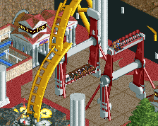
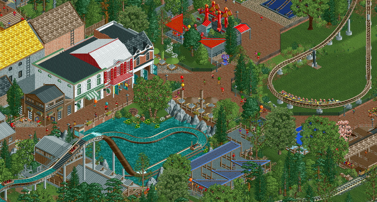
Not a huge fan of the rock formations at the bottom of the log flume, or the color of the giga coaster. I'd even change the color of the umbrellas to liven it up a bit. Other than that this is awesome!!
i actually think those rock formations are the most interesting thing here. very well pulled off. lovely vibes and foliage, I just wish those buildings had a bit more of an obvious theme or maybe slightly less blocky/ more interesting structure
The drop should be way shorter with a splashdown that short.
I like what you did with the bubbly, raging water at the beginning of the large drop. However, the inside of that "helix" on the giga coaster is a bit empty.. Give something to the guests to look at instead of mowed grass! It just looks so empty in comparison to all the buildings and path surrounding everything.
I'd second what MrBrightside said about the splashdown. The buildings at the top of the screen are a bit off for me, the rooves in particular. There is a great vibe to this screen though and a lot to like
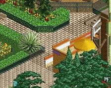
The splashdown section is too short though, like Brightside said. Same goes for the brown coaster color, something a bit more flashy to brighten up the area would be nice. Just a lot of brown right now with the flume, path, foliage and fences.
Your Archy seems a bit blocky as well, it's a good start but overall could be a little better I think and perhaps push for a more "theme park" look a little more convincingly.
A very nice debut screen, but like others have said the buildings are a weak point. I think it's too much white used overall and yes, a blocky feel too. Mix it up with those buildings and this screen is very good.
Very impressive first screen! I disagree about the buildings, I think they look great, except for that white roof which is too bright. I agree with the others about the splashdown, though. Definitely too short.
I like everything except the canopies in the queue (the triangular ones are fine but the rectangular one is a bit off) and the fact that the trim on the green building doesn't continue all the way around.
Great work though!
Wow, where did you come from?
Quite the impressive screen. A bit too wedded to realism for me, but it's clearly your thing, so go for it.
Lovely screen that is full of life! I agree with sneakyfranky, change the colours of the giga coaster and the umbrella's to something colourful.
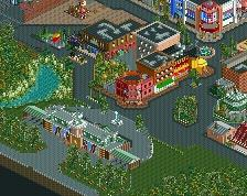
Thanks, All! I appreciate the feedback. I tend to play it safe with my color choices but I am improving on that. Thanks for the prod. Anyway, I agree with the length of the splashdown and there wasn't too much space to work with so I improvised a bit. I cleaned up the buildings as well and made a few path changes. I agree that they are quite blocky and I will carry that suggestion to my next project. My architectural skills aren't quite there yet but I am slowly getting there...I hope. Anyway, here is an updated photo Thanks again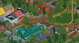 !
!
A good improvement for sure, nice work there.
One thing to keep in mind is make sure when doing trim or awnings etc... that every color has a purpose and you don't just change the colors to change colors, if that makes sense.
Also keep in mind vertical scaling of roofs and awnings, usually I have 5 units below overhangs and roofs, appears you have 4 in some places around the queues. Its not really a problem, just try to keep it consistent in the whole park, it will really help add that extra level of believability.
4 is okay for certain awnings and such. Only thing really lacking is architectural detail, but that will come in time.
I feel like I need to say that for the fact that this is a debut screen is nuts. The last person who started so strongly was Lagom, and he's about to win a second spotlight, so your potential is strong and in your favor.
good work, the improvement is clear. welcome to ne.
I really like the brick paths because it links the screen very well! The grate shades are a nice touch too, but the blue screens don't really pop for me. ( not that that's a bad thing) I really like the rock formations in water, It looks great and you made it work with water. As far as any other color things I see, It doesn't matter cause I'm freaking color blind
Two thumbs up! Welcome.
For a first screen, this is nuts. Archy could use a little bit of touching up, but this is something everyone has to learn for themselves and I'm sure you'll have no problems with that. Glad to see new members with potential! Welcome to NE! Please don't leave us.
Great improvement!
Great job, and a very nice first screen!
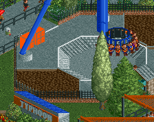
I would change the yellow roof colour though. Think you can find something more suitable.
Looking forward to more screens from you.