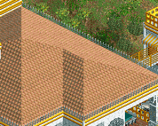
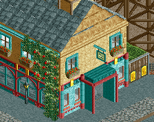
your foliage and landscaping is definitely getting better, good stuff! buildings are pretty blocky still (one big shape rather than lots of little interconnected shapes) but the detailing is improving too. One change i'd make to the cafeteria is making the sides of the brick blocks around the sign black, to match the roof - then you'll have a nice big solid roof color and the sign will be a little more readable.
 12-May 25
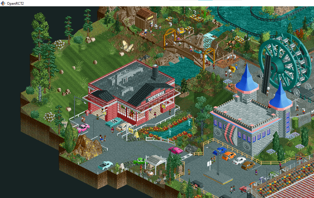
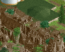
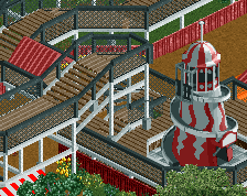
This looks like a very interesting concept and idea, I'm very excited to see how it turns out. Some of your best work in this screenshot too.
your foliage and landscaping is definitely getting better, good stuff! buildings are pretty blocky still (one big shape rather than lots of little interconnected shapes) but the detailing is improving too. One change i'd make to the cafeteria is making the sides of the brick blocks around the sign black, to match the roof - then you'll have a nice big solid roof color and the sign will be a little more readable.
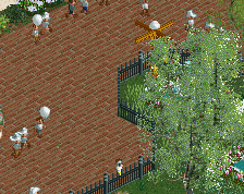
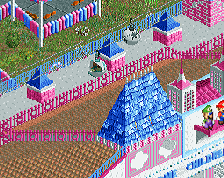
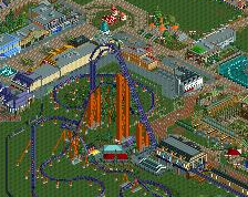
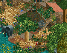
I like this scene, some nice foliage, a good bit of liveliness to it with the peeps and small details, and I like the footbridge.
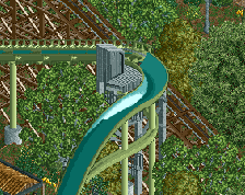
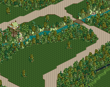
Huge improvements here, wow. Really excited to see this released.
I see a lot of improvements and evolution in your work MTC, keep it up! That cafetaria building is lovely.