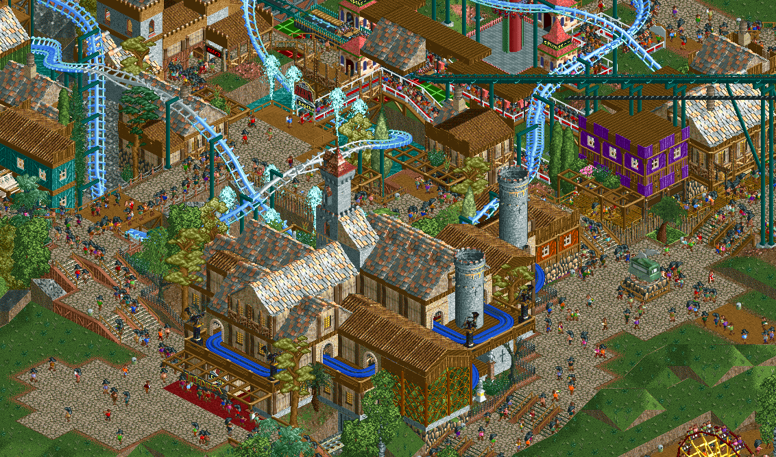
Screenshot / Claustrophobia of the Pirate Town...
-
 21-August 25
-
Fundamental Forest
-
8 of 9
- Views 850
- Fans 1
- Comments 8
Community Forum Software by IP.Board
If I can be honest Sam, I think it looks spammy and lacks cohesion.
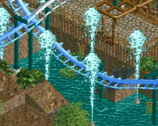
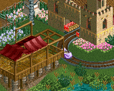
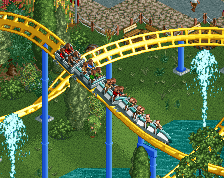
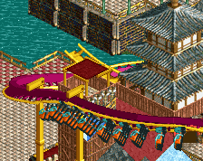
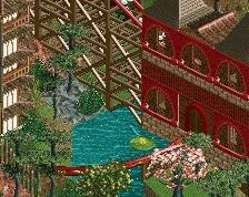
The coaster track interactions are too tight and feel stressful rather than inviting. The big ghost train building, while indeed having nice archi, blocks the view onto what is a pit interaction with water (and fountains!) behind it?
And the entrance to the flyer behind would benefit from a bit more room imo. I think layering it with the view onto the ghost train isn't advisable, as you're looking at two important ride offerings stacked vertically on top from this camera angle.
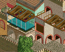
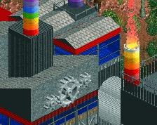
The blue and purple I reckon were bold experiments? I'm not sure they quite work.
I would honestly say you may want to re-macro this, and find a bit more stylistic clarity and cohesion.
I find this to be the best area of the park so far lol
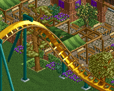
Great work sam. tons of excellent interactions, and the coaster layout looks sweet from what I can see.
I do think big P makes some great points in his comment above though. I understand the theme you're going for, and I also understand the effort in creating a high-density area. I think you've mostly succeeded there as it's certainly high density, but unfortunately does suffer from readability. Hierarchy-wise, the flyer entrance and station aren't given enough room to breathe. Stacking it directly behind the ghost train minimizes it's impact a bit.
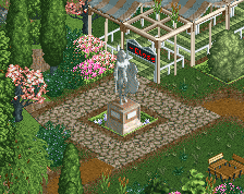
If you're open to suggestions - the purple and pirate buildings on the right are in a great spot. I also like that plaza below with the dolphin statue. What if you make this section the entrance of the ride? Lockers on the bottom floor of the purple building, queue entrance between the two buildings - like an alleyway. You'd have to adjust the steps, but I think this opens up the ride entrance as something more purposeful and grand. Where the existing queue line meets the path could still work really well as an exit path actually. Just suggestions though!
I also understand that this is heavily WIP and large sections of the screen are not complete haha. That said, the macro is a bit challenging here, and stylistically it needs a little bit of tightening up. Reintroduce some elements and color pops to balance it out a bit.
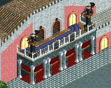
Also, I really do love the purple building and the little red one next to it with the stone walls that meet the path. Such a cool little area. The teal building on the far left also provides great balance to the scene.
Tend to agree with Posix as well here. I think there's too much visual noise through the variety of textures you are using here. If you could space things out a little bit by cut pasting some buildings a bit farther apart that could do the trick. Reason being, I think the watery trenches that the coaster dips down into could be a real draw and a focal point.
adorable